5

We have a system that collects events. An event typically occurs every 10th second or so, but its pretty random. The system collects the events during a project's lifetime which usually runs for about a month.

We are currently presenting the user with a timeline chart that aggregates the number of events (currently per day) for a project, which is an excellent way of showing the user how much events we are collecting and how it varies over time.

However, we would also like to communicate that the system is "live" and that events are entering the system and if there is a current trend in the inflow.

Since the current chart is aggregated per day, its not good enough to just keep it updated in realtime. The last point in the chart (since its an aggregation) will move very, very slowly when a new event is collected and there is no way of detecting any kind of trend.

Do you have any suggestion on how to visualize this? I'm thinking of combining different charts in some way, but not sure how to make it informative and clear.

2
  • How often do the values change?
    – icc97
    Commented Feb 20, 2016 at 18:11
  • 1
    Can you include a sample of your current by day aggregate chart?
    – bishop
    Commented Feb 20, 2016 at 23:19

4 Answers 4

2

I'd do 2 different charts as you're showing 2 different aspects, historical&static and real-time&dynamic, on 2 different timescales. Trying to do it in 1 chart [some bars aggregating per week, others per day, per hour, per minute etc is confusing/ugly, I've tried it before :-( ]. The inset idea by Simon White for the real-time graph sounds a good idea.

PS. Cubism is a great library from the d3 author for real-time data graphing - https://square.github.io/cubism/

1

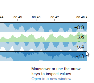
I would show the user a chart that shows a “zoomed in” state of the previous 1–5 minutes, and provide a “zoom out” button that toggles the chart to show the previous 12–24 hours.

Or place a small 12–24 hours chart within a larger 1–5 minutes chart like picture-in-picture on a TV.

1

This answer is based on what @mgraham suggested. But he doesn't make it explicit.

One way to show the values changing is just to show the live value which the user should notice changing.

It would be better to show it just outside the graph - than what I've shown below.

If that's not enough then you can add a faint 'pulsing' to the value so that the background colour changes and then fades each time that the value changes.

enter image description here

0

We can also question the usefulness of a "live system" considering that it uses more resources from your IT-system for a value that you say "doesn't change so often"

But if you really think your customers are aware of the problem of being live :

If they are sensible to the matter, a textual information might be sufficient. Why not adding a tooltip with label "updated X seconds ago" on each value (if each value is updated seperately)? Adding a timer (reverted spinner) at the bottom of the graph that shows the time until next update (20s could be a good idea).

enter image description here

Making the point updated glow (like a GPS emitting its position in spy movies) may be interpreted as the point being "live" or moving.

Your Answer

By clicking “Post Your Answer”, you agree to our terms of service and acknowledge you have read our privacy policy.

Not the answer you're looking for? Browse other questions tagged or ask your own question.