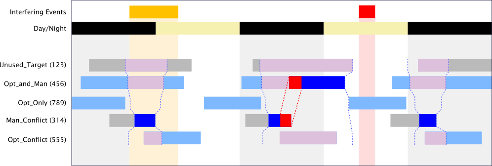
I am working with software that is used for scheduling astronomical observations. I've created a timeline view for the user to create, view, and edit observation schedules. Here's my mock-up:

- Gray bars represent the times when a given target is available for observation (visibility windows).
- Dark blue bars represent mandatory/manual observations, which force observation of a given target during the specified time interval.
- Light blue bars represent optimize/optional observations, which allow the software to choose whether or not to observe the given target. The user can specify a maximum and/or minimum observation time
- Red bars connected with dotted red lines represent a conflict between two mandatory targets. Note that the conflict extends beyond the strictly overlapping parts since it takes time to switch (slew) from one target to another.
- The light purple bars and dotted blue lines represent "shadowing" of other targets by a mandatory target. Again, the "shadowing" interval can extend beyond the mandatory observation due to slew time.
- The vertical stripes in the background and the top two bars they connect to represent day/night and interfering events that the user may want to take into account during planning.
- On the left are the target names and IDs.
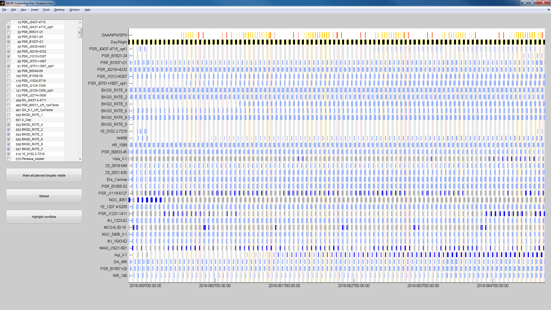
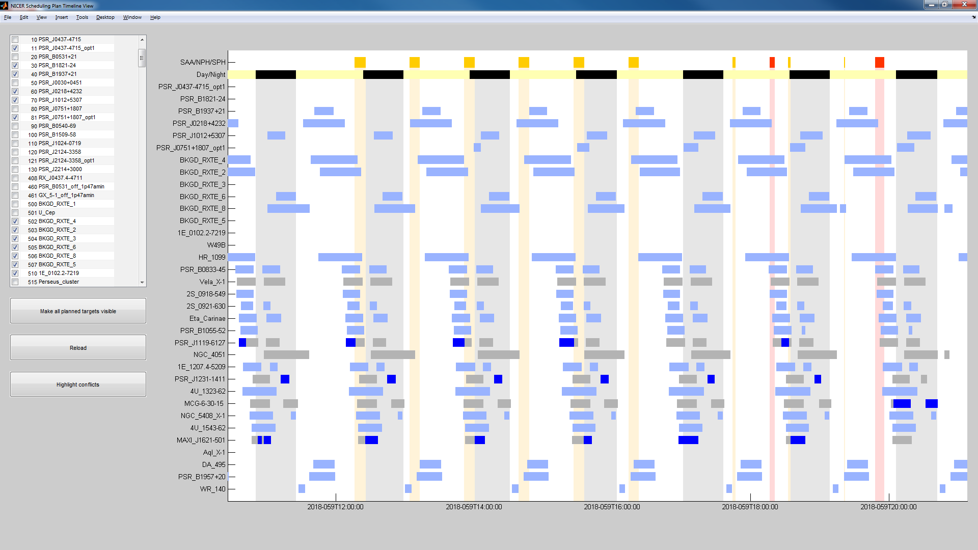
Here is an example of a real schedule plan in the current version of the timeline viewer (note I haven't implemented shadowing yet, and there are no conflicts in this schedule):


The problems I'm having with this interface are:
- I'm not exactly happy with my plan for the shadowing bars. They're going to add a lot of visual clutter, and you can't tell whether or not an optimize observation is behind the shadowing bar. Also I don't like the purple color; I'd like the shadowed times to be visually de-emphasized.
- An optimize observation can extend beyond/between the visibility windows; e.g. in the above plan there is only one optimize observation covering the whole planning period for each optimized target. I'd like the user to be able to easily see what visibility windows are in the same optimize observation.
- The vertical stripes are kind of distracting. The gray stripes for night limit the number of gray levels I can use on the timeline (otherwise I'd probably be using that light gray for shadowing). Also, currently an interfering event will cover the day/night transition.
- I'd like to add another visual element to identify gaps in the schedule (i.e. times when no observation is scheduled), and to highlight parts of visibility windows that could fill those gaps.
Any advice?
Some technical notes:
- Due to limitations of the software I'm using I can't do hatched or patterned fills: solid fills only. However, the borders of filled regions can be solid, dashed, dash-dotted, etc.
- Optimize observations for the same target can overlap each other, and with mandatory observations. E.g. a plan might have one optimize observation for target A covering the whole planning period with a target time of 10 ks, another optimize observation of A on a specific day with a target time of 5 ks, and a mandatory observation of A over a particular visibility window. This is equivalent to telling the software, "I want 10 ks of observations on this target, with at least half of the observations occurring on this day, including one observation occurring at this specific time."
- There are two types of interfering events; they are associated with red and orange/yellow so I colored them that way here, but it is not critical to keep those colors (or even keep the two types distinct).
