0

I'm designing a multi-step wizard, and in the design I've included a back button in-line with the individual step markers

back button

We've discussed things internally, and it has been suggested that the back button be removed completely since you can click on the steps themselves, and instead underline the labels on the steps to make it more clear they are also links.

I've always been under the impression that it is better to have clear back/forward buttons in a multi-step form.

  1. Should the back button be kept (but thinking of changing the label to match the previous step)
  2. Should the step labels be underlined and the back button removed
  3. Should the back button live at the bottom of the form? Unsure on positioning of this however

If point 3, then I'm unsure where to put the button. The next button is currently on the bottom left, directly under the inputs of the form as this keeps the button in the eye line of the user. However having the next and back button in the same place feels a bit wrong hence I put the button at the top to start with

3 Answers 3

2

As per your design the "back" button looks weird and out of place being there, so I can see why somebody has thought to question it. However, I still believe if you are going to allow a user to navigate back, then there should be a clear way to do so.

I assume there is some sort of "Next"/"Continue" button on your form? (maybe at the bottom of each page). I would suggest that you work the "Back" button into that design. Have them next to each other, or at least on the same vertical alignment - "back" on the left side, "next" on the right.

With regards to highlighting the step markers, it won't hurt to make it more obvious that they are clickable, but I don't think it's overly important as an average user is just going to use "back"/"next" for navigation.

In addition, if the argument for not having a back button is that the user can click on the steps, then present the counter argument for not having a "next" button for the same reason. That will hopefully highlight how silly it is to suggest a dedicated "back" button isn't required.


In short, keep the "back" button but move it inline with the "next" button.

3
  • Great response, thanks for this! In regards to the next/back buttons being in the same place or one on the left, one on the right. How does this work in conjunction with the idea that submit buttons should be under the form inputs, since that's considered best practice?
    – PaReeOhNos
    Commented Jul 8, 2020 at 11:39
  • @PaReeOhNos: Yeah that is fine, have both back/next buttons at the bottom of the form data. I just did a quick search and found this might interest you to have a look at some of the examples on their.
    – musefan
    Commented Jul 8, 2020 at 11:43
  • Great thanks, I'll have a play around with some new designs :)
    – PaReeOhNos
    Commented Jul 8, 2020 at 12:15
2

Excellent answer by Musefan. Also, the current placement of the "back" is usually reserved for going back to the previous view, not going back a step. This differs of course, but the affordance right now looks like the user would exit the wizard and go back to what they did before entering it.

Just a minor thing about the draft, right now it is very hard to distinguish between the current step and done steps. The only real difference is the text color being darker compared to light grey. Try working with the fill and border of the circles to highlight the contrast more between what the user has completed and is currently working on.

1
  • Good point about them being hard to distinguish. I'll have a play with them
    – PaReeOhNos
    Commented Jul 8, 2020 at 11:36
1

Should the Back Button Be Kept?

Yes.

There are two reasons to provide the back button:

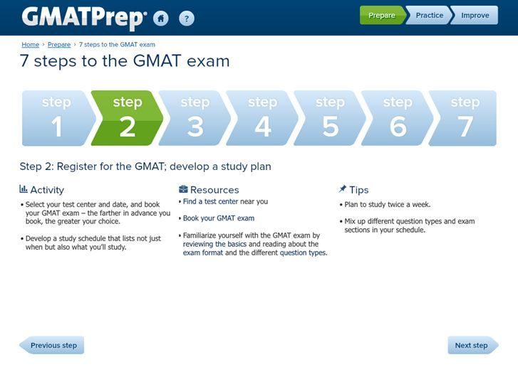
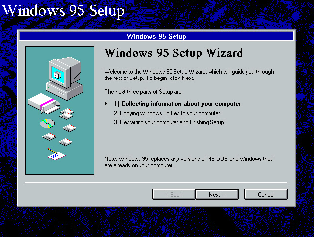
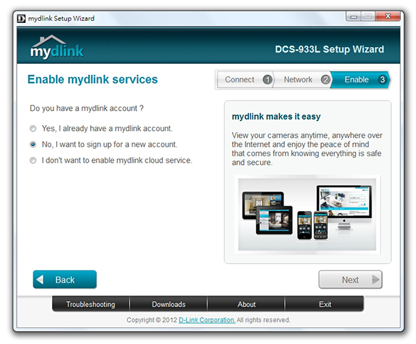
  1. It follows an established pattern (Jakob Nielsen's usability heuristic #4). Many wizards offer a back button. Here are just a few examples: screenshot of GMAT prep wizard Windows 95 setup wizard mydlink setup wizard
  2. Offers users flexibility in interaction (Jakob Nielsen's usability heuristic #7). By allowing users to click on a step marker to go back to a previous step and allowing a user to click a back button, the UI provides users with multiple options.

Where Should the Back Button be Positioned?

I recommend looking to established patterns. Looking at the examples above, there are some that place it on the lower left of the screen while others put it just to the left of the "next" button.

There are pros and cons to each of these placements. I would recommend doing a quick set of user tests to understand which pattern would be best understood by your users.

reference: https://www.nngroup.com/articles/ten-usability-heuristics/

1
  • Thanks for the link, spend quite a bit of time on that site but hadn't come across that one
    – PaReeOhNos
    Commented Jul 10, 2020 at 8:29

Your Answer

By clicking “Post Your Answer”, you agree to our terms of service and acknowledge you have read our privacy policy.

Not the answer you're looking for? Browse other questions tagged or ask your own question.