4

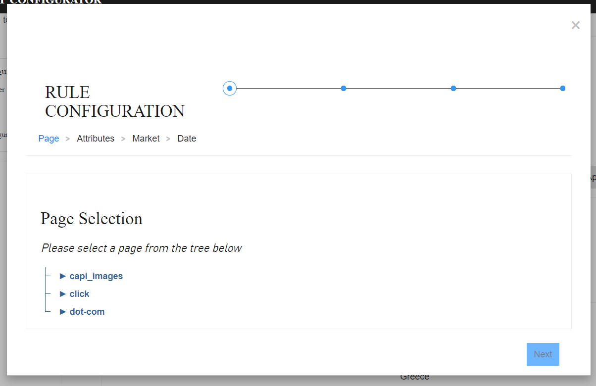
I have implemented this four-step wizard.

┌───────────┬───────────┬───────────┬───────────┐  
│         X │         X │         X │         X │  
│           │           │           │           │
│      Next │ Back Next │ Back Next │ Back Save │  
└───────────┴───────────┴───────────┴───────────┘  

The Next/Save button is disabled until user takes an action.
X in top right corner closes the modal.

Now a task description has changed and it is now required to implement a Back button on the first page that discards and closes the wizard. I am no UX engineer, but I don't feel it's right.

My thinking behind this is that:

  1. Back button should be bound to the context, that is to navigate between the steps and steps only.
  2. If I am on last page and I want to get quickly to first page, I could mistakenly press the back button four times that would cause me to lose the data entered.
  3. I already have a close button and I should not duplicate functionality.

Could a UX engineer explain what is right and the thinking behind this in correct UX PRO terms?

enter image description here

2 Answers 2

3

Design is communication, and good design meets expectations

And landing on the first screen (having clicked to initiate the wizard) and seeing a screen with only a next button communicates "Yes, you are on the first step".

Whoever added this to your spec is over-designing.

You have some good reasons for not having a back button the first screen:

  • Communicates the right message with the right semantics. 'Back' means "Go back one step", and only makes sense when there's an actual 'step' to go back to. It's not actually possible to go back from a first step, it's only possible to close or leave the process.
  • Meets the user's expectation. (this is hard to back up without testing and research. It's just anecdotal. First steps just don't have back buttons. I manage an enterprise-scale application, and have analysed many competitors' offerings, and have never seen a multi-step process with a back button on the first step. Also, check out this sample survey from Survey Monkey No 'Prev' button on first step. https://www.surveymonkey.com/r/22XZM8K
  • Assures the user that they have started in the right place, and prevents potentially distracting thoughts like "wait... is this the first step? or did I miss something?"
  • Reduces the potential confusion of having to parse the existence of a 'Back' button in a weird place.
  • Avoids the loss of data by making it difficult to accidentally back out of the process.
  • Reduces complexity by, as you have pointed out, avoiding redundancy in the design.

Stand your ground on this. I can say from experience that it's exactly the kind of unjustified over-design that tries to get pushed into every build, and that inevitably builds and adds up to an overall inferior experience.

0

It is not good to have a back button on the first step of a wizard instead you can keep a cancel button on all steps to exit the wizard at any point.

The main aim of a wizard is to simplify the task and take the burden of decision making off of the users. Here are a few points to keep in mind:

  1. Keep the maximum number of steps within 5.

  2. Clear and concise labels for each step.

  3. Next and Previous buttons to help the user go back and forth the wizard if he wishes to make changes.

  4. Indicate clearly where the user is in the process.

  5. Option to make quick backward navigation within completed steps.

  6. Cancel button on all steps to help the user exit from the wizard at any point.

Sample wizard screen

Reference: Wizards: Definition and Design Recommendations

Your Answer

By clicking “Post Your Answer”, you agree to our terms of service and acknowledge you have read our privacy policy.

Not the answer you're looking for? Browse other questions tagged or ask your own question.