1

I have a ticketing system that has 5 states. A ticket can be in any of these states:

  • Newly asked
  • Waiting for system response
  • Waiting for customer response
  • In progress
  • Closed

I want to create a better UX for my customers through color coding. For example, I want to show closed tickets in light green background so that user can understand that everything is OK.

I searched for color coding for state-machines and ticketing systems, but I couldn't find anything. Do we have a well-established guideline to color code states of a given system? Do we have universally acceptable colors that we can apply on certain states so that most people would understand it out of the box?

4
  • 2
    You might want to also consider in your design the constraints of supporting accessibility, such as colour blind and blind users. There's different rules for mobile devices than for web and software applications. w3.org/WAI/GL/mobile-a11y-tf/MobileTechniques
    – C'est Moi
    Commented Jun 7, 2020 at 9:52
  • thanks, but i want a unique color for both desktop and mobile design Commented Jun 7, 2020 at 10:19
  • 2
    What you want and what your user needs are different. The fact that you are designing for color shows you are completely ignoring accessibility. Perhaps shapes are a better approach than color? Now for state recognition, try some standard patterns like, checkmarks for closed, elipsis for in progress. Then take these states to your users and ask them to identify.
    – Bromox
    Commented Jun 7, 2020 at 14:56
  • @nimaansari is this a user requirement to have unique colour for both desktop and mobile design?
    – Michael Lai
    Commented Jun 7, 2020 at 23:10

1 Answer 1

1

If you look at two of the biggest companies that have built products around issue lifecycle and ticketing workflows, it might help give you some ideas of what you need to think about.

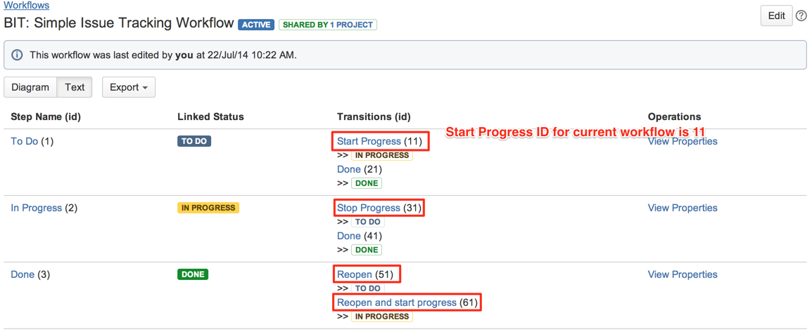
Firstly, if you have a very flexible and complex workflow then I don't think colour is used as a primary way to identify specific statuses. Look at the different Issue statuses available on JIRA and you'll see what I mean. Usually when JIRA is used as a ticketing system it is highly customized to a specific workflow so it is hard to define a colour scheme that is going to work for everyone. But note that by default there are only three colours used in the workflow status:

  • To do (BLUE)
  • In progress (YELLOW)
  • Done (GREEN)

enter image description here

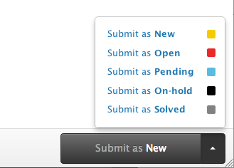
The other example is Zendesk's ticketing system status, which also fall into the three primary categories as is the case for JIRA, but has the additional statuses as follows:

  • New (To do)
  • Open (In progress)
  • Pending (In progress)
  • On-hold (In progress)
  • Solved (Done)

enter image description here

Notice how neither JIRA nor Zendesk use green and red in their colour scheme, so as to be accessible (for colour blindness) for either the agent working on the ticket or the user getting updates on their ticket status.

So I think you could easily adopt one scheme or the other and then test with the users to make sure that it is fit for your purpose.

3
  • Just out of curiosity, how does it look in high contrast mode? Are you able to work with it with a screen reader such as JAWS? You need to need to understand that accessibility is not some frill or option, which can be bunged in later on if someone complains. In most civilized countries, it is the law. Designing a GUI needs to include the constraints of accessibility right from the start.
    – C'est Moi
    Commented Jun 8, 2020 at 21:25
  • @C'estMoi a good point about accessibility, and I am assuming that the designers and developers at JIRA and Zendesk have done a lot of work on this to make sure that it is compliant (or at least are working towards it). The fact that they have considered the choice of colours is a good sign, and that there seem to be good contrast on the existing interface is another sign that there aren't major issues in high contrast mode.
    – Michael Lai
    Commented Jun 8, 2020 at 22:33
  • thanks, it was so helpful Commented Jun 13, 2020 at 15:06

Your Answer

By clicking “Post Your Answer”, you agree to our terms of service and acknowledge you have read our privacy policy.

Not the answer you're looking for? Browse other questions tagged or ask your own question.