2

Recently I updated the style of our admin module of a web app. The buttons were redesigned and new colors were introduced for various states.

In various sections, I have the small question mark icon, that displays the information(about the terminology or help) on hovering.

Now, color of that icon is grey. I kept it deliberately so as not to make it more prominent, bit subdued. enter image description here
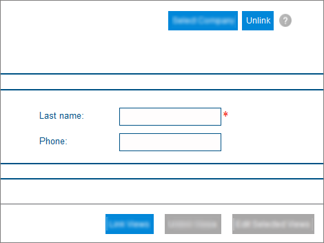
The argument I am getting from some people in my team is that when the help icon is seen in presence of "disabled" buttons, it gives an impression that the "help icon" is disabled too.

Just want to have your opinion if this is true. Your opinions. Should I consider changing the color of icon just for this reason. If no, what are the supporting reasons I can possibly give to make my fellow members understand.

5 Answers 5

6

My short answer is no. Grey does not always represent disabled condition. I think it depends on the usage, context and the colour scheme of your app.

Lets take email sign up popups as a first example. You land on some news website and immediately after the page loads you are presented with a popup with couple of inputs and usually two buttons, Cancel and Sign up. Sign Up button is bright green screaming across the whole page. Cancel is usually grey, somehow faded or even not represented as a button at all. It takes users a while to find it but they still know the button is active (or at least they try to click it).

Another good example is an iOS app. Apple's HIG suggests that all clickable or rather tappable buttons/labels/icons should share the same colour. Fair enough. Users are used to it. It is a well established pattern. So if you have an app that uses blue colour for buttons, users expect that everything that is clickable will be blue. Thus presenting another clickable element in grey will result in users thinking that indeed the button is disabled.

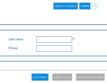
In your case I would link analytics to it and see how it performs. If you find your users not using the button, your app might be just well designed :] Or you can try changing the colour like in the image below. Blue colour suggests the button is still clickable but the outline icon is not taking a lot of focus (which is something you want from a help button).

enter image description here

1
  • sounds good. But it all comes to user's perception in presence of disabled buttons.
    – Praasshant
    Commented May 28, 2015 at 7:15
3

Grey is a convention, not a rule


It helps to understand why grey is used for disabled buttons:

  • Grey is a neutral color so it's good for communicating subtle or de-emphasized elements.
  • Disabled buttons (because they are not clickable) are usually communicated to the user via de-emphasis. The visual message is:
    • "I am a button (look at my shape) but I cannot be clicked (I'm visually de-emphasized)

Visual de-emphasis can be accomplished in a few different ways:

  • Reduce contrast between the button and the page (i.e. subtle background)
  • Reduce contrast between the font and the button (i.e. subtle font)
  • Use italics or thinner font compared to other buttons (i.e. subtle font)
  • Remove shadow or embossing compared to other buttons (i.e. remove interactive cue)

One you understand the design logic above, you can follow it to create all kinds of disabled buttons that can communicate effectively. Some examples:

enter image description here

2
  • +1 for a very complete answer. Although I don't remember an example where the 'Use italics or thinner font ' is applied, is that really in use somewhere? Commented May 28, 2015 at 18:26
  • 1
    hi @rewobs I haven't seen the italic disabled for a long time too. with flat and material design it seems like color and shading have become the primary indicators of disablement. I also remember the days when people were using embossed fonts on buttons too!
    – tohster
    Commented May 29, 2015 at 16:21
1

You might want to have a look at a related UXSE question. It is okay to use grey for non disabled things, provided there is no conflict on page.

Currently your grey color is overloaded by two meanings. On buttons it acts as a disabled state, on icon is not the case. This reduces affordance and users would definitely frown upon it.

The top answers in the linked questions should give you more insight about how you can go ahead with this problem.

1
  • Yes I get your point. But, reason I kept in subtle grey color is that when user hovers on it some info will be displayed. For example, when you start answering here on UXSE, you see a similar help button in grey. Does that loses on affordance?
    – Praasshant
    Commented May 28, 2015 at 7:12
0

I agree with the points made above. The visual association of a disabled button depends on the context of other buttons and styling. In the same way that red and green to do not always mean negative and positive, grey can mean anything you give it providing there is context enough for a user to understand what active looks like.

0

Nothing ever always represents anything... man.

But seriously, those buttons look disabled. Don't waste your time running a test, just use another color. White buttons with a blue outline would probably look fine.

1
  • Yes buttons are disabled. But my question is that if the help icon too looks disabled just because its surrounded by disabled bittons and grey in color.
    – Praasshant
    Commented May 28, 2015 at 17:37

Your Answer

By clicking “Post Your Answer”, you agree to our terms of service and acknowledge you have read our privacy policy.

Not the answer you're looking for? Browse other questions tagged or ask your own question.