6

I'm writing an app with platform UWP-Windows 10-1903(Universal Windows), for making electric circuits, designs and simulations. User makes a design on screen with resistors, generators, etc, and run simulations in time and frequency domain. It is intended for professional use, and non-free.

Target devices are Desktop (keyboard + mouse) and Tablet (finger touch). It could be nice to add Phone option, but it couldn't be possible because Windows Phone died.

I did choose the develop with UWP platform because the Store helps much with the infraestructure for selling the app. Multi device paradigm is also attractive, user could work hard in the desktop, and then check a couple things in tablet mode when he or she is drinking a beer in the bar.

That said, i'm trying to design the commanding pattern.

App will have at least 50 commands, grouped in 10 menus. Remember, app is meant to be pro, and there are many tools and dialogs for helping the user to make his or her design. The app is charged with knowledge in electronics.

(for displaying the data, i don't use page navigation, I use the SyncFusion Window docking manager, because there could be many windows with data, curves and circuits. To navigate back and forth all time could be annoying)

Possible approaches for commanding are:

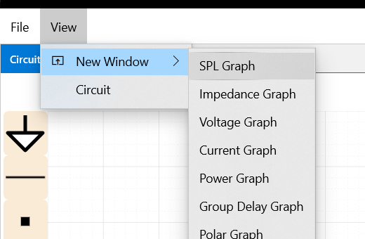
  1. "Classic like win32" MenuBar, with icon+text for menuitems. That includes the file menu. Classic menu like win32
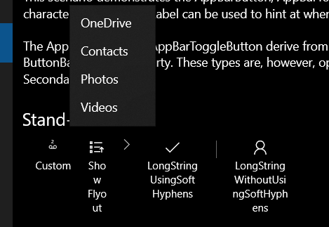
  2. UWP CommandBar at top, with icons, and menu flyouts. Seems nice and attractive. UWP CommandBar
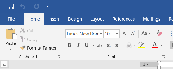
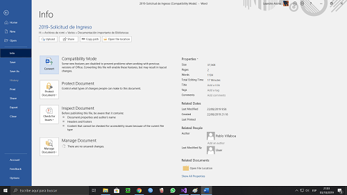
  3. Ribbon menu bar, and Backstage view (for file commands menu). Like MS Office 2016, 2019.., etc

    Office ribbon menu Backstage view full screen

My question is, which approach should I choose? and why?, i'm like hesitant.

I saw many examples of different Windows and UWP apps. But there isn't a consistency, and each app seems to follow its own preference.

Examples:

  • Paint 3D: has a top command bar, but with Backstage View for "file menu" commmands.
  • Win10-1903 Classic Paint: Has a Ribbon bar for Home and View Command groups, but with no Backstage View, just a classic file menu at top-left.
  • Office 2019: Full Ribbon menu, with Backstage View for "old file menu". Settings command in backstage view
  • Microsoft Edge: Has a top command bar, but with the majority of commands grouped as secondary commands, that pops out like a flyout menu with the ... button.
  • Win10-1903 3D viewer app: Has a UWP menu-bar (icon+text items), but the file commands are in a simple menu in classic format! (what happened with the backstage view??), another weird thing, the settings (gear icon) command is in the Help menu, not in the file menu.
  • (Store) DrawingBoard-Pro: Has top command bar, but file commands are in a bottom command bar.
  • Windows BuildCast UWP Sample: Navigation pattern with hamburger icon at top-left corner, almost no commanding. Settings command at the bottom of the nav pane.
  • Win10-1903 Video Editor: Has top command bar with a few primary and another few secondary commands. nice example.

All of those different and inconsistent examples gave me doubts about what to do. What approach should I use for my app? for instance, should I put a Backstage view?

Following, I add a side question, a thing that concerns me very much. Seems much of apps in the MS-Store are like toys or crappy.., and not oriented for serious work. I mean there are no serious big apps like a CorelDRAW, and AutoCAD, an Adobe Photoshop, and Autodesk Eagle or so. All of those little apps in the Microsoft Store, looks very nice in their UX, but are very limited in their capabilities (and cheap). And UWP apps that have desktop counterparts, are inferior to their dekstop versions.. (VLC player is an example), why all of this?

I mean, in the store, there are many apps like for viewing the human body atlas, apps for consulting the chemical periodic table, apps for checking the physics laws or calcuting resistors for a voltage divider, apps like social networks, apps for listening music, apps for checking weather, watch movies, play games, e-mail, calendar, etc. It's like the usage pattern is open app --> use app --> close app.

But there are almost no app with the classic usage for design pattern, like: new or open file --> user edit his or her design --> save file --> share or send by e-mail, or print in paper. It seems like the apps are no more "file oriented", is that "old fashioned"?

If I'm willing to develop a serious app for making electric/electronic designs, UWP and the MS Store is not best approach or option?, should I develop in WPF?

Thanks in advance, and sorry if I made this extremely long.

1
  • 1
    This is a great question and one I've been pondering myself (I'm working on a similar "pro" app with lots of commands). I think the question about commanding is platform-agnostic and is really about adapting traditional UIs to modern touch devices. I haven't found a great solution yet but will definitely be watching this thread for answers.
    – casablanca
    Commented Oct 6, 2019 at 16:38

1 Answer 1

3

I'm so glad, somebody raises that question. It's Microsoft's fault that you have to write such a long question, because they created that inconsistent mess.

Everything started with Microsoft making cross platform + touch input the top priority for Windows 8 and future Windows releases. That brang us

  • a Windows experience that was consistent with Windows Phone (irrelevant by now)
  • hence a touch friendly UI that is terrible for mouse input
    • On touch friendly UI the UI components are placed further apart which makes sense to hit a target with the finger. However, it increases the distance the mouse pointer has to travel from one UI component to another. Fitts’ law states that it takes more time to hit a target if the target is further away which is the very reason for UWP being terrible for mouse input.
  • an incomplete UWP design guide that works for apps to order pizza/browse maps/consume media, but does not work for serious applications as you mentioned
  • lack of up to date documentation about how to design serious Win32 applications

Consequently, we have a huge inconsistency in UI even among Microsoft applications (Settings app, file explorer, office: Each of them follows a different sometimes undocumented style guide).

I am in the exact same position as you are in right now. So, those are my steps to solve that mess some how as of October 2019.

  • If my app must support primarely touch input or many screen sizes (tablet, desktop, TV, XBox, VR), I clearly use UWP (its framework code + its UI styleguide)
  • If my application is for mouse input only or is a legacy app, I have to live with the documentation Microsoft provides me under the section "Win32"
  • I watch all videos of their build and .NET conferences regarding UI and UWP, because Microsoft is actively working on fixing that mess.
  • I try to find serious showcase apps (which is the hardest part). I'd like to add to your list
  • I try to fill the gaps of the incomplete UWP styleguide with other style guides

Bottom line: UWP is still a multi platform touch oriented framework that is terrible to use for mouse input. Microsoft Office not implementing UWP is the best example that UWP fails for desktop. Maybe on build2020 Microsoft drops UWP and proposes an all new desktop framework? We will see... Personally, I'd wait for build2020 if that is an option for you.

Specific to your app:

  • Congratulations, you are one of the few that want to integrate both touch and mouse input. UWP should be the best matching framework for you... But as we go deeper we see UWP was designed to consume data ;(
  • Your "Classic like win32" MenuBar screenshot shows many items. On a mouse pointer focussed UI they are best organized in a ribbon.
  • Make a market research on how your app is going to be used. How many people actually use windows touch enabled devices?

    • If the answer is "90% mouse input"

      • Make sure to follow Fitt's law! The UWP ribbon control I just proposed above certainly performs weaker compared to the Office ribbon we know since Office 2007. Reason: The UWP ribbon has just one line of icons. It doesn't group them as nicely as the old ribbon does.
      • Maybe drop the requirement for touch input?
      • Maybe Android or iOS is the more serious platform for touch?
    • If the answer is 50/50: You've got to code two UIs. Sorry...

2
  • thank you for taking your time in making a detailed reply. :D . I think the most prudent decision is taking a time with the UI design, because probably Microsoft is in a some kind of transitional stage, perhaps UWP isn't dead, but what is dead is their multidevice platform paradigm, they failed with Windows Phone, that is one less usage stage for UWP. so they focused on desktop, but then the people even disliked UWP for desktop apps! so they clearly failed, and they are all still working on fixing everything. as for now i'll focus on code the functionalities and leave UI for later. Thank you! Commented Oct 7, 2019 at 19:44
  • Deutschland über alles :D Commented Oct 7, 2019 at 19:45

Your Answer

By clicking “Post Your Answer”, you agree to our terms of service and acknowledge you have read our privacy policy.

Not the answer you're looking for? Browse other questions tagged or ask your own question.