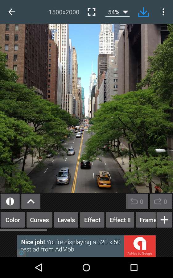
I am currently developing a windows 10 Universal application, that can run on both mobile and desktop systems. It inherited a large code base and quite big number of features from a WP8.1 app, and alongside W10, new features are coming every month or so.
My current problem that has been the ever increasing number of features that have to be visible to the user. Here's some of the alternatives available:
Hamburger menu
The top left/top right positioning is never going to please everybody. Either left handed users or right handed users have to be sacrificed (shockingly, it is the right handed user that is usually scarified in most hamburger implementations).
It feels like it doesn't really belong on the desktop, as much as Microsoft is pushing it everywhere. It is an extra click that shouldn't be there to get to what you need.
It scales really bad with large amount of commands. If you have like 6+, on mobile you already have to scroll, which again, extra command for the user.
People aren't really used to it, and sometimes won't see it. Many articles on the web describe the problem.
Menu bars
These ones scale nicely on desktop, and somewhat OK on mobile, and it is what the application currently uses. However, at some point, there will inevitably be some nesting of features. There can only be so much to put in a menu.
On mobile, you can only out so much items in the menu until it goes outside the screen.
App / command bars
These are similar to the ribbon, but they support only a limited number of commands, and no easy way to achieve tabs.
They feel alien on desktop.
So here comes the ribbon...
Pros: It is somewhat familiar to most desktop users and will fit nicely there, as many productivity tools are adopting it, including windows explorer.
Provides much more space for upfront presentation of items.
Items are easier to discover and grouped in logical groups.
Can provide contextual commands.
Cons: Eats space on mobile, so there has to be some way of folding it when it is not needed. Number of visible commands is still somewhat limited on mobile, but it is much bigger than all the other solutions, and, surprisingly, the most space efficient. I can easily manage to fit 12 commands in a 2x6 grid, and I can go as far as 18 with 3x6.
Not really something that you would expect to see on a mobile phone. Some users will be curious about it.
I have yet to see an application actually implement a ribbon on mobile. Would this kind of UI be appropriate for such devices? Are there other alternatives that would fit well on both types of devices?

