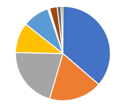
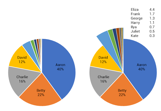
How do you solve the problem of pie charts always having the possibility of really low values (like 0.1% or 1%) and thus really small slices. It becomes especially problematic when you want to show % labels on top of the slice.
-
3Pie Charts Are The Worst Chart In The World - businessinsider.com/pie-charts-are-the-worst-2013-6– Nicholas PappasCommented Jul 19, 2019 at 23:43
-
1How about listing all the small ones as "others" and then show these others in a <li> below– user124151Commented Jul 20, 2019 at 2:41
-
Hi @Apoorva, thanks for your contribution to UXSE. To help work out the design constraints, would you be able to provide some details around the level of interaction that the chart can have, and the potential number of really small slices that you have to display (even if it is the whole chart, in which case you might have to consider not using a pie chart).– Michael Lai ♦Commented Jul 23, 2019 at 2:39
-
show these others in a <li> below or in a 2nd pie chart ;-)– TaWCommented Aug 3, 2019 at 18:40
2 Answers
Maybe pie charts are not the proper solution.
But if you insist on them then perhaps "pulling out" a section onClick would be the answer.
Have it so your rollovers highlight which pie section the user is hovering over. When the user gets to the small slices they're all grouped together. Selecting that group would display a larger, more readily understandable, section.
EDIT: Each chart has it's advantages and disadvantages. Pie Charts are good for showing that "these" sections are large (therefore important or worthy of notice) and "these" sections are small/inconsequential. The only time the "inconsequential" slivers are important is when it's counter-to-expectation.
If you're concerned about comparing numerical values then perhaps a pie chart isn't the best solution.
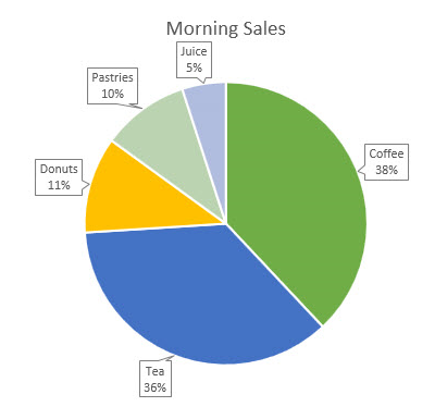
There are numerous ways to make pie charts and their labels visually appealing: DarrylGodden displays one in his post. So, you can easily improve on the visual representation but the pie chart problem remains.
-
Yeah, the hover solution seems doable. How would you solve for labels on such small slices without hover? Having a legend away from the pie chart makes very little sense IMO. Commented Aug 6, 2019 at 15:08
-
1@ApoorvaSavant - Depending upon the number of slices you may not be able to.– MayoCommented Aug 6, 2019 at 15:51
-
Showing them all together still gives space problems. Use a hover or click instead to show the callouts on demand if there is still a space issue.– drumkrukCommented Jul 19, 2019 at 13:20
-
Space and clarity issue can be resolved with a good design on the call-out-tail. Such as stacking the labels in a neat column and giving them an L pointer to their respective Slice. Further data breakout can be done with a key to the side [with visual highlight on hover/tap/click. Interact with the key, animate the pie chart's relating component.] Commented Jul 19, 2019 at 22:06


