7

I'm reworking an existing module which graphs results from a live survey with several different question types. I discovered that the results of matrix-type ranking questions are graphed as a single pie chart (apparently representing the proportion of first-rank votes for each item, ignoring the rest of the data).

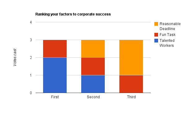
Considering different ways of representing these data in a more complete way, I considered generating a multiple column chart, either side-by-side or stacked. While I decided on stacked, I'm somewhat torn between grouping the data by item or by rank. Here's an example data set I concocted (n = 3):

For tajmo, codeinthehole, Sure! Here's (a new) mock data table used to generate all of the charts (which have been re-done) showing number of votes received for each element:

            Talented Workers        Fun Task        Reasonable Deadline
First       2                       1               0
Second      1                       1               1
Third       0                       1               2

In this mock example, three participants vote to rank (by a ordering a series of draggable rows) their 'factors to corporate success' from among: having a talented workforce, having fun tasks to accomplish and being given reasonable deadlines. In this example, 2 people ranked "having talented workers" as their first choice, while no people ranked "having a reasonable deadline" as their first choice.

I have re-made the three graphs with this new data set (which is why they differ from previous versions of this question).

As I mention above, the first version of this module presented only the pie chart, showing the proportion of first-rank votes each item received.

I am tasked simply with "providing more information, probably in the form of bar charts" from these data.

My question centred around the best way to display this "more information". Since I chose to use a stacked bar chart, I'm left with the problem of grouping: is it conventional to group the data into:

  1. Bars of rank segmenting them by item; or
  2. Bars of item, segmenting by rank.

Grouped by item Grouping success factors by item
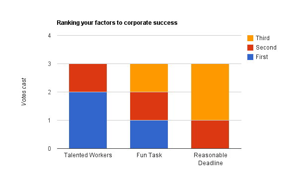
Grouped by rank Grouping success factors by rank

The original first-rank pie chart was presumably implemented to focus attention on the proportion of votes cast for highest-ranked item. While there is a desire to provide more complete information, that original idea is still relevant. I believe the second graph, grouping by rank, best shows this trend.

What do you all think? Should I even consider a different graph type?

(While the possibility exists that the survey designer may provide a nearly unlimited number of items, they are practically limited to 6.)

As per dnbrv's request, here's a mock-up of what the current pie chart would look like. I believe the previously implemented charting function was done quickly, which is why it's functionality is limited, and not that they simply only care about the top ranked item. As in the first data set, this chart only plots the number of first-rank votes each item received (in a population of 3).
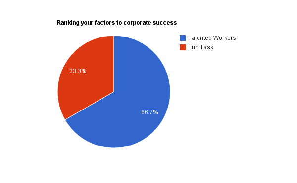
Ranking success factors pie chart

I imagined the answer to the question would be rather straightforward, which is why I didn't bother including the data table (especially as it's mock data anyway) or going into great detail about the surveying procedure. I hope these additions, and more clearly-labelled charts will help.

6
  • Can you post the original pie-chart for comparison?
    – dnbrv
    Commented Jan 5, 2012 at 19:09
  • @dnbrv Done. Please note that these are mock-ups, since I don't have the ability to publish actual data sets (as they are private and not mine). Sorry for the limitation!
    – msanford
    Commented Jan 5, 2012 at 19:26
  • 1
    I can't make heads or tails of your data as it is. Could you show us what the survey looks like?
    – Taj Moore
    Commented Jan 5, 2012 at 20:40
  • I'm assuming that each respondent can has a certain number of 'votes' that they can distribute between a set of answers according to their strength of preference. Is this correct? Commented Jan 5, 2012 at 20:53
  • 1
    Thanks for the update. I needed to understand the data collection methodology in order to know what you were really trying to represent. I posted my answer below. I strongly recommend against the sort of bar graph you have because it obscures the relative size of things when they don't appear side-by-side.
    – Taj Moore
    Commented Jan 6, 2012 at 18:16

5 Answers 5

6

The fundamental question to answer is "what is the rank of choices?" The secondary question is "how were these ranked?". And it sounds like your primary task is to show meaningful information, while and your secondary task is to provide context with data.

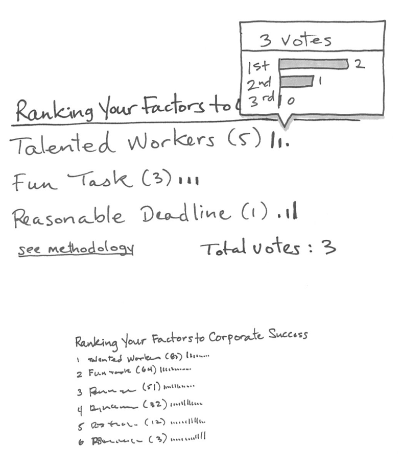
To answer the first question, you need to actually rank the results; that is implied in the title (although not explicit), but I don't see overall rank in any examples. Assign point values, like "1st = 2pts, 2nd = 1pt, and 3rd = 0pts. That yields an actual rank and scoring as follows:

  1. Talented Workers (5)
  2. Fun Task (3)
  3. Reasonable Deadline (1)

That right there is pretty meaningful and easy to understand. You could call it a day at this point, but you still need to provide context.

How were votes distributed? Show the ratio. Since the number of people voting (a scalar value) is universal to each answer, you do not need to include it in each data point: just say it once at the top or bottom. If the vote distribution is simple enough or doesn't need to be precise, I recommend sparklines. If you need to provide more context or precision, a rollover popup can do that.

Drawing 1: details
In this case the rank is obvious, you don't need to include numbers. (Avoid chart junk by leaving out any extraneous information.)

Note that methodology is just a link, since it's relevant to only a subset of users. I recommend making that a rollover popup if it's short copy.

Drawing 2: bird's eye view
This illustrates a larger set of results and how they might look with the ranking numbers included, and longer sparklines to represent more data points.

Ranking Display of Information

3
  • 2
    I love this answer tajmo! You've provided me with not only a wealth of information but a lot to think about for future projects. (I'm still getting my feet wet with real UX design and spend a lot of time reading this forum; this was my first question.) Thank you! PS. I've checked out your other posts on prototyping and sketching, I think I might pass by Staples and pick up some Sharpies on the way home ;)
    – msanford
    Commented Jan 6, 2012 at 19:19
  • 1
    Nice to know I have recruited a new sketcher! If you deal with information design a lot, I recommend the one-day workshop with Edward Tufte. It's pricey, but you get a whole library of his books. That really shaped how I think about stats reporting and the usefulness of data.
    – Taj Moore
    Commented Jan 6, 2012 at 19:52
  • 2
    More on sketching for UX here: ux.stackexchange.com/a/14818/4695
    – Taj Moore
    Commented Jan 9, 2012 at 20:05
6

Personally I find a stacked bar chart confusing to read; I think part of the problem is that you're trying to display the results of two variables.

To solve this:

  1. You could produce a separate chart for each rank.
  2. You could produce a three dimensional bar chart, with (question /ranking on the planar axes and number of respondent on the y axis)
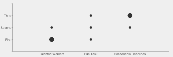
  3. You could use a 'punch chart /scatterplot' type graph to display the data:

Punchcard / Scatterplot Chart

An example of the third type of visualisation has been included below. This would be my preference.

I created the chart using the Google Chart API:

Enter discription

Chart code detailed below:

https://chart.googleapis.com/chart?chs=600x200&chds=-1,3,-1,3,0,3&chf=bg,s,efefef&chd=t:0,1,2,0,1,2,0,1,2|0,0,0,1,1,1,2,2,2|2,1,0,1,1,1,0,1,2&chxt=x,y&chm=o,333333,1,-1,25&chxl=0:||Talented%20Workers|Fun%20Task|Reasonable%20Deadlines||1:||First|Second|Third|&cht=s

Rapheal.js can be used to provide a nice interactive version of this chart type:

http://raphaeljs.com/github/dots.html

2
  • Thank you for this suggestion. I hadn't considered this type of weighted scatterplot. You may have noticed that I used Google's new(ish) Visualization API to produce my original charts; thanks for including your code, as well.
    – msanford
    Commented Jan 6, 2012 at 17:03
  • updated link for Raphael if anyone is interested: github.com/DmitryBaranovskiy/raphael
    – Adam
    Commented Jul 27, 2017 at 21:55
1

It all depends on how the data needs to be compared.

If the goal is to compare answer distribution among categories, then bar or column charts are the best way to go as they take up the least space while showing all categories & answers in one graph. However, grouping should be done by the category and the graph should show the distribution of answers because cognitively it is easier to associate the color bands with rankings rather than with categories. (Test this yourself by trying to read the second graph in the OP and notice how much you'll be going back to the legend.)

If the goal is to rank categories, then the best way is to calculate the average weight of each category (e.g. Talent (1 × 1 + 2 × 2) ÷ 3 = 1.667) and either showing it in numbers or plotting it on column chart.

Showing a pie chart with just the distribution of categories among one rank has little analytical value. It doesn't allow for comparison of answer distribution within a category and doesn't provide an easy way to see the top choices (i.e. in column or bar charts you can ballpark the top choice by comparing the bands of top rankings vs bands of lower rankings).

1
  • Thanks @dnbrv: Your last paragraph is exactly my rationale behind changing it in the first place! My intuition told me that grouping by item was a better idea.
    – msanford
    Commented Jan 5, 2012 at 20:46
1

I like a 3-D columnar chart. The ranks are represented as rows and the tallies of responses are represented by height. I tried to post an image of an Excel graph, but I'm new and not allowed to post images.

0

Looks like you already got your answer, so I'll just say that I tried reproducing your data in various forms. I definitely agree that the stacked chart works best overall, and the first one is easiest to comprehend with the rankings identified by colour vs on the axis.

Your Answer

By clicking “Post Your Answer”, you agree to our terms of service and acknowledge you have read our privacy policy.

Not the answer you're looking for? Browse other questions tagged or ask your own question.