Has anyone done any user testing they could share about padlock or shield icons on payments screens and which is perceived as most secure?
2 Answers
Google and UC Berkeley tested different solutions to understand users perception of HTTPS in the browser. While this is not specifically geared to a payment page, their paper contains some strong insights when it comes to choosing an icon to signify security online.
Here's what they said specifically about the icons used in the survey:
The shield and lock consistently performed well across all colors, which suggests that either shape should be meaningful to people who are colorblind. We break the tie by considering that many browser users have already been taught to look for locks...
Source (pdf): Rethinking Connection Security Indicators
The lock icon seems to be favoured by Chrome devs when it comes to signifying a secure connection with a website due to the ubiquity of its usage for over a decade.
One caveat however is this was not testing for placement in a UI so take care where it is positioned as this could affect your results. The designers I have worked with favour padlocks on each button in the checkout journey because they reinforce the feeling of security at the moment information is "sent" by the browser, ie. when customer taps/clicks the Pay button but placement would be a good thing to test on your own site.
If you need a lock icon Google shared one as part of the material design system icons.
Baymard has done a number of studies on the subject of perceived webpage security, summarized in this article. Some key points:
Throughout all of our testing of checkout processes, we’ve consistently observed 2 important user behaviors relating to security:
- Depending on the design, users perceive some parts of a page to be more secure than other parts of the same page.
- The average user’s perception of a site’s security is largely determined by their “gut feeling”, which – beyond how much they trust the brand – is to a large extent observed to be directed by how visually secure the page looks.
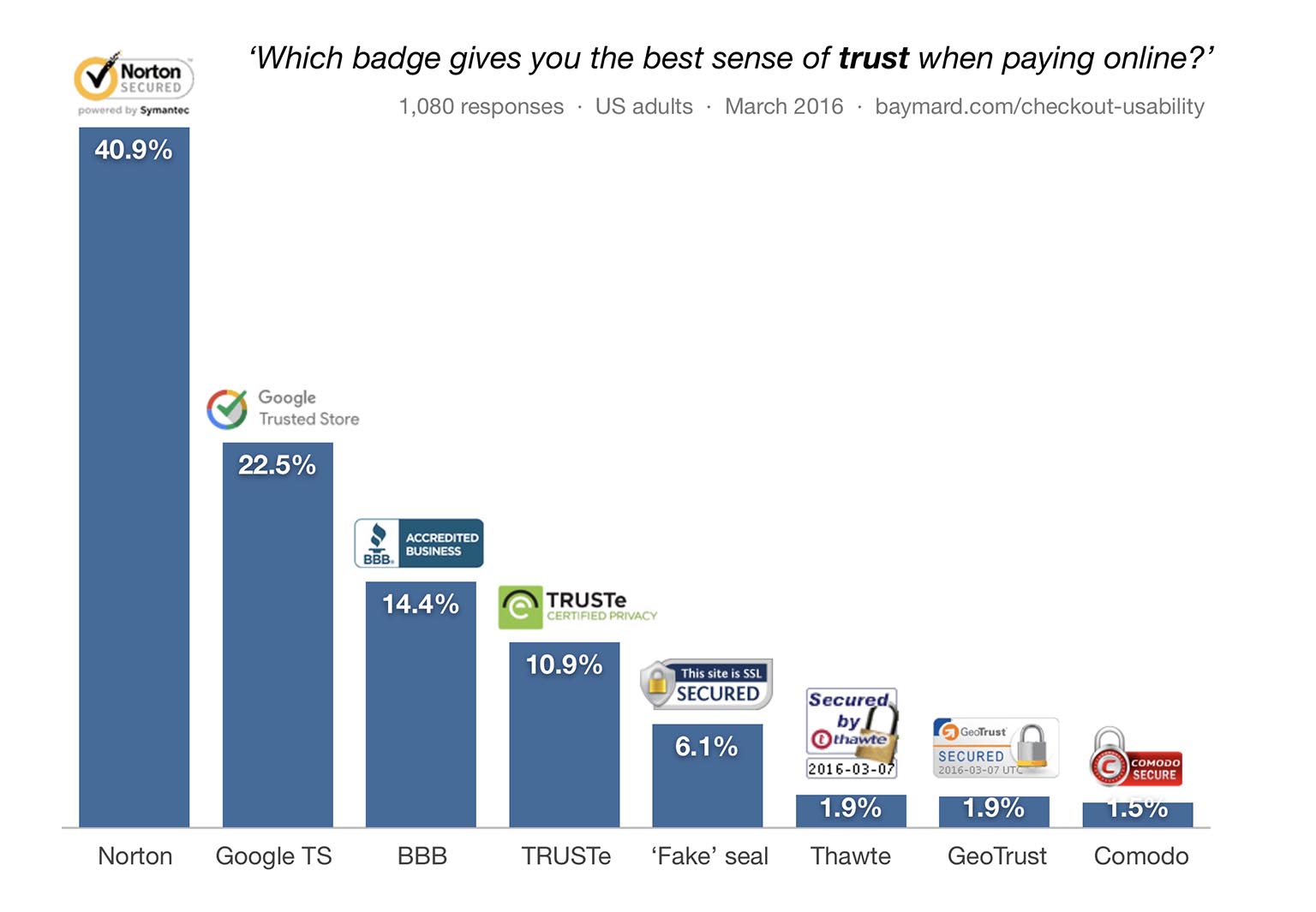
Regarding which seals users trust most, here are the results of a 2016 survey cited in the above article.
-
2Makes sense ... the busier and worse-looking logots are at the end (is that a gradient?) Commented Feb 4, 2019 at 22:40
-
5I love the fact that they threw in a fake one and it got 3-4x more votes than the largest SSL companies... Commented Feb 5, 2019 at 7:56
-
2Just wanted to highlight "it’s very interesting to note that the seals from well-known consumer-facing brands, like Norton and Google, perform very well." (from the linked article) To a certain extent, this is "trust through familiarity" and the most commonly seen trust icons will be viewed as the most trustworthy. (Search google scholar for keywords like "advertising trust through familiarity" for further reading)– tolosCommented Feb 5, 2019 at 14:07
-
3Shame - it should be 0% for all of them, because someone telling you "we are endorsed by <X>" means absolutely nothing and obviously the unsecure miscreants are the ones who are going to mislead you. Sad times! Commented Feb 5, 2019 at 16:25


ssl.example.orgstyle sub-domains (as opposed towww) for these. IIRC ebay did it in the mid 2000s, and some others as well. I have not seen any research, but I've worked at a large e-com company that did that too, and explained it with copying from even bigger companies, because if they thought it was right it must be.