8

I'm designing a touch screen user interface to control a physical robot. The interface also includes physical buttons, similar to how a cell phone has touch screen elements and physical home buttons, but this is a custom device.

For safety reasons, only the physical buttons can be used to cause a motion on the robot. On-screen touchable elements are only for UI navigation and parameter changes.

I want to know a good way to direct the user to press the physical buttons, instead of pressing the area on screen where the text prompt is.

My design is limited to static elements only, so no animations can be displayed that might show a finger pressing the button or anything like that.


Here is my concept at an on-screen element that prompts the user to use the physical buttons for robot motion. In this example there are 3 physical buttons that can cause robot motion: a left arrow, a check, and a right arrow button (all placed to the right of the screen). In the current state of the robot, only the right arrow does anything, so the other buttons are grayed out. Pressing the space on-screen does nothing. The orange of the arrow matches the orange color of the physical button.

Example of UI element

Here is what that element would look like if the user held the physical right button to take the robot into the next state:

Example of UI element In this state, both the right and left physical buttons will cause motion.

Here is an idea of what the handheld device will look like. I've superimposed an idea of what the UI could look like. In this prototype, the physical buttons don't have the arrow icons or the color of the finished buttons. I also don't have control of the individual LEDs behind the buttons, so I can't flash them or anything. Prototype UI
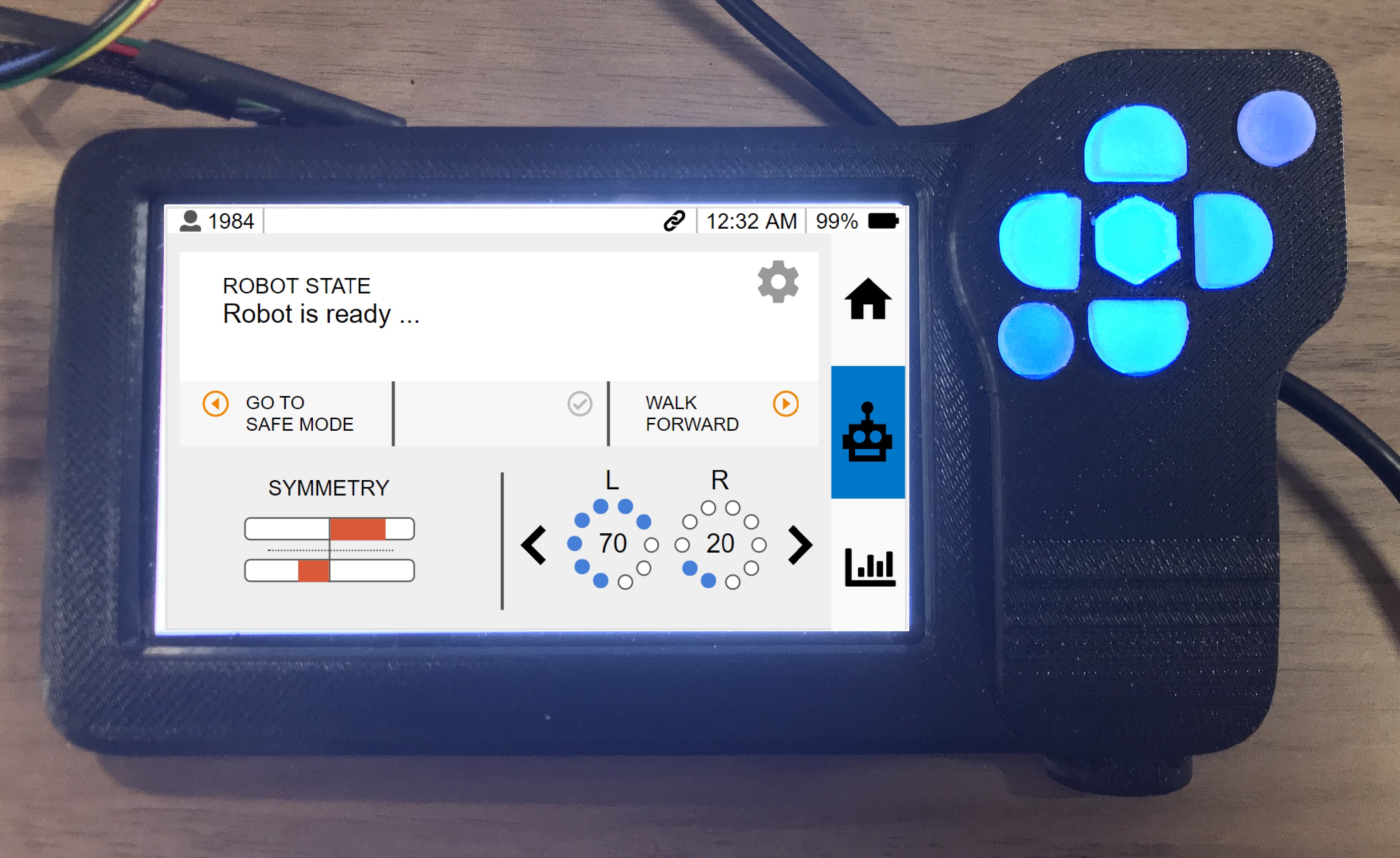

In initial testing, a new user initially tried to press the on-screen text space before I directed them to use the physical buttons. From that point on, the user did not seem to have a problem using the physical buttons. I worry that this will be a source of frustration for new users who are unfamiliar with the user interface.

3
  • Interesting question. Do you have an image of what your physical controller looks like? It might be quite helpful to be able to see at least a sketch of it. Commented Sep 11, 2018 at 21:44
  • @maxathousand I've updated it with a photo of the concept.
    – jekso
    Commented Sep 11, 2018 at 22:16
  • +1 Thanks for your contribution to UXSE! I always like interesting questions and this is certainly one of them - keep them coming :)
    – Michael Lai
    Commented Sep 12, 2018 at 22:26

2 Answers 2

5

I would use a miniature of the control pad in the UI, showing which button to use by highlighting and animating it in the miniature.

Displaying the entire control pad, rather than only the one button will allow the user to locate it more quickly and avoid any possible confusion. Otherwise, it would be difficult to differentiate the upper right and bottom left circular buttons: they have the same shape and color, their location is the only visual difference.

1
  • 2
    Possibly, if display space is at a premium, you could display the "image of the control pad" only when the user tries to use the "on-screen text space" instead of the physical button.
    – TripeHound
    Commented Sep 12, 2018 at 8:08
4

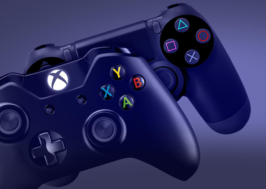
Consider adding unique icons or labels to your physical buttons (ideally with colour coding), as video game consoles do:

A photo of an Xbox One and a PlayStation 4 controller, showing their face buttons with prominent, colour-coded icons on each
Photo from BGR.com

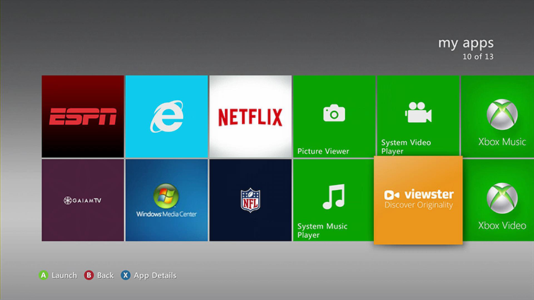
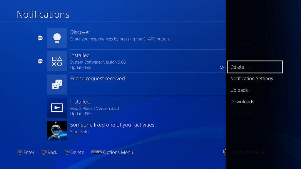
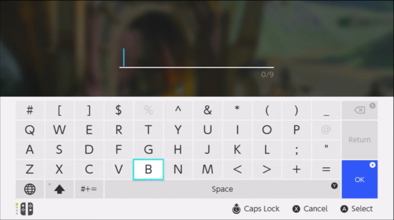
Then you can lean on some of the conventions that video game designers have used for some time (see the bottom of each interface):

Xbox 360 dashboard interface showing button icons in the corner
Playstation 4 interact showing button icons in the corner
Nintendo Switch keyboard interface showing button icons along the bottom

2
  • While I like the idea of making each button unique, I'm not sure the video game UI is the best example. That was never meant to be a touchscreen, so you kind of have to use the handheld buttons (I might be wrong on this, I haven't used a game console in a while). But this is a good example of one way designers have dealt with this problem. Thanks!
    – jekso
    Commented Sep 12, 2018 at 15:42
  • @jekso That’s a fair point, although I think combining this kind of UI with an on-screen message if users try to touch the actions instead would probably work well.
    – Kit Grose
    Commented Sep 12, 2018 at 21:06

Your Answer

By clicking “Post Your Answer”, you agree to our terms of service and acknowledge you have read our privacy policy.

Not the answer you're looking for? Browse other questions tagged or ask your own question.