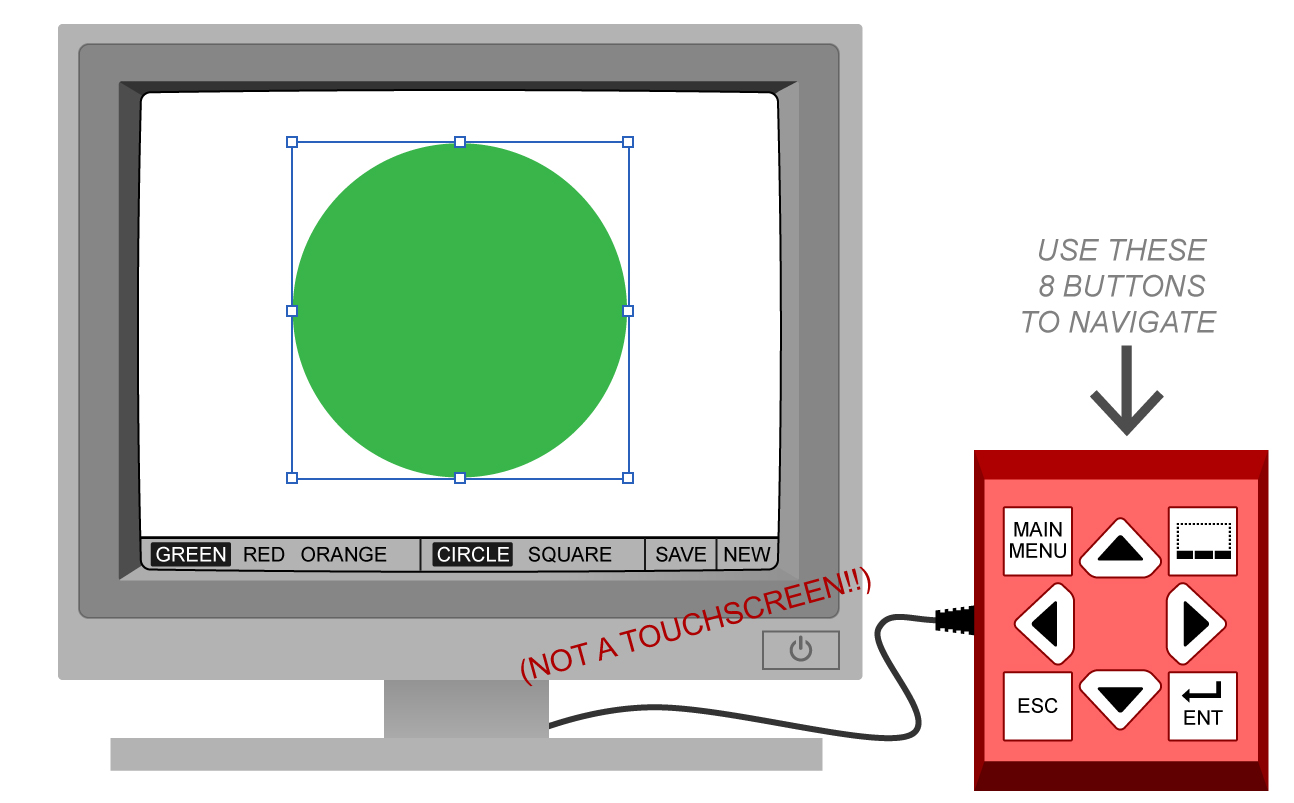
Currently my team and I are working on an interface where the user interacts with navigation buttons on the side of the screen.
After conducting several usability tests, we are running into the problem of getting the users to correctly associate the top right navigation button with toggling the sub menu below.
In this image, they would press the top right button (placement is non-negotiable due to people who are paid more) to access the bar at the bottom of the screen.

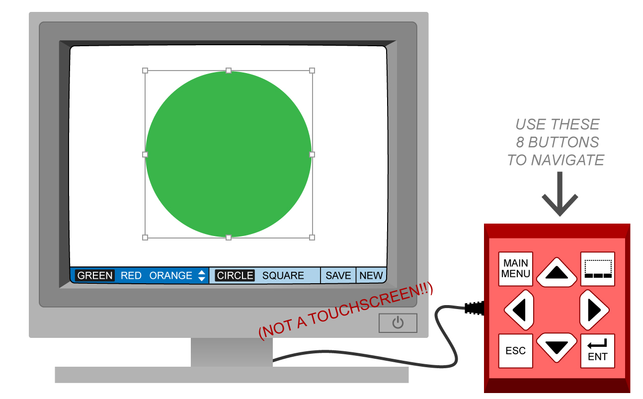
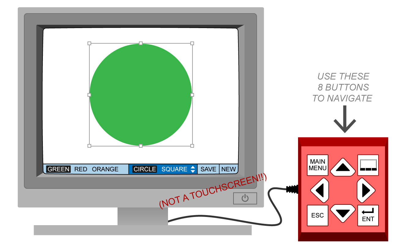
Once they access the sub menu, it becomes highlighted and they are able to navigate using the arrow buttons.
Arrow button right would make the interface look like this:
We've tried several icons, including an ellipses, "SUB MENU," a generic home icon, and the icon shown below. Despite the variation, all of these buttons lead to confusion with our users.
I understand that learning effects will likely render whatever icon we use as a non-issue, but we want to effectively communicate how to access this menu the first time.
Are there any standards for this type of situation? What would be the best way to convey this to our users?


