0

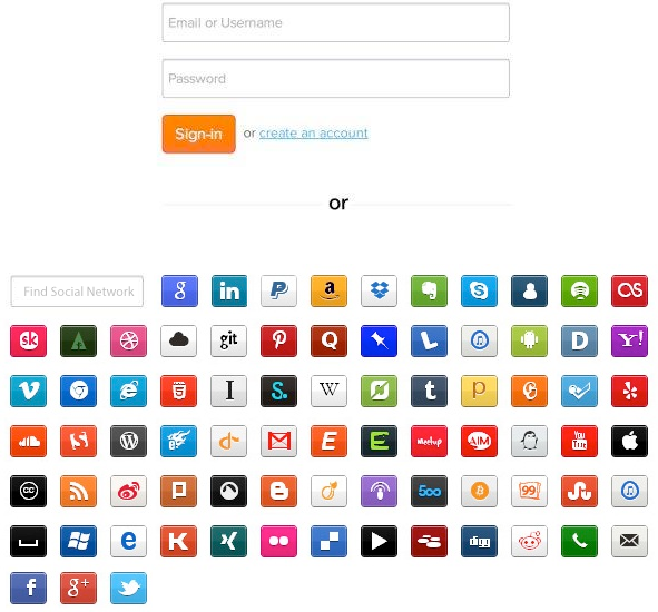
We're planning to redesign the signup procedures on our landing page at my company. We want to add options for users to register with their credentials or using OAuth buttons. The problem is a big quantity (about 20) of these buttons.

I think that it is a bad idea to add a lot of buttons. The 3-4 popular systems are enough.

Is there any study about big quantity of sign up buttons? Is there any other examples of using this kind of sign up pages?

0

2 Answers 2

4

The stack exchange login dialog shows the most common options by default, and then has a "more login options" link which will show you the full plethora. This seems like a suitable solution to your problem as well.

0

You can add a lot of icons if you position them appropriately and enable filtering. You can add all your social login icons and add a filter search bar to allow users to minimize the choice.

Please see my mock-up bellow (please note this is not what your final version should look like):

enter image description here

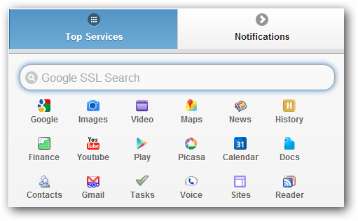
Here is also an example of Google doing something similar:

enter image description here

Your Answer

By clicking “Post Your Answer”, you agree to our terms of service and acknowledge you have read our privacy policy.

Not the answer you're looking for? Browse other questions tagged or ask your own question.