37

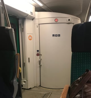
I was traveling by train, and I came across the board toilet in the picture below:

Toilet door with a handle. Next to the door is a button.

Unlike other board toilets I encountered so far, this one had an automatic door. At least this is what I suspected because of the blue button with the red LEDs. It is not visible in the picture, but the blue sign above the button says "Automatic".

However, during my ride I saw probably like five people entering the toilet, and all using the door handle instead of the button. And they struggled a lot to open the door because it was not meant to be opened manually. Actually, the door seems to be broken because of this.

Why is there an (obvious) door handle in the first place?

I can imagine that it is useful to have one in the case the mechanism is broken (like now), but the one presented here literally invites me to pull it without considering alternatives. How can this be done better?

How can the door handle be designed less dominant, or how can the automatic character of the door made more obvious?

I can imagine, that the (still somehow salient) button was ignored because it was close to an exit and some people might associate the button with this other door on the left. These doors have very similar buttons, always open automatically, and this is well-known.

11
  • 6
    I would keep the handle, but since it's not meant for every day usage, i would put it under a cover, you know what i mean? with a sign like, "in case of emergency or malfunction, use the lever." or something like this. That would keep people from using the handle, because they would have to stop and think, before "automatically" go for the handle.
    – Zorkind
    Commented Jan 22, 2018 at 14:24
  • 4
    While I agree with the sentiment, an automatic door without a knob and power isn't even a door. Commented Jan 22, 2018 at 14:47
  • 23
    There's a (common) semantic issue at play: it' not automatic, it's motorised (A shop near me had "automatic door: press button to open"). It may close automatically as there's no close button on the outside. Recessed handles are often used in this sort of case, but obviously not here
    – Chris H
    Commented Jan 22, 2018 at 14:51
  • 3
    A door powered for accessibility concerns would allow the button or manual operation. Many automatic doors in the USA are initiated by a push button (not by a user approaching the door), but opening the door manually is faster and easier if the user is able to do so. The "automatic" label on these doors is a notice that the door may suddenly open apparently on its own.
    – Randall
    Commented Jan 22, 2018 at 20:55
  • 9
    Step 0 of every automation system: provide a manual override.
    – CptEric
    Commented Jan 23, 2018 at 7:57

11 Answers 11

41

This is a classic door design problem. Don Norman, the author of the book "The Design of Everyday Things", is quite vocal about door problem faced by users throughout the world.

Interactive product design should address five basic principles of interaction: Affordances, Signifiers, Mapping, Feedback, and Conceptual Models.

I'll give a brief intro to all five here:

  1. Affordances - "An affordance is a relationship between the properties of an object and the capabilities of the agent that determine just how the object could possibly be used" (Norman, Don. The Design of Everyday Things: Revised and Expanded Edition, p. 11)

  2. Signifiers. - Refers to indications or symbols that convey how to interact.

  3. Mapping - One to one relations. For example, red, and blue buttons on a switchboard illuminate red and blue lights, respectively.

  4. Feedback - Every interaction with a product should provide feedback.

  5. Conceptual Models - Users have a certain mental model of an object. In case of complicated machines, conceptual models of the machine should be aligned with that of the user.

Now you should be able to see where the problem lies: the handle is the most prominent signifier on a door. Users have a preexisting conceptual model of a handle, that it is used to open or close a door. User conceptual model does not match that of the designer here.

I can go even deeper into this concern, but I hope this gives you some direction in understanding the fundamental issue with this door.

Since this door seems to be inside a train, the automatic door cannot be employed due to excessive movement in the train. I could not agree more with Marco, hiding that big handle should resolve user struggle with the door and that handle should only be accessed by staff in case of emergency. A button with light should be accompanied by some text (Signifier) to convey interaction.

Additional information on door interaction: https://99percentinvisible.org/article/norman-doors-dont-know-whether-push-pull-blame-design/

8
  • 1
    I believe affordances are just possible interactions, rather than the communication of the interaction. The signifier communicates the affordance.
    – Anthony
    Commented Jan 22, 2018 at 16:06
  • 1
    My explanations for affordances was off, as you pointed out. Found exact definitons - An affordance is a relationship between the properties of an object and the capabilities of the agent that determine just how the object could possibly be used. Norman, Don. The Design of Everyday Things: Revised and Expanded Edition (p. 11). Basic Books. Kindle Edition. Commented Jan 22, 2018 at 16:30
  • 8
    +1, but as an aside, I find the sentiment "should only be accessed by staff in case of emergency" downright terrifying and I see a real danger to a society embracing it. Especially in an emergency, interfaces should be understandable and accessible to the person(s) most effected by that emergency, not just to a handful of trained persons who are just as fallible as us and who are rarely any more prepared for real shit-hits-the-fan situations than the average layperson (besides a handful pre-scripted ones they've been trained for).
    – mtraceur
    Commented Jan 23, 2018 at 1:54
  • 1
    Thankyou mtraceur . Word "emergency" sounds a little extreme here. I used emergency for a situation where door mechanism (Button) is nonoperational. Commented Jan 23, 2018 at 6:45
  • 1
    The handle is there so the door can be opened if the electricity fails, or the mechanism fails.
    – SnakeDoc
    Commented Jan 23, 2018 at 20:40
16

Question 1: not only for when is broken, but also to CLOSE the door (unless it uses sensors to detect movement inside). Most users will automatically try to close the door and they won’t like a door that takes its time to close, specially when it’s the toilet door.

Question 2: put the electronic button in the handle itself. Its sole presence will transmit an affordance and users will know they will need to use the button. And if the button is broke or you have no electricity.... well, you have the handle

EDIT: Thinking about it, there might be another reason: to help users keep stability in case the train shakes or otherwise creates an unstable experience. Seeing that the handle is on the right and the button on the left (thus allowing users to press button with left hand while grabbing the handle) I think this could be the rationale behind this design

7
  • Thanks for this other point in your answer to Question1. Have not thought about this. Probably the same buttom should work for closing too. Also I assume you meant "I CANNOT even imagine a logical reason to make the toilet door electronic"?
    – M. Winter
    Commented Jan 22, 2018 at 14:54
  • 2
    A big reason to make the toilet door electronic is to make the toilet more easily usable by people with mobility issues: for instance, it's hard enough moving around a train on a wheelchair as it is, without having to try to open/close manual doors at the same time!
    – psmears
    Commented Jan 22, 2018 at 14:57
  • M.Winter yes, you're correct, I edited it. @psmears that is a valid point, but having working A LOT on physical accessibility, I can tell you that button's position is a bit difficult and requires an additional effort, while the handle is way closer for people on wheelchairs. Of course, it all works out for everybody if you put the button on the handle, but still a bit overboard IMHO. A mechanical open/close device would do the same task without the added cognitive load and need for electricity, and it existed on trains for decades
    – Devin
    Commented Jan 22, 2018 at 16:37
  • 2
    @Devin: Yeah: I'm just saying where the motivation for the design likely came from - not that it's an especially good design ;-)
    – psmears
    Commented Jan 22, 2018 at 16:53
  • 1
    Users may want the ability to open a toilet door more quickly than a motor would, for much the same reason as they would want to close it quickly.
    – supercat
    Commented Jan 22, 2018 at 18:46
9

Why is there an (obvious) door handle in the first place?

As already said, it's needed in case of emergency.

How can the door handle be designs less dominant, or how can the automatic character of the door made more obvious?

Not at all. Anything like hiding the handle, putting it in a less prominent position, making it smaller or less dominant by painting it the same as the door may lead to problems in case of emergency. So don't do it. Just do something better.

Let the handle work like a button (actually a pair of them). There're already such doors between the wagons, so people are used to them... and if not, they pull the handle in the direction they want it to move and that's exactly what activates the motor - there are no buttons on the handle; instead the handle is a bit lose and pulling it to the left or right closes a circuit.

You can keep or drop the button, depending on whether it's better for persons on wheelchairs.

6
  • I've seen doors like this that work very well, and instinctively agree that this is the right solution - if people go for the handle, that should trigger the door mechanism. Having said that, the opening speed/force needs to be about what you'd expect. The doors here in my office (ex hospital wing) are meant to be opened by waving your hand in front of a sensor on the wall but also have grab handles, even on the "push" side (grrr). You push the door open maybe 20cm and then the motor tries to rip your arm out of its socket. It really hurts.
    – Ed Daniel
    Commented Jan 23, 2018 at 13:27
  • @EdDaniel So you move it to the left and it moves to the right??? Crazy, if not criminal! It's like car power breaks accelerating the car.
    – maaartinus
    Commented Jan 23, 2018 at 19:59
  • @maaartinus moving it to the left would close it. Commented Jan 24, 2018 at 2:25
  • @maaartinus Sorry it wasn't clear, ours are regular swing doors with power assist. One or two are fully automatic, the rest have the hand-wave sensors, a <10cm pad on the wall some distance before the door (presumably so it's open by the time you get there with a patient on a trolley?). Either way, looking at the door itself it appears completely manual. You get to it, it doesn't open, therefore it's not automatic, so you grab the handle and push - then the mechanism kicks in and yanks your arm.
    – Ed Daniel
    Commented Jan 24, 2018 at 8:32
  • Here in Finland, they seem to love having pull handles on both sides of the door, whether they're pull or push. Add to that the fact that external doors tend to open outward, as opposed to inward iike I'd expect in the UK, and it drives me mental.
    – Ed Daniel
    Commented Jan 24, 2018 at 8:35
6

For what I can see, I think that the handle in the picture is not useful to open the lock, but just for pull the door. It is unclear why you should pull if it is automatic. How do you open the door then, if it is locked?

Anyway, In this particular case, we would "nudge" users to push the button rather than pull the handle. We would then enhance the visibility of the button and somehow reduce the visibility of the handle.

I would put the button (that seems yet well placed though) on the door itself, where the users first looks for a handle.

At the same time, I would insert the handle into the door itself and cover it using a same-color plastic cover. This should make the handle less visible to the users than the button.

On the other hand, we would have another UX issue: what if the automatic door is broken, the only way to open it is through the (hidden) handle?

  1. I would check with some engineer if the cover could be hidden in the door when the automatic door is not working, thus leaving exposed the handle.

  2. I would rather use a common display "available/not available" on the door. Not on the button since the informative function is not linked to the opening function of the button.

  3. I would use an error message (next to the button) to signal that the button is not working.

6

To answer your first question:

Why is there an (obvious) door handle in the first place?

One possibility is that the train only had a manual door to begin with, hence the handle. The train might have been upgraded to get the automatic door opening functionality, and during the upgrade, they didn't change the position/design of the door handle and kept it as is.

3
  • 1
    Also that handle is about the simplest handle you can fit, just a bit of curved metal bolted to that door. A recessed handle would require the door to be designed around it. Commented Jan 22, 2018 at 18:13
  • 1
    In this case it doesn't fly. I know those doors and the trains they're on. The door has always been automatic. Train-toilets with non-automated doors look quite different and if the toilet is upgraded it happens during the complete rebuild. In which case the original doors don't survive.
    – Mast
    Commented Jan 23, 2018 at 21:32
  • It seems unlikely that they'd be able to add a motor to an existing non-motorized door, rather than needing to replace the whole thing. Commented Jan 24, 2018 at 16:25
3

I've seen a lot of doors that are nominally manual but that have a button for automatic operation for people who use wheelchairs or other devices to get around. Most people use the handles, but the folks in wheelchairs will push the button. You said the button is blue, which, at least where I'm from, is typically used for signs highlighting accessibility features for the disabled.

So it's possible that the expectation is that the door is to be used in either mode, and that this one was just broken.

3

The handle isn't doing nothing! It communicates the fact that it's a door, and that it opens left-to-right. That is useful information that enhances the user experience.

What is bad about the design, though, is that it encourages misuse. Presumably, the user is supposed to tap the light to activate the door. The fact that there are two separate mechanisms — the button and the handle — sends mixed messages to the user. A confused user might be tempted to apply excessive force if the door doesn't open.

Ideally, the button should be part of the handle itself: a skeuomorphic design that takes advantage of what people are used to. Also, the handle should be less grabbable, so as to suggest that the door-opening mechanism is primarily electric. It only needs to protrude enough to function as a backup in case the electric mechanism fails.

(Side note: both of the in-use indicator lights seem to rely entirely on colour, which is unfriendly to red-green colour-blind users.)

0

History. And manufacturing legacy.

There are plenty of doors like this that are not automatic - it seems like the automatic functionality was placed as an add-on/upgrade to an existing design, likely a checkbox on a sales sheet.

How to improve the design from the point of usability? The trivial solution is to swap the button and the handle. Put the button where the handle is (make it's case protrude and stretch vertically so it reminds of a handle), and put a red manual emergency unlock mechanism much higher than where the button is.

3
  • 1
    Putting the handle much higher might be a problem for very small persons or people on wheelchairs. IMHO the only sane way is to make the handle work like the button in the normal case.
    – maaartinus
    Commented Jan 23, 2018 at 0:02
  • @maaartinus Manual emergency unlock mechanisms are normally deliberately inaccessible to children. Most train doors follow the same principle.
    – Peter
    Commented Jan 23, 2018 at 11:02
  • Good point, though I think, it makes sense for mechanisms, which may be dangerous, like opening the train exit doors.
    – maaartinus
    Commented Jan 23, 2018 at 20:03
0

If the button is the intended interface, then it should be placed prominently, and in a manner that one has to "go through" it to get to the handle. If the handle is only there for special circumstances such as a loss of power, then it should presented in a way that communicates that it's not for casual use. Consider this opening mechanism: https://thumb1.shutterstock.com/display_pic_with_logo/883918/379993228/stock-photo-red-shipping-container-cargo-background-close-up-of-container-back-door-locked-379993228.jpg If you saw a door where you could choose between this or just pushing a button, what would you choose? There's a balancing act between making the handle intimidating enough that people won't use it in normal circumstances, but not too difficult to use in an emergency (and seeing as how entering the bathroom is probably not a critical functionality in an emergency, we can weight it more towards the "intimidating" side than, say, an emergency exit mechanism). Note that the handle doesn't have to be actually difficult to use, just psychologically difficult to use. The key is to make it so using the handle requires putting it in a state that is sufficiently different from its usual state that the user feels that they "transgressing". Using the handle should be ostentatiously inconvenient; that is, it should be inconvenient in a manner that conveys that it's not supposed to be convenient.

1
  • You also have to consider that having to go to the bathroom bad enough to actually want to use the bathroom on a public train Is already a psychologically distracting emergency to a decent number of people …
    – Weaver
    Commented Jan 24, 2018 at 7:36
0

The button is used to unlock the door, it's not to open it. It displays whether someone is on the toilet or not by using coloured lights around the button (and will only unlock from the inside if someone has locked it from the inside).

Press the button -> door unlocks -> use handle to open door.

The reason they lock is so that they don't slide while the train is moving.

0

I suspect it is a broken door.

Consider an ADA door -- where able-bodied people open the door normally, but if you push the big square button, a power opener will swing the door open for you. You know the ones. The power mechanism makes it a little stiffer in manual operation.

So here is what I guess about the door based on some experience in transport design:

This door is vulnerable to unintended movement due to train motion. Installing enough damping to stop that makes the door too heavy to move without great effort, and would be no help if the car was stopped on a steeply banked curve, or at an awkward angle post-derailment. So the door mechanism must be powered -- but is designed to emulate that common ADA manual-or-button operation.

They designed it so if you pull on the handle, you get a motor-drive assist. Presumably this is done through a strain gauge (on the handle?), set high enough to avoid being activated by train motion (thus requiring a mild effort, not 1-finger operation).

The emergency escape plan is that a) the mechanism is powered off the coach's internal low-voltage battery system, not the inter-car AC buses or overhead wire. Thus good chance it'll work post-derailment. Or b) a strong first-responder can overpower the damping mechanism/motors. "Locking" the door on the inside simply electrically disables this motor assist, so a person who has locked the door is still rescuable post-accident.

On this door, the strain gauge, the key to "manual" operation, is broken.

Your Answer

By clicking “Post Your Answer”, you agree to our terms of service and acknowledge you have read our privacy policy.

Not the answer you're looking for? Browse other questions tagged or ask your own question.