3

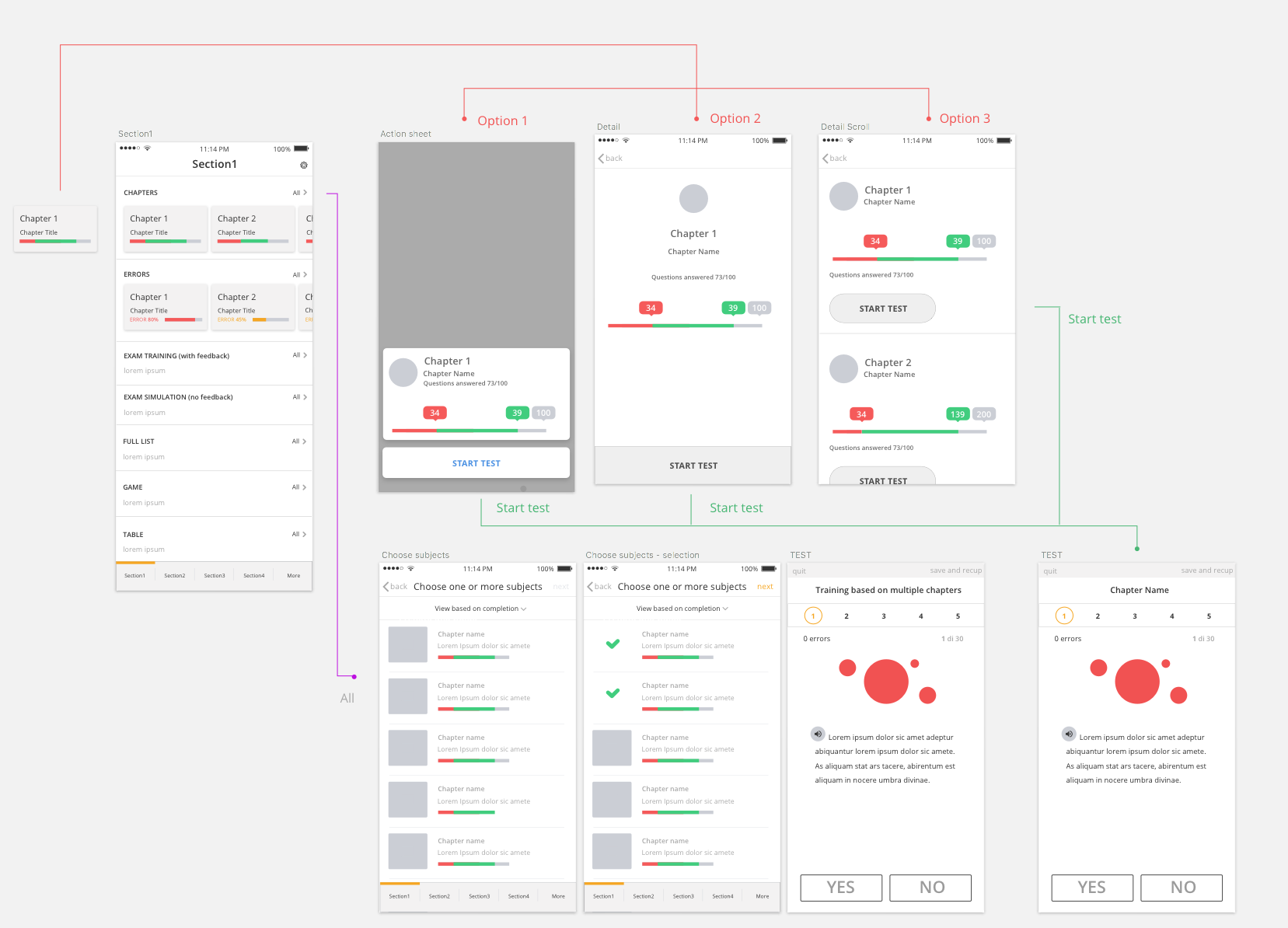
I can't decide which option is best. What I know for good is that, in 'Section1', if I tap on 'All' next to the 'CHAPTERS' line, I get the full list of chapters in order to perform multiple choices and start my training.

My doubts are about what happens when I tap on a single chapter panel, where I am supposed to see the green/red bar in detail as well as the possibility to start my test/training getting questions only about the selected chapter.

Initially, I was thinking to use the 3D touch, allowing the user to get a peek and pop of the selected chapter (after a long press on the chapter panel in 'Section1') as well as a chapter detail as shown in option 2 or option 3 (not sure if this is totally correct but that was the idea).

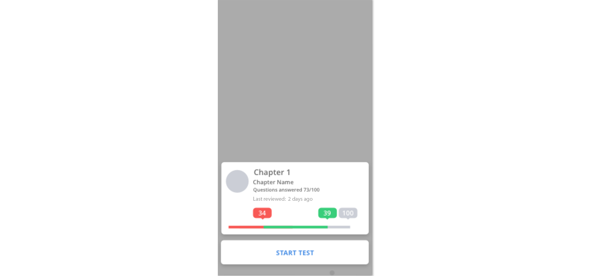
I quickly abandoned all that for a more classic action sheet (Option 1), when I get the bar details with numbers and progress + the possibility to start my test/training on selected chapter 1.
I was wondering if it's better to provide a sort of landing instead of an action sheet (option 2) or the possibility to select a chapter and then scroll to see the details of all the other chapters and make my choice (Option 3).

Please note that there's no other place in the app where I can see the red/green bar with numbers on top of it. Please also note that having the curiosity to see chapter numbers in detail may be useful for some users and completely uninteresting for some others. I am providing to users the possibility to get training depending on their needs: multiple chapters choices for users who want more questions on more subjects or full details + specific training on a particular chapter for users who feel the need to train themselves on a particular subject.

enter image description here

3 Answers 3

1

One advantage the action sheet allows is providing a user with some quick info without committing to a new view

With an action sheet you can keep context of the list view you have in the background. It looks like you have 2 top rows of swipeable horizontal lists.

Either way in your design, the user has to do at least 2 selection actions to actually begin the test, so there doesn't seem to be any steps saved from one option to the others.

Can you provide more contextual info to a user before they start a test on any of the chapters?

In your action sheet, the only perceivable differences are giving the precise number of correct / incorrect answers, with the indicators.

If you're going to give them a quick view like this, is there another piece of contextual info that might help them?

  • For example, is there value in showing them the last time they accessed the challenges for this chapter? I would imagine they would have a hard time remembering.

enter image description here

Have you had any testing to see what users are looking for before they go back and continue (or start) a chapter test?

3
  • - 2 top rows of swipeable horizontal lists.>> That's correct. - Can you provide more contextual info (...) is there value in showing them the last time they accessed the challenges for this chapter? >> not really, it would be unnecessary piece of information. - Have you had any testing to see what users are looking for before they go back and continue (or start) a chapter test? Unfortunately I can't have tests with users at this point, I am just following common sense, logic, teacher's indications, my CEO indications and it is a bit of a mess i know :)
    – Antonella
    Commented Aug 27, 2017 at 9:19
  • If I could decide, I'd stick with option 1 providing that extra bit of information needed (bar with numbers), so the user can start answering questions only for the chosen chapter. I'd skip option 2 or 3 because I don't think going back and forth is the best option here. For any other need, user can go to "all", select multiple chapters and go forward with the test. Any thoughts? It sounds reasonable to me but any opinion or different point of view is more than welcome.
    – Antonella
    Commented Aug 27, 2017 at 10:44
  • From your input, option 1 seems the most reasonable trade off. It also allows for if they select the wrong chapter by mistake, they can quickly dismiss, and they are still in the main view.
    – Mike M
    Commented Aug 27, 2017 at 22:50
0

Similar Situation

Some months ago I had a similar situation with an app. It had several skills that the user could select to learn. Inside each skill detail screen, the user had 3 types of content: readings, videos, and workshops. Each type of content is presented in a row (as you have for your chapters).

The preview on the row only displayed an image, title, 2 line description (normally truncated) and the teammates' rating for that content.

In my case when the user taps on a specific reading/video/workshop she navigates to a more detailed screen. There she had a bigger description and some actions that the user could perform. In case of a reading: Read Article (if it was an article, it could be a book), Save Reading, Rate Reading.

The reason I decided to do it like that is that we had different actions other than reading and because it is difficult for the user to judge if the reading is what she is looking for by only reading the preview in the previous screen.

On your case

Option 1

This is what Apple's Human Interface Guidelines says about action sheets:

An action sheet is a specific style of alert that appears in response to a control or action, and presents a set of two or more choices related to the current context. Use an action sheet to let people initiate tasks, or to request confirmation before performing a potentially destructive operation. On smaller screens, an action sheet slides up from the bottom of the screen. On larger screens, an action sheet appears all at once as a popover.

Read at Apple's Human Interface Guidelines

I would say that, since, in your case, you can only perform one action and it is not a potentially destructive one an action sheet won't exactly fit your case.

Option 2

This option is similar to what I decided to build for my app. In particular, for your case, I wonder if you really need it. I cannot see a major difference between the info provided in "Section 1" and the info shown in "Option 2". You are repeating the majority of the information.

I wonder what size of the screen you are working on. Maybe you can make the element bigger in "Section 1" so that you can easily fit all the information. If you do that I cannot see why you would need to introduce a screen before starting the test.

Option 3

This option is not correct. On tap on a particular chapter the expectation, probably would be to see further on that chapter. Showing a list of all the chapters is a little bit unexpected. This navigation corresponds to "All >"

0

In my personal experience, making decisions based on iOS/Material guidelines can get you out of the real problem. The major point is to analyze how many information about a "chapter" is useful to be displayed. Once you have it, you could:

Refactor the chapter component: Adding more information to the component of the main screen (may let you skip the confirmation screen.)

If confirmation screen needed: Action sheet (option 1) is not commonly used for this situation. I would rather stick to a new screen (option 2) refining the information displayed.

Your Answer

By clicking “Post Your Answer”, you agree to our terms of service and acknowledge you have read our privacy policy.

Not the answer you're looking for? Browse other questions tagged or ask your own question.