2

I am creating a Learn Norwegian language app for both iOS and Android. The app consists of 4 chapters, each chapter has a sub category, for example, Pronunciation, Exercise, Grammar etc.

My problem is the sliding menu's sub-menu. I'm not sure if I've used it in the correct way.

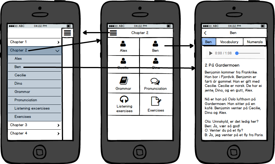
My menu

Image displaying app's navigation flow

On the main menu you have chapters 1 - 4. When i click on chapter 2's arrow, you get the sub-menu. You can select items from the sub-menu; if I click Ben I will go directly to the Ben page.

On the main sliding menu, when i click on Chapter 2 (not the arrow) I should go to chapter 2's Home page. Is this part correct?

I would like my app to be user friendly and I am worried that it might be confusing to the user. Is this the correct way to do this?

Any advice or suggestions would be appreciated. Thanks in advance.

2 Answers 2

0

You're using two patterns in your design. The main menu uses the navigation drawer pattern and the sub-menu uses the accordion menu pattern. I've only seen one application on my Android phone which combines these patterns so I'm guessing that this design is uncommon.

enter image description here

On the main sliding menu, when i click on Chapter 2 (not the arrow) I should go to chapter 2's Home page.

This isn't typical behaviour for an accordion menu. Accordion headers are used to expand and collapse content only. They are not used to link to content. Additionally, users who are familiar with the Navigation drawer pattern will expect the entire menu item to be a single touch target. Having a separate touch target for the arrow icon will not be intuitive in my opinion.

Additionally, having the sub-menu in your main menu and a home page for each chapter means you have duplicated your navigation. I would consider removing the accordion and using the grid of sub-categories on the Chapter home page for navigation. In this way, your use of the Navigation drawer would be more aligned with what user's already expect.

2
  • Thanks Andre, you made some valid points. I will remove the sub menu from the drawer menu. What are your thoughts on the Toolbar (action bar) on the Ben page. It has only a back button. Should I also add the menu button next to it?
    – Charm Geld
    Commented Oct 7, 2016 at 8:08
  • @CharmGeld I wouldn't. Your question implies that you think your main navigation should be available on every page. Because of the space constraints on mobile, detail screens (like your Ben page) typically replace the main navigation with local navigation controls for that screen. Commented Oct 7, 2016 at 8:25
2

I've seen this design before, so you're in pretty standard territory. Google's Material Design has a section on navigation drawers and I just opened an app on my phone that does it exactly the way you've designed it.

However, I have to say, I'm not a huge fan of navigation drawers on mobile that are only accessible from a single location.

My concern is that the navigation between the three views is inconsistent. The navigation panel takes up the whole screen, and it doesn't "overlay" on anything but the chapter selection. You can't access this menu from the last pane, without passing through the previous pane.

Without ever seeing the material design guidelines I'd suggest something a bit more consistent to move between the three views:

enter image description here

Going left takes you 'higher' in the hierarchy, going right further down. This might get confused with going to Chapter 1 from Chapter 2 (which I'd expect the user would want to do) so if there's an obvious way (drop downs) of doing that it would be less confusing.

Depends on whether you want to follow the material design guidelines or not.

Regarding the sub menu items, (after some confusion on my part) the other poster is correct in that, with material design, its discouraged to have sub-menu items in the navigation draw - unless on desktop:

Nested Navigation

When you have multiple levels of navigation, sibling views should be nested underneath their parent.

On desktop, a secondary level of navigation may be nested within the navigation drawer.

Appropriate for these hierarchies:

Lateral navigationParents with siblings or peers

Recommended for:

Deep navigation structures with many viewsEnabling quick navigation between unrelated views

https://material.google.com/patterns/navigation.html#navigation-patterns

Does that mean you shouldn't do it? Not necessarily. Worth doing both and trying it out. It might be a little confusing to be able to cut straight to the chapter (and if that's the case, why have the 'middle' section at all? How many times is a user going to just click on the chapter rather than named sections? Does it provide any more information?)

8
  • Could you reference the application which used this pattern in your answer please? Commented Oct 6, 2016 at 18:08
  • The app was "Reddit is fun". First app I opened, but above poster says its rare - maybe that was just a weird coincidence.
    – Joe
    Commented Oct 7, 2016 at 13:15
  • I also just opened google docs and it is similar. Menu just like yours on front screen, but when you open a document you have to go back a level before the menu is available.
    – Joe
    Commented Oct 7, 2016 at 13:17
  • Similar with Google Photos. I don't think the above poster is correct in saying this is uncommon.
    – Joe
    Commented Oct 7, 2016 at 13:18
  • my uncommon comment refers to the combination of the navigation drawer and the accordion patterns in Android apps. Both Google Photos and Google Docs use the Navigation Drawer pattern only on Android. Commented Oct 7, 2016 at 13:33

Your Answer

By clicking “Post Your Answer”, you agree to our terms of service and acknowledge you have read our privacy policy.

Not the answer you're looking for? Browse other questions tagged or ask your own question.