65

A lot of people commenting on What color for error messages for a form with a red background? say that bright pink background is a bad UX/UI.

Is it true? Is using bright red/pink as a background automatically a bad decision that results in bad interface and usability? If so, why?

Note: if that matters I am not a designer, I only know a little bit of theory here and there, enough to go by for small things I might need.

13
  • 4
    Personally (and I'm sure I'm not the alone in this), I associate pure magenta (#FF00FF) with "something is wrong", but that's only from the standpoint of a developer. Many graphics engines will use that color as a default color for when data is missing, e.g. a 3D model with a missing texture file. Sure, you could just render it in black or something, but then it wouldn't be as blatantly obvious that there was a missing/broken asset, so magenta is used to stand out better, because it's bright, and less likely to be used legitimately by the artists. Commented May 24, 2016 at 15:01
  • 9
    You have to understand that sometimes people call UI "good or bad" based on trends. UI can not be good or bad without context. A red back ground is totally fine. Red on red is a bad thing. Same as some others.
    – coteyr
    Commented May 24, 2016 at 15:14
  • 3
    I was one of the people who made that comment. My reason was partly that it led to your problem, partly that contrast with white input fields was poor, and partly that I found it dazzling and tiring to look at. In general, I think backgrounds should be subdued colors, so as to not distract form foreground elements. Perhaps it is possible to make bright pink background work, but your question was not an example of this.
    – Superbest
    Commented May 24, 2016 at 22:49
  • Well, you do run the risk of "magic pink" transparency. And transparency in UX is so passé. ;)
    – Yakk
    Commented May 25, 2016 at 13:58
  • 1
    Agreeing to disagree is exactly my point...it's a matter of pure opinion that bright pink 'hurts' :)
    – DA01
    Commented May 26, 2016 at 14:06

3 Answers 3

83

It hurts the eyes

Certain colors and color relationships can be eye irritants, cause headaches, and wreak havoc with human vision.

Yellow, pure bright lemon yellow is the most fatiguing color. Why? The answer comes from the physics of light and optics. More light is reflected by bright colors, resulting in excessive stimulation of the eyes. Therefore, yellow is an eye irritant.

and after giving you the task of staring at a red rectangle:

The 83,000 cones that are used to decode red became fatigued and over stimulated when you focused on the red rectangle.

The operation of the eye is largely muscular and any excessive activity will tire it out. http://www.colormatters.com/color-and-vision/color-and-vision-matters

So it is not just the bright pink that is the problem, it is bright colors on the screen in general. Bright colors will hurt a users eyes and cause them to cease using your application sooner.

Contrast

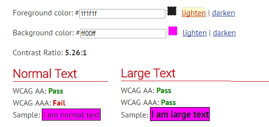
There is also the issue of contrast for text on top of it: enter image description here

See the pink background example, nearly impossible to read.

Combinations of colors that are far apart on the visible spectrum require users to constantly refocus their eyes, resulting in visual discomfort and, possibly, fatigue. http://www.uxmatters.com/mt/archives/2007/01/applying-color-theory-to-digital-displays.php#sthash.NZw9zDUs.dpuf

In fact it is very hard to find a color that contrasts effectively, white and all but the darkest black fail WCAG 2.0 standards for contrast: (showing lightest black that will pass, all lighter fail) leaving the most common font colors unusable. enter image description here

http://webaim.org/resources/contrastchecker/

27
  • 24
    Most of the color combinations in the image cause me almost immediate eye pain though it seems I am more sensitive to those than everyone I know. But why is the strain only limited to colors? After all if red background is straining to the eye than white should be more so, as it contains the whole spectrum and should engage all cones.
    – Maurycy
    Commented May 24, 2016 at 14:09
  • 9
    There is a very good answer here ux.stackexchange.com/questions/53264/… that explains why white is ok. In short it stimulates all three color cones equally making it easier to focus. Very good point though, I'm certainly no scientist so white not being bad does seem confusing to me too.
    – DasBeasto
    Commented May 24, 2016 at 14:23
  • 11
    This answer makes my eyes hurt :P
    – Devin
    Commented May 24, 2016 at 14:32
  • 1
    @Devin Right, going through all those articles and toying with the images in paint I now feel the need to take a break from the computer.
    – DasBeasto
    Commented May 24, 2016 at 14:35
  • 2
    I'm not convinced by some of the arguments here. If yellow is an 'irritant' because it reflects so much light...then white should be even more of an irritant. And we still seem to print on white paper and create web sites with white backgrounds. Regardless, we're talking about an error box...not a book printed on pink.
    – DA01
    Commented May 24, 2016 at 14:47
40

Is it true?

No.

Nor is it true that it's good UX.

It's a visual design question that can only really be properly answered in context...and part of that would be how it works with the overall page design.

In the particular context of the cited question...

enter image description here

...it is asking very specifically about Red on Pink

That's a very specific combination and as DasBeasto states, the issue isn't that one is using red and pink, but rather that there is very little contrast between the red and pink, so it doesn't stand out.

It's an entirely different question than the one you are asking, which is if pink, itself, is bad. Again, no, no particular color is bad--but colors can be used in bad ways.

For example, we can have the same exact problem using green. It's not an issue of color, but of contrast:

enter image description here

5
  • 2
    I was specifically asking about bright pink/red background because I was surprised by the statements in the comments @Andrew linked. Specifically by how broad and unconditional these statements were which in turn made me wonder if those colors are really completely unusable as a background due to some objective reasons.
    – Maurycy
    Commented May 24, 2016 at 19:39
  • 2
    Agreed -- poor contrast is the issue rather than the colour choice. Commented May 25, 2016 at 13:52
  • @Maurycy to be clear, no, there are no blanket objective arguments for not using bright pink.
    – DA01
    Commented May 25, 2016 at 18:40
  • But color is linked to contrast. The human eye has different response levels to R, G, & B— it's most sensitive to green, then red, and least blue. And technically this is a brightness-sensitivity (rods) concern — instead of a color-sensitivity (cones) one, and the peak of bright-sensitivity is around 500nm (cyan-blue-ish). So color-wheel-shifting the prev example has left it looking brighter than it was before. It would've made sense to use the PAL/NTSC grayscale conversion ratios of R=0.299 : G=0.587 : B=0.114 to get a more mid-toned green, but even then the green would be more contrasty. Commented May 27, 2016 at 6:02
  • @SlippD.Thompson I don't think I disagree with any of that.
    – DA01
    Commented May 27, 2016 at 14:04
0

Any brightly coloured background is a bad UI, for physical and physiological reasons which I expanded on in this answer Should software for 8 to 14 year olds be colourful and "childish"?

As for how to draw attention to an error message against a pink background: you need to increase the contrast between the red background and the pink background. In @DA01's example above, a white or black border around the red panel containing the error message would help.

But the real problem for me is the bright pink background. Work around it if it's a given that you cannot change, but do not be responsible for choosing it. Pink or red is particularly bad as a background, because chromatic aberration in an eye always forces it forwards from the plane of a neutral screen.

Your Answer

By clicking “Post Your Answer”, you agree to our terms of service and acknowledge you have read our privacy policy.

Not the answer you're looking for? Browse other questions tagged or ask your own question.