67

I am developing a learning application for children somewhere between 8 and 14 years as part of my masters degree in Computer Science. I have absolutly no formal UI design background and in the past wrote all my applications based on what seemed intuitive to me. But as my target audience is now vastly different from what I am used to I started looking around.

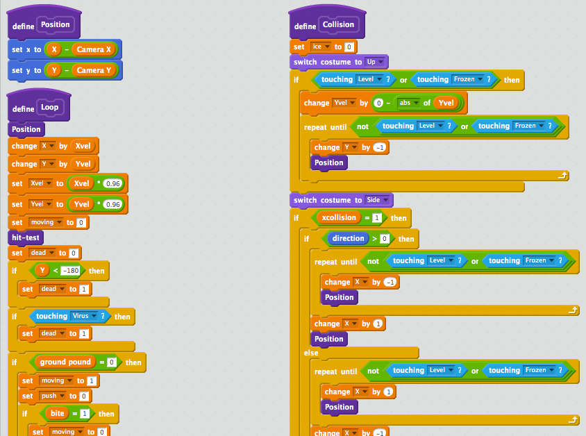
The program I am creating is somehow similar to Scratch (but about databases, not general purpose programming). Scratch's core design, the programming language, is very colourful. I do see that these colours form a very clear visual hierarchy which is obviously useful when dealing with an abstract topic like program flow. Screenshot of Scratch Blocks
But it's not only Scratch: Most stuff for children looks a little wacky to me.

So this got me thinking: If "everybody does this", should I also start to use some distinct colour schemes in my application? What are the research papers or general best practise guides I could follow when developing for children? As this is part of my masters thesis I would love to have something formal I could cite. But simply googling stuff such as "Why should childrens applications be colourful" did not take me very far.

Below is a very rough draft of the colour scheme I have thrown in. Apart from "errors are red" those colours do not have any kind of deeper meaning.

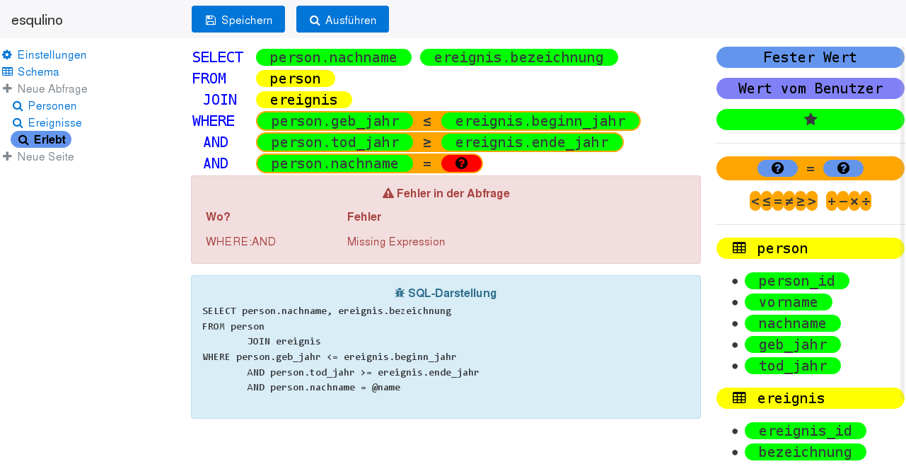
Screenshot of my project

16
  • 3
    Be careful you don't focus on color choice and ignore color use. You can both blue and red "question mark" boxes. Nothing except the color warns me that the "angry" red one is probably a bigger problem. If I couldn't see color, I wouldn't get that clue. Look how on the "Scratch" interface uses differences in shapes to provide an additional way to discern between the kinds of elements.
    – Tim Grant
    Commented May 16, 2016 at 21:22
  • 3
    Just an opinion (I work on syntaxes and reading effectivity problems). I don't think that child's cogniton of textual information is fundamentally different from adult's. What is readable for an adult must be readable for the child. I would probably just make everything bigger. General rule for colors - don't use more than 2 extra colors. I am an adult and this looks to me really bad, sorry.
    – Mikhail V
    Commented May 16, 2016 at 23:28
  • 1
    Should software for children be garishly colourful? If you want to sell it to their parents and teachers, probably. Do children care? I doubt it. Minecraft has a clunky interface, but is a hit with children because it's playful and creative. Commented May 17, 2016 at 9:11
  • 1
    I wish I had syntax formatting when I was learning to program... Commented May 17, 2016 at 11:20
  • 5
    I'd draw a distinction between "colourful" and "childish", myself. Colours are (or can be, at least, for those with average colour-perception) an extra information-channel that we use in software for adults, too. Apply those principles, rather than making the software "childish", because kids are pretty smart and can tell when someone's patronising them - and most of them don't like it much.
    – Darael
    Commented May 17, 2016 at 13:51

7 Answers 7

91

What you have described here is not 'childishly' colourful - The colours represent different information: the colour has meaning beyond decoration.

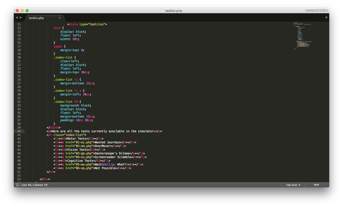
Scratch colour codes its code blocks according to what type of element they are (variable, logic operations, flow operations, etc) in a similar way that Sublime Text (and many other code editors) does:

Coloured code in Sublime Text

This is certainly not childish - this is sensible information management. Beyond the code blocks, the rest of the Scratch interface is mostly a sober grey - not 'wacky' at all.

"Wacky colour schemes", provided that they are executed with care and attention to detail, can aid the initial uptake of software aimed at younger children simply because it's attention grabbing and feeds on their experience of toys and books (possibly related to how eyesight develops in babies - stronger colours are easier to discern for young eyes). However, the age range that you specified (8-14) spans a period where younger children are also starting to affect more adult sensibilities. Older children may reject brightly coloured (in the decorative sense) software as too childish in favour of more restrained and refined adult styling.

Your proposed colour scheme looks reasonable with the caveat that some of the brighter colours can make text hard to read (try them with a colour contrast analyser). If you're consistent with your colours and don't head too far into 'wacky' then you should be OK.

10
  • 15
    +1. The most straightforward solution for the "older children [preferring] more restrained and refined adult styling" would be to develop multiple color schemes and allow the user to choose which one they prefer.
    – Sabre
    Commented May 16, 2016 at 19:25
  • 1
    @MarcusRiemer - here's an article that seems relevant and has a few academic references at the bottom: uxmatters.com/mt/archives/2011/10/… As for specific references to syntax colouring - I don't have any academic references for you there but I can tell you that, put quite simply, it's a secondary layer of signalling that helps the user process the page content more quickly: 'meta content' if you like. Commented May 17, 2016 at 7:07
  • 7
    In text, colour coding has the additional benefit of making it easier to spot syntax errors: if everything goes grey, you have an unclosed comment; if everything goes green, you have an unclosed text string. This consideration probably doesn't apply to a block-based drag-and-drop interface, but the other benefits of colour still apply.
    – TRiG
    Commented May 17, 2016 at 10:28
  • 2
    There's a difference in the usage of color though. In your example, the text is colored instead of the surroundings, which makes the overall image calmer. Commented May 17, 2016 at 13:32
  • 1
    @PixelSnader - Re. information density: That was my point. Re. my choice of image: That was to show that the "childish" colour scheme in Scratch is more about information management than for the sake of "childishness" - I picked the first real-world example I could find. If you have another example that fits better please do post it for us. Commented May 17, 2016 at 14:31
9

I would tone down those colours a little. Two of the effects of colour on a screen are physiological and have nothing at all to do with the age of a user, but everything to do with the physics of eyes.

Firstly, all eyes suffer from chromatic aberration. You cannot bring red and blue into focus on your retina at the same time. (If you display a pure red block on a pure blue background, the red block will appear to be hovering some distance in front of the blue). Which is why the recommendation is for all backgrounds to be pastel to some degree: "coloured white" rather than pure colour. How much pastel is probably a matter of taste. Children seem to prefer definite colours to subtly shaded white. But whatever, avoid pure colour.

Secondly, eyes have much better discrimination of dark/light detail than between colours. One's retina has many more rods (for monochrome vision) than cones (colour sensors). So for readability, do dark (usually black) on pale. (Less good, light on dark. Least good, colour on contrasting different colour) The things in your mock-up which are least visible are the darkish blue oval buttons labelled in black, which are less clear than even the dark blue text on the light blue panel.

Also, children are more likely than adults to have undiagnosed colour-blindness, so it's probably even more important than with adults to make sure that all information content is clearly visible in monochrome.

3
  • 2
    That's really interesting - is there any further reading on chromatic aberration you could recommend?
    – Midas
    Commented May 17, 2016 at 17:19
  • 2
    @Midas I graduated in Physics and my uncle was an Optometrist ... Google "chromatic aberration" plus "lens" or "eye". This has lots telescope-optics.net/eye_chromatism.htm. What I was referring to is the second diagram "Longitudinal". If you've never stared at a red block on a blue background, try it!
    – nigel222
    Commented May 17, 2016 at 18:08
  • I would tone down those colours a little. At the very least. Quite a lot is closer, imo.. ;-)
    – TaW
    Commented May 17, 2016 at 18:51
5

In particular, avoid black on red (use white or yellow instead) or black text with any dark color. In other words, use text that contrasts well with the background.

Andrew Martin made a great point in his answer: Children in this age range are starting to develop more sophisticated sensibilities. But at any age, a more subdued color palette with selective use of bright color may have cognitive advantages. Take, for instance, good cartography or charts and ask yourself which ones are more effective for distinctive use of color. Too much of and too many types of colors can be just as bad or worse than no color at all.

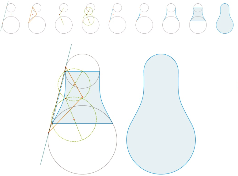
Consider how the use of bright and subdued colors, transparency, different line weights and styles is used here to convey construction steps:

construction steps

Brightly-colored text takes up few pixels compared to solid blocks of color. So while those colors may work in a text editor, unless saturation is reduced they may be overwhelming in larger doses.

3
  • 5
    did you accidentally upload the wrong image? i'm not sure what you're trying to convey with this image. Commented May 16, 2016 at 19:36
  • Thanks for mentioning the problem with the red background, somehow this didn't strike me as less-then-optimal until right now. Commented May 16, 2016 at 19:44
  • 3
    @WoodrowBarlow While it isn't an ideal mirror of the images posted by the OP it is meant to illustrate what I mentioned: bright and subdued colors, transparency, different line weights and styles. The point being that one has a variety of tools/techniques at one's disposal. Trying to help and still work for a living. I bill by the hour.
    – Stonetip
    Commented May 16, 2016 at 20:29
5

Colorful? Yes, Childish? no. Color has a huge place in design, especially in any sort of coding IDE as pointed out by other answers, color helps indicate to the user what the function of each word is. Bright colors are probably fine to use too, but mute the colors down from the mock up you give. Neon colors on a white background are a little hard to look at for too long. Try doing a similar mock up with bold, bright colors instead. Here's a site where you can play with color schemes.

However, keep the age range your working with in mind. Because you're mainly catering to pre-teens and young teenagers, making the software look childish is one of the worst things you could do. It's around this age that kids start trying to prove that they're not kids anymore. Having software that looks like it was made for preschoolers is one sure fire way to make them think it's stupid, pointless, or under them. Design in the first example you give looks far too juvenile. Bright colors are okay, but avoid funky shapes or overly bloated design. Making the interface easy to use is more important than making it "fun". Too may programs I used back in my days of public school forgot that!

2

Just thought I'd throw this out there.

A significant % of people are colour blind. Colours can be useful, but also don't neglect size, outlines, etc.

I really liked outlines as a kid and visually that is the thing that strikes me as the most useful; to me the colouring makes it too busy.

I would try to at least add some meaning to the colouring.

1
1

I am afraid there might be no other way around. You should conduct some user research, or get in touch with somebody who is familiar with the whole process, if you want to do things by the book. And it seems you do.

I don't recommend user research necessarily because you are dealing with children. Normally, user research is the right thing to do irrespective of your target-audience.

There is no such thing as a saving rule of thumb with regard to simply approaching a target-audience, no matter how particular that target-audience might seem.

That is why one of the operative concepts within the UX field is "persona": a hypotethical representative of your target-audience who functions as a guiding line in the development of the user experience.

How To Create UX Personas

Creating Personas

For example, if your application is destined to color-blind children, is the unwritten law of a colorful design still valid? No, it changes everything.

This was just a radical example, but there might be slight variations within your target-audience that will determine your success or your failure, and you better control them.

2
  • your spam has been removed
    – Devin
    Commented Jul 29, 2016 at 17:22
  • I removed also other links, assuming them to be a spam attempt Commented Aug 8, 2022 at 12:29
1
  • A son of mine, while interacting with a childish UI mumbled "this is humiliating!". He was about 6 years old.
  • The eyes of the children are not different from the adults'. How could they benefit with a brilliant colors palette design?
  • Reading text laid over colorful backgrounds requires more effort, that's why we tend to bold color text. Font engines seem to be optimized for black an white (like, the antialiasing thing) and don't render color text optimally.
  • Changes in text color are like changes in font type. The eyes and the brain have to "recalculate", thus the lower quality of the multi-font designs. This means an additional cognitive load that affects children the same as adults, if not more.
  • Children exposed to very busy environments tend to get crazy because of anxiety.
  • Children want to be treated as grownups. Not fully, obviously, but they appreciate when it happens.
  • Children have an aesthetic sense of beauty, despite the high number of colorful childish UIs they see during their first years. Including some horrid toys.

For all the reasons above, I would do a normal (respectful) design, with some subject-related decoration.

Your Answer

By clicking “Post Your Answer”, you agree to our terms of service and acknowledge you have read our privacy policy.

Not the answer you're looking for? Browse other questions tagged or ask your own question.