3

For example, In order to design a event log, I provide users multiple ways to sort out the log entries they want to find out: search box, tagging system, category tabs. The ultimate goal for users is to find what they want.

We did some user test, and mostly users figure out how to accomplish it. But some users claimed that they are provided with too many options.

So what do you think about it? Will it be helpful or harmful to user experience?

2
  • Since you are asking what I think, I will comment rather than answer... I would rather have a complicated interface which offers the user every tool imaginable than omit a tool which the user might someday desperately need. That being said, I personally would divide the options into a simple mode and an advanced mode, hiding the less common search options until the user asks for them. Commented Nov 17, 2014 at 19:06
  • if possible, could you add and image/mockUp to your post to get a better image of your particular case? Commented Nov 17, 2014 at 19:55

4 Answers 4

2

It really depends on how savvy your users are, but usually the simpler you can make your interface, the easier it is for users to navigate and use.

A psychological principle known as Fitt's law shows how the Paradox of Choice affects user behaviour. For a typical sample, the more options you offer people, the less likely they are to actually make a decision. By contrast, the more you help them out and tailor their options before they even have to make any decisions, the more you can help them complete their tasks.

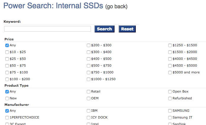
If you have power users, giving them a quick way to have more options (similar to the newegg example) can be a simple solution that makes novice users and power users happy.

See http://en.wikipedia.org/wiki/Fitts's_law for the math behind this, and http://coglode.com/gems/choice-paradox for some of the main research findings.

1

The standard approach is to show to most used/useful/efficient filters, and then add some "Other filters" / "Advance Search" to show more specific filter/search parameters.

1

You can provide options for two kinds of users, non-power users and power users, those two kinds of users differ a lot in how they want to do something.

Non-power users need only one simple way to do their tasks, and no more, and power users likes to have the more flexibility to do what they want.

Take an example: newegg.com

By default they use a guided search:

newegg.com guided search

But they also offer a power search (designed for power users):

Power users

And they target the two kinds of users very well. Most of power users will notice the "power search" link (power users are good finding that kind of stuff), and use it, and non-power user will find the guided search a good way to do his/her task and will use it, so you can satisfy the needs of both kind of users.

0

Maybe not the best design but this is what I do in one app
Let the user expand / collapse so they don't have to see the details of options they are not interested in

search option

Your Answer

By clicking “Post Your Answer”, you agree to our terms of service and acknowledge you have read our privacy policy.

Not the answer you're looking for? Browse other questions tagged or ask your own question.