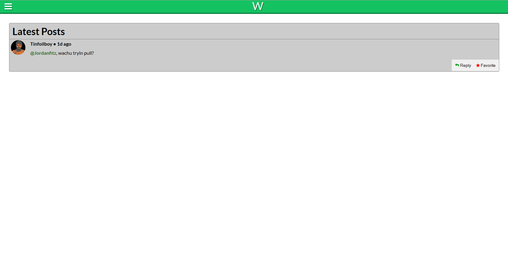
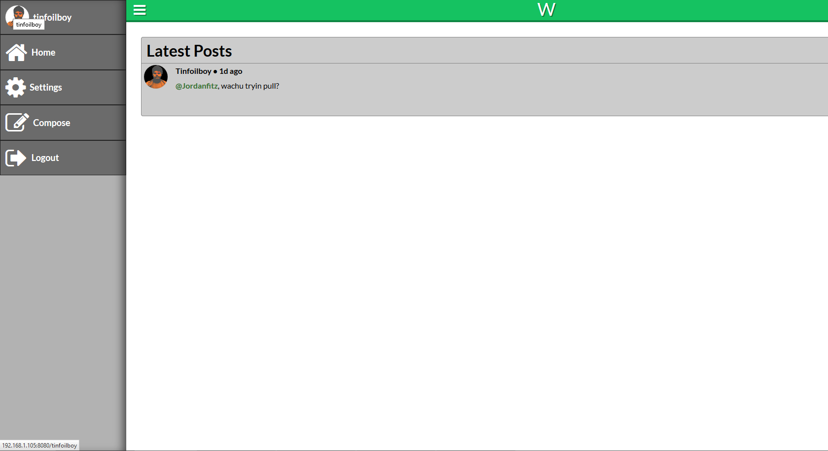
First off all, I appreciate that you seem to design your responsive web with a mobile-first approach (that's how I perceive it anyway).
As Imperative has already stated, consistency is generally a good thing. However, the mobile-sized interface might still be come through as consistent with the desktop-sized ditto even though they don't share the exact same navigation pattern. For instance branding elements, graphical profile, copy, artwork and information architecture might keep it together just fine. Especially important is that the IA is, at least, very similar for the users to find their way around the site. When the content is grouped and structured the same way, a user that is familiar with one of the platforms but new to the second will know what to look for and have a hunch of how too, which helps a lot.
The off-canvas drawer menu is (obviously) a solution that partially solves a common mobile interface problem: the deficit of real estate. But that's a problem that rarely applies when it comes to desktop interfaces. Consistency is valuable, but should you be consistent between your own interfaces, or with the standards for the respective platforms they're being used in?
Off-canvas drawer for mobile:
- Access to all top level navigation items in one place
- Robust in a sense that new items can be added in infinity (can be a curse too:)
- Menu button is in a convenient position (even though it's usually in the "hard" corner)
Off-canvas for desktop:
- I guess Fitt's law still applies, and the expedition up the north-western corner of the screen can actually be quite long. A drop in efficiency?
- You don't always want to fill the entire width with content as the user can use a very wide screen on a PC, which can make the positioning of the menu and its button really awkward, and actually even hard to see.
- A button in the corner can interfere with hot corners, or rather, the other way around.
- An extra click, that could have been avoided, is added to reach a menu item.
- The menu items are obscured until the user has visited the menu, when they could have been displayed directly.
Based on the arguments above, I would recommend a different pattern than the drawer menu for the desktop site.


