1

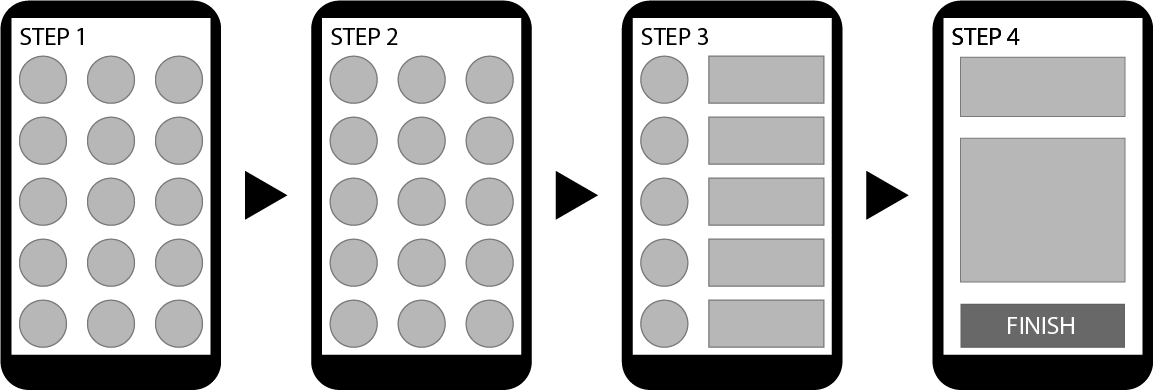
Right now I have a mobile app where you can navigate like this:

enter image description here

I need to transform it into a desktop app. The only thing that I cannot change is the fact that the circles that are clickable options must be in three columns.

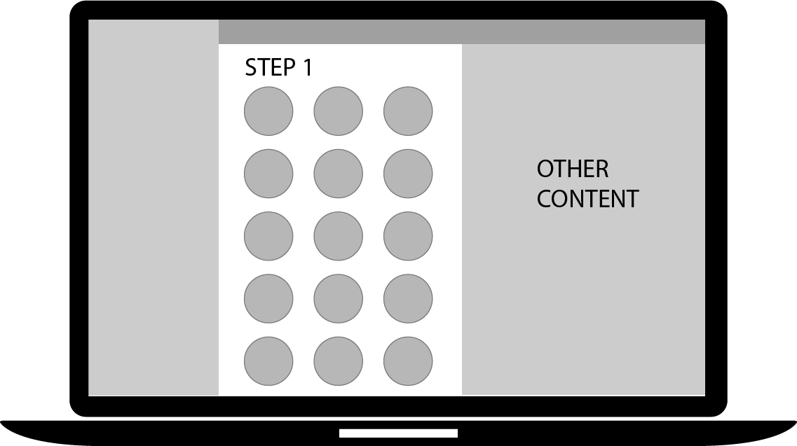
I have came out with this solution:

enter image description here

Which is pretty much to stuck the mobile app into a desktop screen. I don't know if you ever had this problem and if you know other ways to solve it.

Usually I would go from desktop to mobile but in this case the work is the other way around.

Thanks!

2
  • I've been in a very similar situation before. The client (a big government department) had something designed specifically for mobile and then decided it should be available on desktop as well. Do you actually have "other content" to display on desktop, or is that just filling the space?
    – Matt Obee
    Commented Oct 23, 2017 at 13:22
  • Yes yes, well... it's not necessary content but it helps to have it there. Commented Oct 23, 2017 at 16:00

2 Answers 2

1

I would always centralize the content more to make the unused real estate look not too obvious. Also the "other content" can be placed on a card with a background color different from the website's background color.

This elevates the content and looks better when there is more unused space.

1

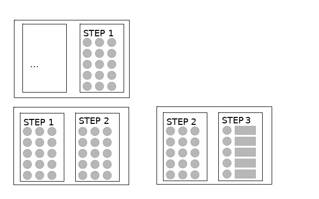
Would this solution work?

This would show results of previous steps while showing the new step to be completed.

An image

2
  • I used this solution first, but it was a little confusing for the users, since they were confronted with too many options (half of them already seen). Commented Oct 25, 2017 at 11:47
  • @RaulLeanoMartinet Grey out the old step?
    – anna328p
    Commented Oct 25, 2017 at 18:07

Your Answer

By clicking “Post Your Answer”, you agree to our terms of service and acknowledge you have read our privacy policy.

Not the answer you're looking for? Browse other questions tagged or ask your own question.