2

I'm making a javascript widget that will allow the user to see the translation of a specific word together with examples featuring that word, synonyms, etc.

This how it works:

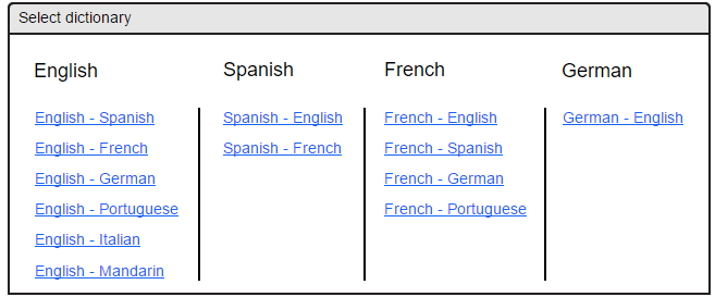
On the desktop) The user selects the word, a button appears below it and if clicked a dialog like the one below shows up:

enter image description here

On the mobile) They double tap the word and a similar dialog shows up?

I don't think my dialog's UI is a good idea, it is not scalable. What if I decide to add support for a lot more dictionaries? The dialog would be too big, should I use dropdowns instead of hyperlinks for each dictionary combination? Also, I don't think it would work very well in the mobile.

Are there any websites with a similar functionality, ie.: Dictionary selection and nice UX ?

Mockup

4 Answers 4

1

Have an area of your UI used to select the "From", and once "From" is set, show the remaining options for "To". Though, you should also allow searching by destination language too for complex use cases*. An entry could be used to let users type a language name in order to filter the options faster.

Yes, this is exactly how you book an airplane ticket. And it scales up very well.

Screenshot of Ryanair's flight booking search engine

*(for instance I speak French and Spanish and need a term in Catalan, that I know will be closer to a word existing only in French; that translation may be missing so I might go for Spanish instead).

2

Here your problem is what will happen when list increase. So short answer make it simple for the developer and for the user.

Add 2 drop down (from, to) that will handle if lists go long and even as a developer it's easy to maintain in future.

Current UI

  • Users have to search for what they are looking for.
  • If list goes long then it's difficult to maintain in mobile. At some point you have to add scrollbar also.

Drop Down UI

  • Just 2 drop down to get the job done.
  • Scalability is not an issue. Works fine on both mobile and desktop.
  • Easy to use and easy to maintain
1

If the user is likely to use the same dictionary over and over, then put your selector in a prefs pane so they don't have to make that selection every time. They can then simply click or double-tap and see the translation immediately, in whichever dictionary they last chose. (Or in whichever dictionary you set as the default, before they pick one.)

(One of my favorite UX principles is to provide good defaults. Users can change things up if they need to, but if you can avoid having them make choices like this, then it will streamline their process.)

1

I suggest to limit the lists by detecting the languages. Check for special characters, they are the key. This will help to detect "from" or at least limit the options. Then use current browser locale to choose the default "to" language. I believe this should cover 80% of the use cases. The remaining 20% may choose their "from" and "to" languages from separate lists, as suggested in another answer here.

Your Answer

By clicking “Post Your Answer”, you agree to our terms of service and acknowledge you have read our privacy policy.

Not the answer you're looking for? Browse other questions tagged or ask your own question.