13

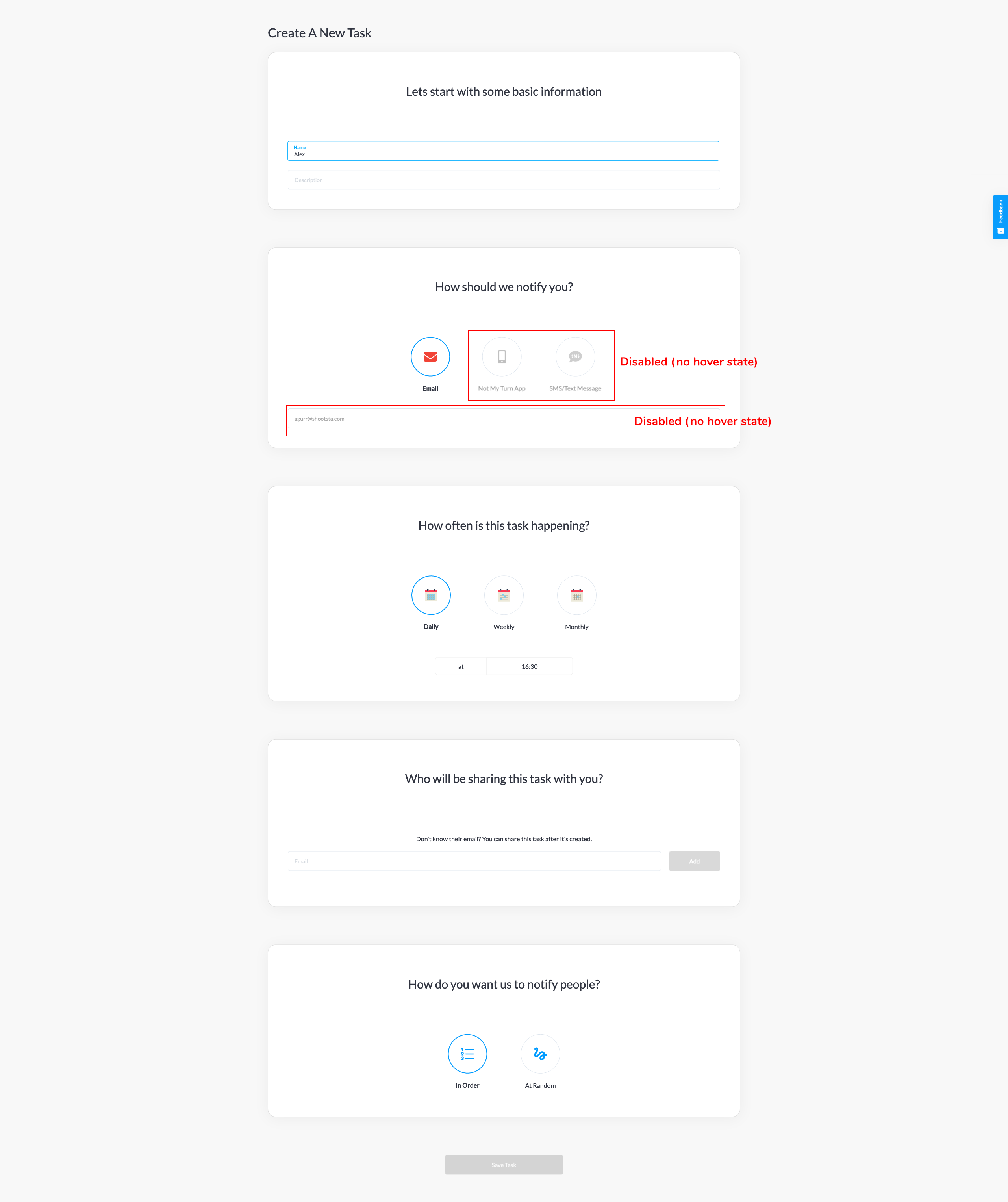
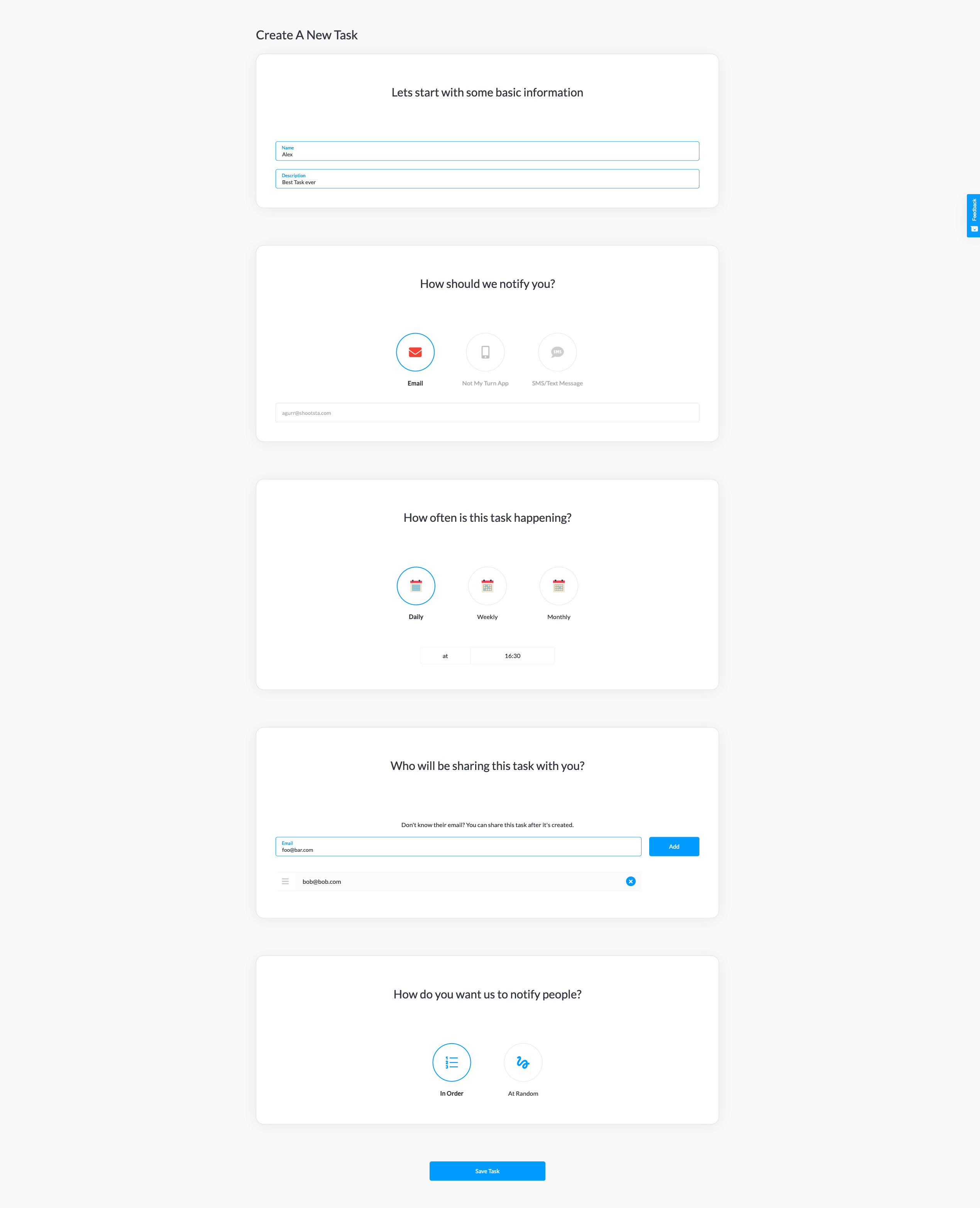
I have the following form on a website I'm building. I've tried a few different approaches/designs but I can't seem to find anything clean that fits. This is a pretty high res screenshot - in reality you'd scroll the page.

Does anyone have any suggestions/examples they think could work? I've had a look at a wizard approach, but it always felt like a lot of steps.

Happy to DM a link to the hosted version. It's not ready, hence I don't want to publicise it in the post.

Some context

The app is for creating shared tasks with other people. Someone creates the task, invites others and the appropriate people are notified when it's their turn to complete the task.

Anyone can create tasks for free. Users who haven't signed up can access and fill out this creation page. This is the only thing they need to fill out. They are required to create an account when they click the save button if they want to continue. It's imperative this page is clean/exciting as intimidated users are much less likely to fill it out and will bail.

Once a user creates a task, I imagine they would have little or no interaction with this page again, unless they wanted to create more tasks. Editing would be infrequent (this form is also used to edit).

Target Audience

As you can imagine, this can appeal to a variety of different people. The common use cases I identify on my homepage are:

  • At home: Who's turn is it to take out the rubbish? We know!

  • In your sharehouse: Toilets looking a little rough? We can help share the load.

  • At work: Share fridge starting to grow fur? Take turns.

It can be used in enterprise, families, share houses, between partners. I would always expect it to be adults interacting with the product however, even if children were to receive notifications.

Devices

I've built it as a responsive app, meaning it works on mobile. As with a lot of sites, I'd expect as much, if not more traffic on mobile than on desktop. I'm also building a native mobile app that mirrors similar functionality to the website.

-- Update --

Lots of people are talking about inputs/labels, greyed out things etc. Just to clarify, some of the UI is disabled. The add email button is disabled (no email in the input) and the save/submit button is also disabled because the form hasn't been filled out. My CTA primary buttons buttons are clear and blue.

The input design moves the placeholder/hint to a label when you focus the input or add text. I'll add further screenshots with annotations.

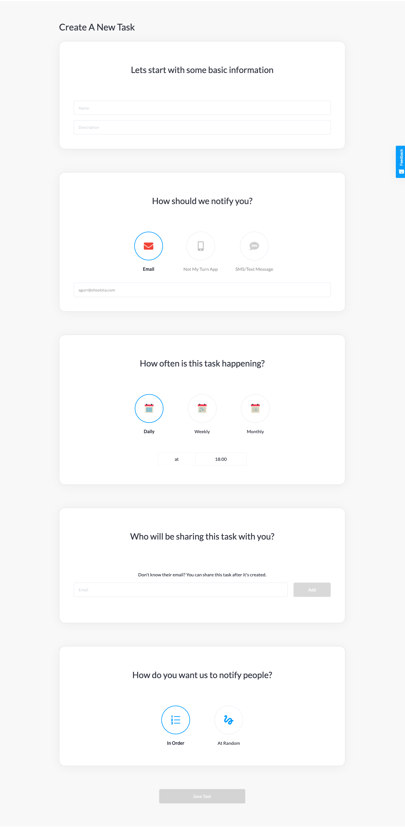
form-screenshot

annotated-screenshot

completed-screenshot

5
  • 3
    Hi, and welcome to the site! Can you tell us what bothers you? Just a personal feeling, or results of a Usability Test (the other end of the spectrum - this would need serious consideration)? Also, can you tell us more about the use case (who is creating tasks, on which device, how often, is this everything to enter?) - design is always contextual to the users and their goals. Commented May 18, 2020 at 8:38
  • Hello! Definitely personal feelings here. I go through lots of redesigns and love to browse Dribbble for inspiration (I'm definitely a developer, not a designer). This is the one page/experience on the app that I'm not happy with. It feels boring, too much to do in one go and I'm not vibing the general experience. Users who don't sign up can still access this and it definitely doesn't excite me. I don't want to put people off. I'll update the main post with some context on the page and the app.
    – Alex Gurr
    Commented May 18, 2020 at 8:43
  • 7
    I would only say it seems kind of long and spacious for power users. If a user wants to make lots of tasks quickly, it could be tedious. Perhaps have a shortened form with only table rows and icons to generate a large number of tasks for power users. This is more like a one-page wizard which is great for new users. I don't know your audience but something to consider.
    – Chloe
    Commented May 18, 2020 at 21:12
  • 5
    As per a close reason: "Questions about Site Reviews are off-topic because questions here are expected to be relevant for a variety of people in the same situation. Reviewing a site, flow or interface only helps one person at a specific time. Instead try to ask a focused question about a particular aspect of the design that solicits solutions, not opinions."
    – NotThatGuy
    Commented May 19, 2020 at 14:18
  • 1
    I downvoted because I believe this is an ad for their app instead of a genuine question. There's no real question except "look how cool my app is; could it BE any cooler!?" The fact that he waits until the user has completely filled out the form before asking them to sign up is further evidence he's willing to use backhanded and deceptive marketing techniques. Commented May 20, 2020 at 20:48

7 Answers 7

27

I feel you might be coming at this from the wrong angle. A form shouldn't excite you (or a user), it should get the job done quickly and painlessly.

Boring can sometimes (usually!) be best.

You mention that this form can be accessed on mobile - can we see that?

There are some issues with your form that I can see from the screenshot, many of which are accessibility problems.

Add labels to text fields. All fields in a form should have clear labels. You have used hint text within the field as the labels - this is not good for usability.

Remove any placeholder text. You don't ever need to use placeholder text in any fields in a form. Far better experience for the users to leave the fields blank.

Add help text for the description. This may not be needed in the entire context of the app experience, but I wouldn't know what to add in that field right now. You have good help text on the sharing section.

Increase colour contrast. The grey text and element colour you are using only has a contrast ratio of 2.81:1, which will cause issues for a number of users, especially on mobile. Increase it to something like #7C6D6D to ensure good contrast (and add a hint of warmth).

Put it all in one page and simplify the layout. This is a task that people want to complete quickly and easily. That should be the forefront of your design. Your users won't care how pretty the form is if it take them to long to fill in.

And please, don't rely on Dribbble for good UX. I like browsing it too, but many of the UI designs would give poor user experiences, and quite a few never actually get made. :)

15
  • 3
    @Big_Chair I would be interested in why you don't agree with the other points? From a usability standpoint, these are all common practice. Commented May 18, 2020 at 10:21
  • 10
    Hint text without labels can lead to a situation where a user doesn't remember what all is supposed to go into the field, or isn't sure why what they've entered is in there (ie if reviewing a form before submission) so +1
    – DeadChex
    Commented May 18, 2020 at 21:36
  • 4
    @DeadChex also autofilled forms (like in chrome for example) sometimes get filled wrong. Without labels there is no way to see if all the information is filled correctly
    – J_rite
    Commented May 19, 2020 at 15:24
  • 4
    Since when is hint text bad design? Commented May 19, 2020 at 23:22
  • 4
    @SteveO'Connor Based on the screenshots it looks like these behave per the material design guidelines from Google where the placeholder converts into a label on selection. Commented May 20, 2020 at 15:10
24

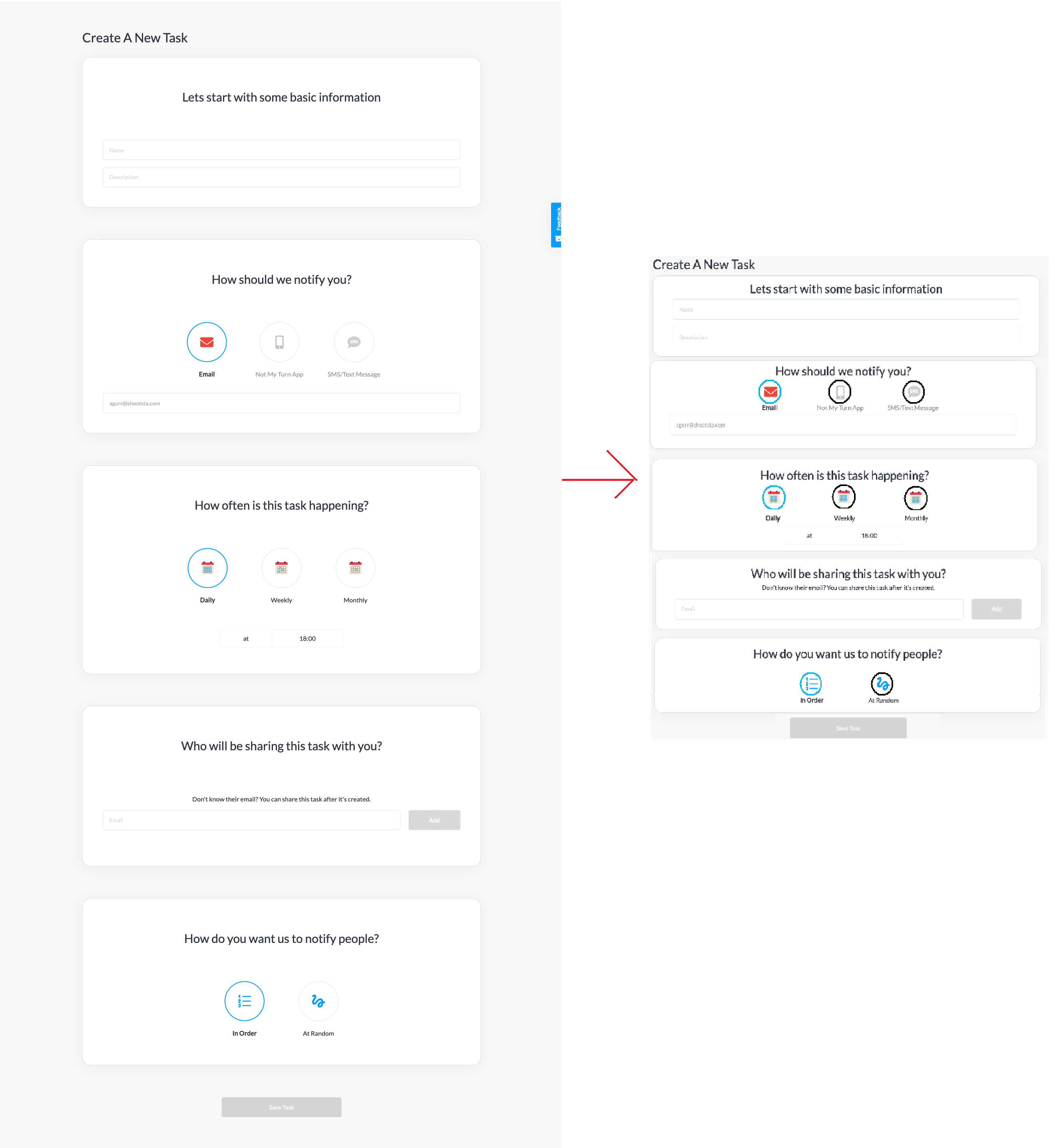
I'll start by saying this will probably be an unpopular opinion because, for reasons I can't comprehend, what you've done is done a lot. My complaint is that you've made 5 text fields and 3 multiple choice questions around 2800 pixels tall.

"In reality you'd scroll the page"

I swear in a decade we'll all have 8k monitors and still be endlessly scrolling because user interface people have convinced themselves that everything needs to have at least 1000 pixels of complete emptiness around it and the buttons need to be the size of your fist on the screen with tiny monochrome icons in the middle.

If you absolutely must make the same UI for phones and desktop, with big buttons for sausage fingers to easily press, here's my suggestion:

enter image description here

Yes what you're doing is considered aesthetic or whatever, but by the time your users are making their tenth task you're just wasting the time that you're supposed to be saving them. If you're really worried about your users to be scared off by the sight of more than one question at a time, give them the tutorial version of the page the first few times, or give them a checkbox at the end "Make this more compact next time". A calendar/reminder is a natural side task, it (and it's menus) should act like it. Many desktop users will not be keeping this window full screen and that will just make your plus-sized margins that much more obnoxious. And if they're like me, and scroll back through the form to double check it afterwards...augh.

Oh, and increase the contrast. If any user has to adjust their monitor/phone's contrast/brightness to see your light gray on white, you messed up. Just because Google does it, doesn't mean you also have to make every color scheme to be white on light gray with a gradient of light to super light gray. 50% gray to 100% black range is also available. And colors too.

This looks like it was made with Google forms.

7
  • 1
    That's a bit harsh, I'm a "user interface person" :D I think you mean "graphic designers". But then, I one of those too… Commented May 19, 2020 at 6:47
  • 3
    @SteveO'Connor Me too on both, that's why I get worked up about it. I think phones/touchscreens made a lot of designers forget all the lessons learnt before about what makes a good interface.
    – gunfulker
    Commented May 19, 2020 at 7:42
  • 2
    @gunfulker I think the fundamental problem here is always in trying to make the same interface work both on mobile devices, and computers. They have different available screen space, different methods to manipulate the device, different usage context, etc. At best there is a compromise, and the UI is acceptable on both platforms. But it in a lot of cases such a UI is just poor on one of the platforms or even both.
    – Malcolm
    Commented May 19, 2020 at 10:56
  • 2
    @Malcom One might argue that there's something fundamentally flawed about an input system that requires your hand to be between your eyes and the display.
    – gunfulker
    Commented May 19, 2020 at 12:17
  • 1
    Personally I would argue that whitespaces can be used to direct user attention and cause less scanning behavior. This is ideal in certain situations, but detrimental in others. E.g. back in the day wizard like forms were popular, another way to achieve the same benefits is by having long pages. Similarly a form which has to filled out 100x of times is very different to a form which needs to be filled out once. If it's a one time deal I would maybe keep the original, if it was a multiple times a day deal I would use radio buttons and make sure it fits on a target resolution screen. Commented May 21, 2020 at 17:04
7

I agree mostly with what @Steve O'Connor has said, but there are two things I think we can discuss further:

Hint text should be useful. Meaning that if you're going to use it, write examples instead, like: "e.g. [email protected]" in the email field. Hint texts are extremely helpful especially when the field itself doesn't exactly explain what should be written in it (in cases like adding phone numbers).

The description field is only a single line field when you know for a fact that it cannot be more than a sentence or two. If there is a case where users can write a paragraph as a description then it is better to switch the single-lined field to a multi-lined one.

Other than that you should definitely increase the contrast when users type in the input fields (for a second I thought the email you had written was a hint text) and there's no need to separate them in this case in their own boxes. They could be all connected and separated simply by their respective headers.

Final thing, in my experience, the fields seem to be too long in width. In general you want them to have a set max width which they shouldn't exceed, and so not completely stretch with the screen size.

1
  • 2
    I strongly agree on the recommendation on the hint text: they should be examples, not just more descriptions. A good rule is "if the hint text were actually pasted/typed in by the user, it should qualify as valid input".
    – Ti Strga
    Commented May 20, 2020 at 16:22
3

Great answers so far! I would just like to add a few points:

  • Check those tiny grammar details: Instead of 'Lets' > 'Let's', instead of 'Create A New Task' > 'Create a new task' or 'Create a new Task' it is not a big deal but those small details could matter for some users who would not take your form too seriously. As your site gets bigger those mistakes could be more common.

  • Why at the 'How should we notify you' section the non-selected options are grayish and in the other sections that is different? I don't know if everyone will agree here but I like that functionality of highlighting my selected option and blurring or making the other options less noticeable. I don't understand why the other sections of your form do not implement this, it makes it confusing for me.

  • Time selection contrast Is the 'at' preposition a button? The contrast is not enough. It seems like both the time and the 'at' word are buttons.

  • Unify everything or change the structure: As others pointed out, forms should get the job done quickly BUT I think a good design could be exciting as well. I would group everything in a different structure or maybe you could try having like 3 different screens that get loaded instantaneously with a kind of progress bar and these tiny dots at the bottom of the form so the user can see how many empty fields that he/she has left to be filled. Careful if you do this, it's not easy to design something that leaves the user with a good taste.

  • Change the button colors: They seem disabled

  • Background color and general style: I'd choose different colors. Of course the style of a website should be in concordance with the logo, primary colors chosen for other things, etc, etc. As a general rule I always choose 3 main colors for most of the design.

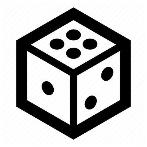
  • Random icon could be changed This is a personal preference but I would choose a different icon like the crossed arrows or a dice maybe.enter image description here

Keep it up! You are in a good path. Always study famous websites and their layouts. Try to imagine why did the designers of that website chose those colors, that structure, the order of the elements, etc.

2

+1 what the previous answers said,

I'd also like to add a little note about the consistency of the selections. In the "how should we notify you" section, deselected elements are grey. If that's the intended effect, that should be consistent with the rest of the selections as well.

1

I see this sort of design a lot, and frankly I find it annoying.

I think it can be tidied up quite easily though. These would be my steps:

  1. Get rid of the empty grey space between each portion, maybe leave a tiny line.
  2. Have each question except the top one collapsed, so you can only see the question but not the answer options.
  3. Once the data is filled in the top question, open up the second question. When the second is filled, open the third and collapse the first. Have the current and previous questions open.
  4. Clicking on the question are expands or collapses that question, always.

It is also very important to get the microcopy (text, especially of the questions) to be very clear.

0

Disclaimer: I am not a UX/UI designer, but I am a user who knows what he wants.

I will repeat a few points that I think are very important:

  1. This is a form, users hate forms

If forms are unavoidable, you should do everything to streamline the process to make them as quick and effortless as possible. This is especially true for forms that will be completed again and again by the user.

With this in mind, I don't think that the separation into multiple cards is necessary. In fact I would go as far as to say that the entire thing should be encapsulated in a single card. This form is taking up so much unnecessary space and I would hate having to scroll through a form that I fill out maybe 5 times a day - empty space is good to an extent.

  1. Small improvements

I agree with much that has been said on the smaller suggestions. Increase colour contrasts, change hint text etc. above

Your Answer

By clicking “Post Your Answer”, you agree to our terms of service and acknowledge you have read our privacy policy.

Not the answer you're looking for? Browse other questions tagged or ask your own question.