If user doesn't find an item from the list, they should add it using “add a new item” option.
Are there any patterns, guides or best practices showing where to put an “add a new item” option?

If user doesn't find an item from the list, they should add it using “add a new item” option.
Are there any patterns, guides or best practices showing where to put an “add a new item” option?

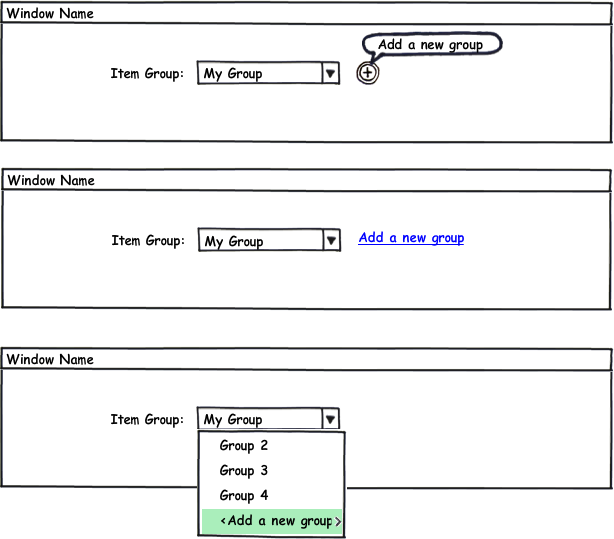
The first design is the worst in terms of usability because the icon is ambiguous, and there's a real possibility that the user won't even see it. The user is going to be focused on (ie, reading) the dropdown menu and s/he can't process the icon at the same time; it's physically impossible. You're counting on the user to either find the icon by chance or by an educated guess.
The second design is a bit more usable because the Add option is more prominent though it still has the same limitations. It depends on how wide the dropdown is and how prominent the Add option is.
The third design is probably the safest of the three because it guarantees that the user will at least scan the existing list. It's not the prettiest, but it's the most intuitive.
A fourth option would be to put the a text link underneath the dropdown menu, where the user has a very high chance of seeing both. You could disable the text link and then enable it once the user has activated the dropdown menu.
Add a new group at the bottom, ok so put it at the top and bottom, problem solved right? nope, the user picks an option in the dead center of the list and the person returning to edit this item has never used your program from scratch. Dynamically place Add a new group above/below the position of the selected item if outside of the viewing scope of the top/and or bottom of the list. Just my 1/50th dollar.
Commented
Mar 26, 2014 at 19:37
Based on the answer from @tim-huynh and the smart comment from @monkeyzeus, here's my two cents.
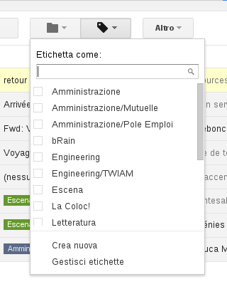
The solution I suggest is to implement an advanced select widget, like the smart guys at Gmail did for thei tag button below (sorry for the italian terms... "Etichetta" means "Tag")

In this widget,
I think the first and third options are both possibilities, depending on how it will be used.
If the user will need to add items quite frequently, the + button is definitely preferable out of those two, because it will be annoying to go through the list every time to get to "add new". If it might be a very long list of items, this will also increase the annoyance of getting to the "add new" option.
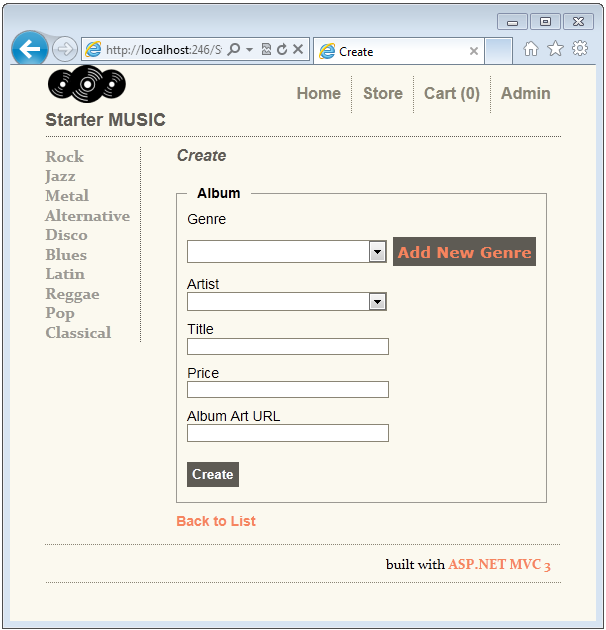
I would recommend going with the first option as it a clear visual indicator that users can add a new item to the list if not found. Here is an example of how you might do it

The challenge with the third option is that you are expecting the user to scroll to the bottom of the list before he finds the option to add a new item. If the items in your list are organized alphabetically and the user is scanning alphabetically, after the particular alphabet is over the user might scan any further
The second option can also work but the concept of a link is a not a strong call to action might be overlooked in reference to the dropdown.
I would go with the 2nd option because it clearly states the action and there is little or no ambiguity. Either you select one of existing groups from the dropdown or create your own. User experience cannot get simpler than that!
1st option could also work, but requires some action on users behalf. I assume the tooltip is shown only with a mouse hover and, thus, doesn't trump 2nd option in its simplicity.
However, this approach might be neater out of design and aesthetics perspective. A small simple (+) button looks better than a text link (and in the case of app internationalization you never know how long your UI text strings are going to be and where it might break a line and create a mess).
So to make it work, you could show the tooltip in the beginning, but hide it permanently when user has created a new group once or twice, and, thus, knows what this button does.
Needless to say, it would require some user preference/data storage functionality (maybe localStorage which is accessable in all modern browsers http://caniuse.com/#feat=namevalue-storage, or if more users are expected using your app from a single device/pc then store it in the backend. )
3rd option is clearly worst of them all. User has to needlessly discover a crucial part of functionality, which could be very hard if the list of groups is large and requires scrolling.
I would like to add that The third option will depend on the size of the list. If the dropdown is very long, you might want to consider a predictive search, and then use that term to "Add New Group" if it's not found.

download bmml source – Wireframes created with Balsamiq Mockups
If this is a high volume page it's worth investigating with analytic tools to find out for sure.
Ideally you could investigate your users using web analytics to determine the best answer for your user base expectations. clicky.com, for example, allows you to time each duration between the click on the form element above the item group and the form element after the item group field. Then you look at the analytic timing diagram and do a histogram of the duration users spend on the "item group" field.
You don't necessarily need to do this timing analysis with an A/B setup if you want you can just pick one, build, and check for severity of design flaws later. later, you look at the histogram of just people who choose the "add new category" option and check for out of sequence use (they didn't see it at first and had to go back up to that form element later). If you have a large enough sample size you should see distinct peeks in the timing histogram with each peak representing a different user models time to recognize the functionality. As a fun exercise, you can profile the distinct groups of your users base by looking at the peaks in the timing histogram and assigning each peak to a different user mental model without the need for a survey or other annoying feedback mechanism normally used for segmenting an audience.
The third option is best in my opinion however hard to implement as you will need special checks to perform a special action when that item is selected. Furthermore, longer lists will make this alternative not very user friendly.
I would go for the second option but make sure to give the "Add new group" option a lower importance compared to the combobox iteself. This is to tell users that they first need to look up a group in the drop down before adding a new one. Having the dropdown and the "Add a new group" on the same line kinda makes them of the same importance which might lead some users to think that they need to click on the "Add a new group" to get their selection available in the dropdown (even if something similar already exists)