7

I've looked around and can't find any pre-existing examples/patterns of an easy way to inline add/remove an item within a form.

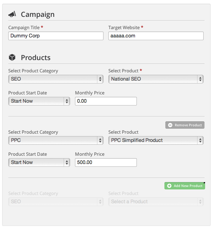
The scenario is during a process for me to add a new customer to my account, I can add or remove any number of products and change some options on those products.

Screenshot:

This is a section of a form that allows you to add/remove a product and change some options on it.

Do you know of any UI patterns or live examples that has that functionality?

To me, this form clearly has some confusing areas but before I work up a solution, I'd like to know if there any existing best practices. Any other general thoughts on the form above would be welcome as well.

Thanks!

1
  • I'd reverse the functionality so that you show less. Then only make the sections visble when they become relevant.
    – Tim
    Commented Jan 24, 2014 at 3:33

7 Answers 7

4

There are a few things about your current form that you may want to consider.

Use View Mode For Each Product On Form Load. It seems like every product is in edit mode when the user sees the form for the first time. Too many input elements, especially when repeated is eye-brain overload for many. Consider putting everything in view mode on first load - no input UI elements, just the minimal information you need for the user to uniquely identify each record. On view mode, have buttons or links to view (more details), edit, and delete. Place these three buttons clearly away from the data in the right-most column, and right-align this column.

Add New Product Button. Most forms like this append the new product to the end of the list. I see that this is your intention. You will want to create an Add New Product button clearly away from your list. I recommend putting it below your list, right-aligned. Some like to put the "Add New" button on top of the list, aligned left. This is fine, too, but if you choose this placement, make sure you automatically scroll to the bottom of your form to bring the user to the Add New Product UI.

Add/Edit Mode. This will contain all your input elements. To make this sub-form stand out, ensure that only a maximum of one item is in edit mode at any given time. You may also darken the background color to draw more attention to editing.

In Add/Edit mode, there should be two buttons - Cancel and Save, ideally positioned on the bottom right of the add/edit "sub-form", and right-aligned. Instead of "Save", you can use the word "Create" if it's a new product and "Update" when you're in editing one that already exists.

NEVER require the user to click Create/Update or Cancel to get out of edit mode. If they click on another record's Edit button, automatically cancel the current edit view and put that other product in edit view.

Delete. As mentioned, delete should be in the commands column of products' view mode. When you delete, ALWAYS ask the user for confirmation.


In some cases, each item may have an administrative "switch" or state you'd like to set without having to go inside edit mode. In most cases, this is a true/false deal. Instead of a check box to represent this on/off state, use clickable words or icons that will toggle between states. One click should automatically save the new state to your data store and change the icon/word when you've saved successfully. For these toggles, give them a hover state to hint the user that it is clickable.

There are a few common switches you may want to include on each item's view mode. Ideally, these switches should be your middle columns.

Ready vs. Not Ready. In some cases, you're not sure whether you want users to see the product but you want to save your changes. Saving something doesn't automatically mean it's ready for presentation.

Public vs. Private. This has to do with whether visitors or regular users can view your data if it's in the ready state. Private would mean privileged users within your company can see the product as long as the creator marks it as ready.

Enable/Disable Interaction. An interaction would be a user's action such as comment, rate, like, etc. For each of these, you can set whether a user can do it to your product.

0

I would advocate for a combination of the above:

Use the first example to add records.

Use the grid to display the list of records. Selecting a row, the user can select to edit or remove/delete. The form above could also act as the edit form, once the record is saved and selected from the grid.

1
  • @grzeg and Leslie M: Interesting ideas but it just seems to me like that sort of interaction pattern is maybe more work than necessary to add 1 to 4 products. Thanks for the response though!
    – ccnokes
    Commented Jan 23, 2014 at 16:45
0

There's no best practices, only convention and a good eye.

enter image description here

Greying-out the area for the new "product" makes it clear what happens when you click the button. Also, it gives the second advantage that the "top-right" of each section always means "add or remove a product", you can even throw in an animation to reinforce that concept.

1
  • The grayed-out area is an interesting idea. Has anyone seen examples of this in the wild?
    – ccnokes
    Commented Feb 23, 2014 at 6:41
0

I think you've already got a good start with your original design. However, the sectioning and position of the action buttons are confusing to user.

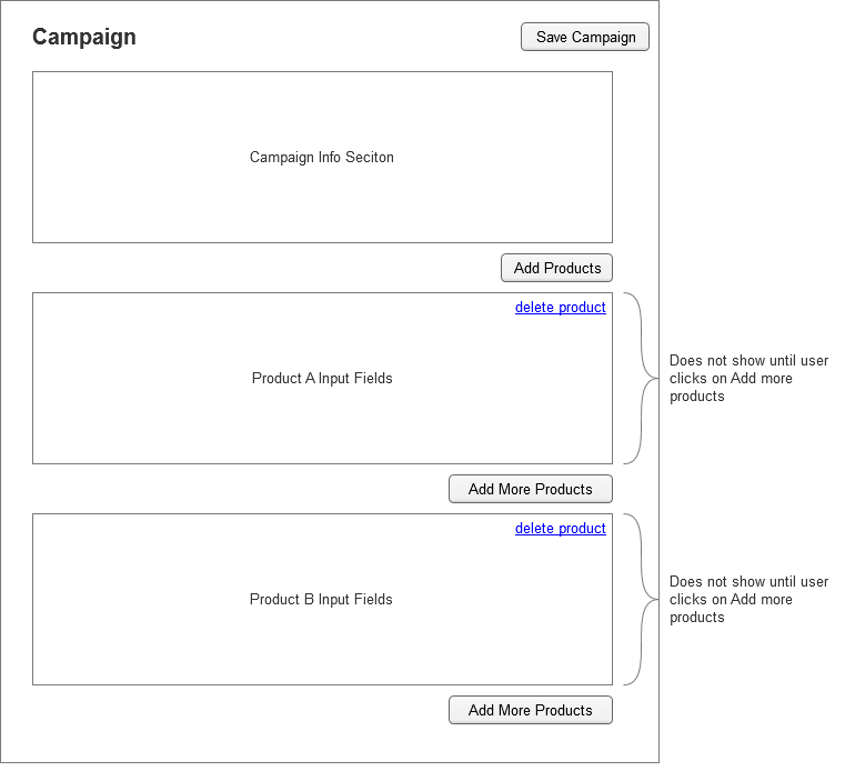
Here's my proposal:

enter image description here

Campaign should contain the products sections to make it clear to users that you're adding products to the campaign. Your original design had them all on the same level which could be interpreted as isolated form sections.

Do not display any input fields for adding product until user initiate that action by clicking on the Add more product button. Otherwise, user will be confused as to what those fields are before they get to it.

When user is done adding products to the campaign, they could simply click Save Campaign which is located on the top, same level as the Campaign, so user know when they save, they are saving the campaign along with the products they've added.

This step by step process gives clarity to user when they are inputting data for campaign and when they are inputting data for products.

0

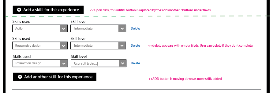
For what its worth...I just played around with something similar...enter image description here

...green line means the stuff under it doesnt appear until you click the stuff on top of it.

0

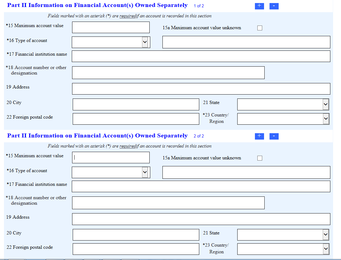
I see this is an old thread, but I'm having a similar conversation with my designer on this topic. She's suggesting that we adopt a design used by the IRS at https://bsaefiling1.fincen.treas.gov/lc/content/xfaforms/profiles/htmldefault.html

See image: Report of Foreign BNank and Financial Accounts

I find the IRS solution awkward as it suggests that the scope of the [+] and [-] buttons is the same. The [-] button allows you to delete the section below, but the multiple (two of them, in this instance) [+] buttons do exactly the same thing: they add a single section to the end of the list. The solution at the top of the thread is what I'm proposing. Anyone have any thoughts on either of these approaches, or possibly a third way?

1
  • This is a reasonable question. Could you create a brand new question for this? The format here is one question per post. All the responses are answers.
    – Mayo
    Commented May 30, 2019 at 20:26
-2

You should use a table, instead of collection of fieldsets for displaying list of products, and then let user perform actions like edit or remove by checking particular rows and selecting an action. The fieldset should appear only after performing the edit action; this solution: saves space, prevents user from mistaking products (in most cases he will only edit one field at time), and lets you display all the data you want at time. phpMyAdmin - an SQL database graphical user interface - is an exact and very convenient example of the aforementioned way of data presence. Here's a screenshot:

List of tables in the database - a good analogy to a list of editable products along with information about them

1
  • This doesn't answer the question of how to add an itme.
    – jgthms
    Commented Feb 23, 2014 at 14:32

Your Answer

By clicking “Post Your Answer”, you agree to our terms of service and acknowledge you have read our privacy policy.

Not the answer you're looking for? Browse other questions tagged or ask your own question.