0

Context: In the "Returns" details page we have a form where we can add Items, that items represent what we want to send back(return) eg. 1pen and 2 notebook. So I have a list of "n" items and I want to display the "New Item" link. This list doesn't have a sort, so the new entry will be placed after the last one.

What should be the best position?

enter image description here

enter image description here

What version should I choose, 1 or 2? Or any other option, and why? Regarding the copy from the link: is "New Item" ok or would "+ Add Item" be preferable?

5
  • 1
    Does the user need to refer to the list before adding an item? If not, then above a variable length list is far more noticeable and accessible than below. Commented Jan 19, 2023 at 11:10
  • Of all the user a activity on this page what percentage is "adding a new item"? Commented Jan 19, 2023 at 11:13
  • Action buttons should be kept on top right side of the data table as per the standard design system. So keep +Add button on top right side. Commented Jan 19, 2023 at 12:10
  • @bloodyKnuckles yes they need to add items very often because it what's mean the Return process. And makes sense to them to check what items they already have in there to only add the missed ones. Commented Jan 19, 2023 at 13:49
  • Please elaborate... How often do users add a new item without reading the list compared to adding a new item as a result of reading the list? Commented Jan 19, 2023 at 14:37

3 Answers 3

1

I'd use the second variant, just with a button rather than a text link. The text link is almost invisible (I only noticed it on the second image, then I looked for it again on the first image).

The reason for using the second version: when the list gets large, the user doesn't see the link (or button, as I suggest). This is a problem Google had with Google APIs until a month or so ago, see image
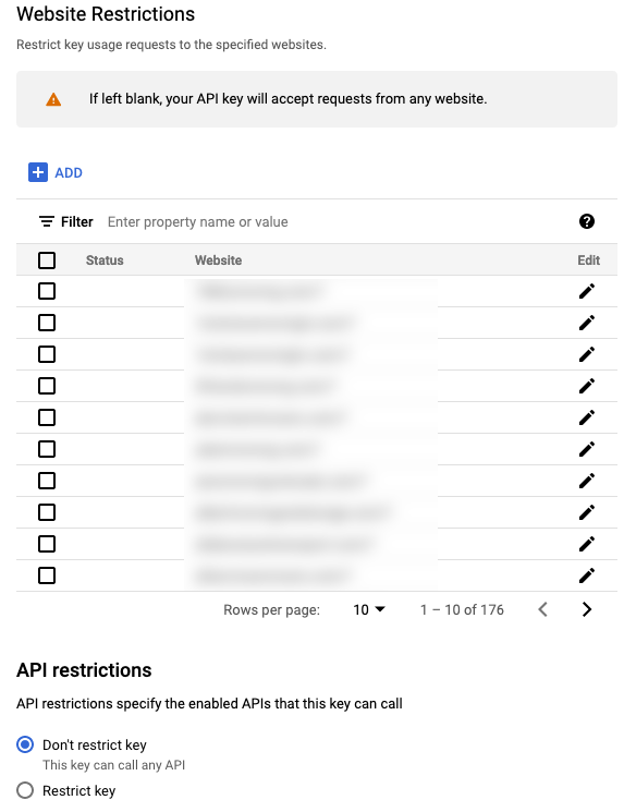
Insert image description here

(As an interesting aside, Google solved one problem and added many more in the same change, such as lack of sorting, no date, and as soon as you add a property it is added to the list, but there is no easy way to detect it unless you actually search for it. Finally, the main problem has not been fixed: No matter if you add a property, and even if you see it in the list, the property is NOT added until you click on a SAVE button at the bottom of the page, which makes people think they have added something, which is not the case. This is also why I tell you to add the action at the top)

As you can see, the button has been added to the top, although for years it was at the bottom of the list and the list was about 50 lines long. Now there is also the possibility to choose how many lines should be displayed.

As for the wording, it should be "Add Item". On the one hand, it's about returning goods, so the word "New" has a different meaning. Also, "Add Item" prompts the user to perform an action, while "New Item" is ambiguous and could mean almost anything, especially if it remains a text link.

3

Im not sure about the context of this list, but It really depends on how the list grows with an increase of items.

My best answer is to use the 2nd one.

If someone first loads up this page and wants to add something,(and new items are added to the top) then the corners are the perfect place to add a button for this kind of action.

Also it might help for this action to be a button instead of a link. A link might confuse the user to believe you are gonna leave this page. Using the words "add item" also helps because this is a action that the user is performing.

1

Without knowing your use case (and the full context), the answer is often 'It depends'.

Option 1: If it's sorted in ascending order, then this option could work. Perhaps the table is more valuable for viewing it's earlier data at the top. Adding on the bottom means you'll be adding a new row in close proximity to the New item action.

A downside is that if the table goes below the viewport, it's not immediately apparent that you can add to the table.

Option 2: The top left is often more valuable real estate, with users eyes often starting top left and scannning across and down.

Are these items default sorted? If you have most recent up top, it makes sense to add from the top. That way you see the item being added right in proximity.

Graphical thoughts

New Item is presented as a link, similar to Archive, but it seems adding an item is a primary action (should they need it). It might make sense to present it as New item button, and you could even use an outline button so it doesn't compete with Save, but still hold visual salience.

Question: Are we looking at actual UI? I ask because from an accessibility point of view, there's several low-contrast items, including the link itself. You could probably tone down the gray and get a contrast boost.

Right now either option has the action being lost against the background, and the cramped spacing.

Your Answer

By clicking “Post Your Answer”, you agree to our terms of service and acknowledge you have read our privacy policy.

Not the answer you're looking for? Browse other questions tagged or ask your own question.