5

I have a web application for creating forms.

Currently, the create form interface looks like so:
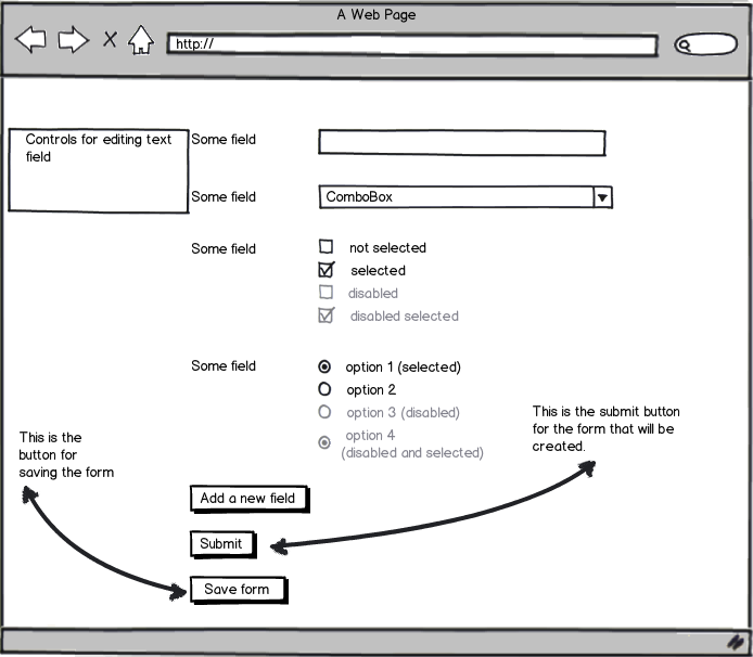
mockup

download bmml source – Wireframes created with Balsamiq Mockups

The interface is designed so that what the user sees while creating the form would be what the user of the form sees. The form that is being designed here will be used within the application by users.

There are a few consistencies across the whole application:

  • All submit buttons are styled in a consistent manner and are aligned to the left of the form.
  • All form fields are styled in a consistent manner as well.

Problem: Since submit buttons are styled in a consistent manner, the "submit" and "save form" buttons would be styled the same way. The form submit button needs to be there so that users can customize the submit button's text.

What can be done to differentiate those buttons while maintaining consistency across the whole application? There should be no ambiguity so that users will not mistake the "form submits" button with the "save form" button.

2
  • Why can't you add a dedicated style for each of those buttons? And then change the layout's architecture.
    – dnbrv
    Commented May 20, 2012 at 14:01
  • Is there any circumstance in which the Submit button would need to be usable while creating the form?
    – kastark
    Commented May 21, 2012 at 10:59

2 Answers 2

9

If I understand you correct, this is a form builder where the submit button is part of the form. If that's the case, I would group the form in a container which would effectively separate the form building activity from the save activity.

mockup

download bmml source – Wireframes created with Balsamiq Mockups

I would also group the "Add a new field" section of its own with a label text input and a drop down of field input type. The label input would be where you add your "Some field" text and the drop down control would let you select (1) text input, (2) Drop down input, (3) check box list input, (4) radio button input and a (5) date time picker. More controls could be added if you need them.

When the user selects which input type to use, the view changes to display the options (if there are any) and editable text input labels for the controls different options.

I would also align the submit button to the other controls and not their label. It makes readability easier for the user of the form.

To save the complete form, I would use two buttons; Save and Cancel. But this is optional and their are different meanings of wheather a cancel button do any good on a web form. But my reason for having it refers to the accepted answer of the question Is a cancel button necessary in a windows form.

But the main part is to group the form builder into one container.

1
  • 2
    +1 This is pretty much what I was going to write For a design like this, controls within the designed form and controls for the form builder have to be kept completely separate, else all kinds of problems arise. I'd say grouping is the only reliable way to do it in this sort of application. Commented May 21, 2012 at 11:39
2

Since both the buttons looks the same, it will be a mistake to place them next to each other.

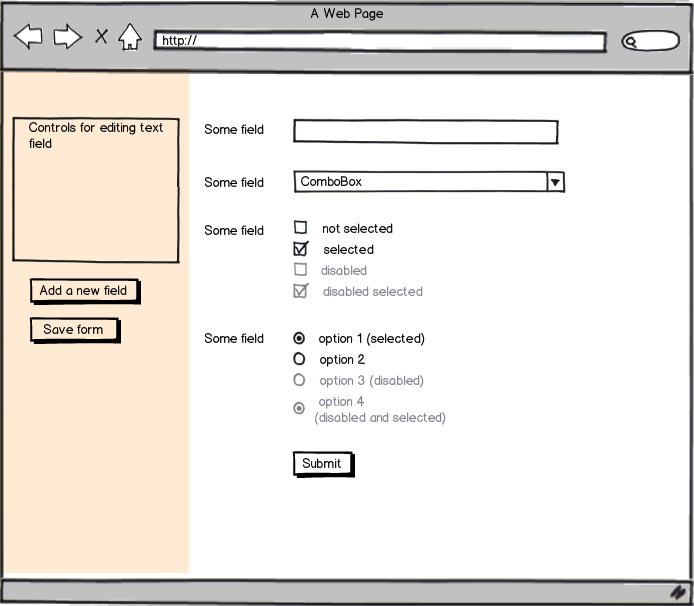
Best thing to do is to create explicit, even obvious spatial partition between form zone and form editing zone. Use background color to make distinction even more obvious:

enter image description here

Your Answer

By clicking “Post Your Answer”, you agree to our terms of service and acknowledge you have read our privacy policy.

Not the answer you're looking for? Browse other questions tagged or ask your own question.