Standard checkboxes are not typical on touch devices.
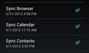
If they must be used, the preferred UI implementation would be a 'selectable bar' such as this android example:

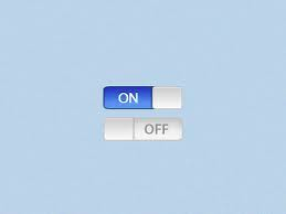
Or perhaps a toggle would work ala iOS:

In both cases, the advantage with these is you are creating a larger touch area than your typical HTML checkbox (yes, the label is and should be a trigger as well, but visually many people miss that fact).
Regardless of your particular UI control, you'll likely want to stack them vertically. It's much easier to scroll, scan and select items on a small device when it's all vertical.
That said, you mentioned
The select options might be more than 80 options
That is likely not solvable via a UI control. At the very least, you need to re-think the user flow and how they're going to read through 80 options. Can this be paginated? Tabs? Wizard? Panels? Sliders? Anything but 80 options on one screen?
Ideally, there'd be a broader rethinking of IA and business rules/requirements here. That's a daunting amount of items for a person to scan through and select on a desktop--let alone a mobile device.
 .
.
