4

I'm working on an app (touch input) in which it should be possible to select one or more items. Think about google maps: you search for 'restaurant' and a couple of restaurants are shown on the map, now you want to select 3 of them.

Right now I'm thinking about

  • press to view one item
  • press+hold > give feedback to the user > press to select multiple items > CTA to view items.

This is not an ideal solution and I'll need to explain this interaction to the user at first use.

I'm wondering if someone has another idea or suggestion that is more user-friendly and intuitive?

1
  • What about drawing on the map? Sometimes pins might overlap and tapping could be difficult.
    – freeedia
    Commented Oct 18, 2019 at 17:43

3 Answers 3

2

Don't overcomplicate the interaction patterns, use existing common patterns that would be easy to remember and use.

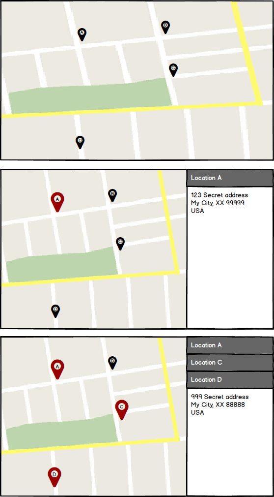
Potential Solution (wires below)

  1. Image shows several pins - nothing special
  2. User taps on a pin - a side panel slides out with information on the selected location
  3. User taps on other pins - selected locations are added into the side panel

NOTE: User can 'tap' on a pin to select it, second 'tap' unselects it.

I don't know what type of a CTA you need after a user selects one location or multiple and if you need a mass CTA, but I hope this gets you closer to what you are trying to do.

Map Examples

2

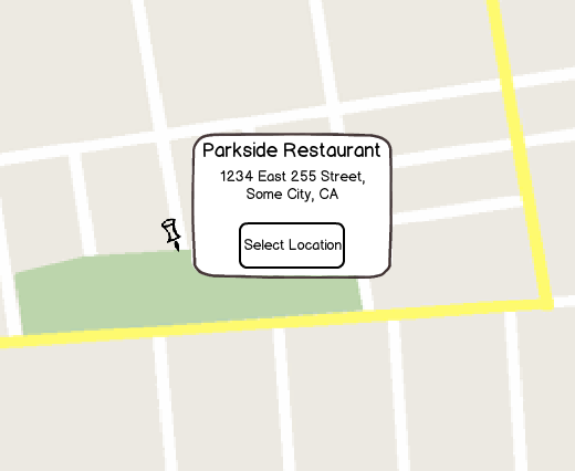
A map pin denotes a location, it doesn't give you info about what that location is in order for the user to make the decision that "Yes, I'm interested in this location".

So something like this may make sense

mockup

download bmml source – Wireframes created with Balsamiq Mockups

When user clicks/taps on the pin, display a popover with details about the location plus a toggle button to select/deselect the location.

It may also be a good idea to have an area to the side (e.g. right hand column next to the map) that acts a little like a shopping cart holding area so user can see number of locations they've selected and the option to readily deselect them.

1

Maybe you could combine the pin with a checkbox and give the pin two clearly distinguishable states (checked, unchecked and maybe differentiate with a colour too, see image). This allows the user to make a selection of different locations/items in one view. It should be clear what can be done with the selected items and I suppose there is a button somewhere on the screen that lets the user view the selected items. I would also place the number of selected items in the label of the button (a bit like a basket in a webshop).

enter image description here

3
  • Thanks for your reaction! This seems to be an obvious solution, since it will be very clear to the user. The problem I see will be space, each pin would need a checkbox and something to open the item directly. But definitely something to look at.
    – Rolfertjan
    Commented Apr 8, 2015 at 9:50
  • I think you have a point that the pin-element will be to big when it contains both a check box and view button. But since the view option is the same functionality for every pin, I would combine them in one button and place it somewhere fixed on the screen.
    – Ruudt
    Commented Apr 8, 2015 at 11:16
  • 1
    maybe you can have a combination of the suggested pin with checkbox and what google maps actually does, when you click on a pin it's details appear at the bottom of the screen
    – ThaSaleni
    Commented Jul 7, 2015 at 11:55

Your Answer

By clicking “Post Your Answer”, you agree to our terms of service and acknowledge you have read our privacy policy.

Not the answer you're looking for? Browse other questions tagged or ask your own question.