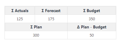
I need to display 5 numbers. These numbers are essentials and display a summary of all the dashboard. This web application will be use by professional who already work with this kind of data. Here is how I actually display them :

- The first four cells are sum of data present in the dashboard
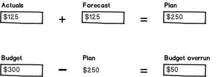
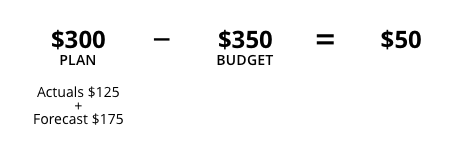
- Plan = Actuals + Forecast
- The last cell is the subtraction between Plan and Budget
Do you think a table is a good choice for display these data in a dashboard ?
Do you think the order of the cells in this table is judicious ?
The symbols ∑ and Δ are user-friendly and representative ?


