3

I run some user tests on a finished page (not the mockup you see below) and found that two thirds of the users (in a sample of about 10) miss the Back to previous page link at the top left of the page.

In fact most of them don't even notice it is there and use the browser's back button. When I ask them at the end why, they say they didn't even see it.
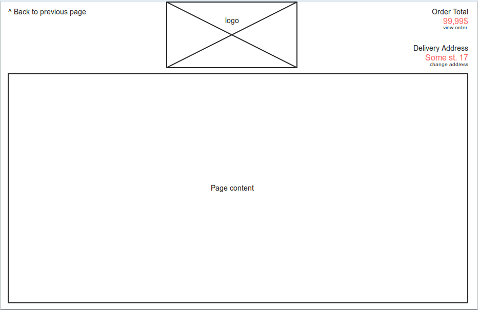
mockup

The page is heavy on AJAX and works like a "one page" design auto scrolling top to bottom according to user input (ie you select address and it scrolls to product catalog). Imagine the UI for github's folder/file structure display but vertically.

When the first page comes up, "back" isn't displayed because it obviously doesn't make sense, it is displayed with a fast fade in from the second page on. It is not underlined for aesthetic reasons, but the cursor changes to pointer on mouse over, the same with all other links in the page that users see, find and use without trouble.

Also Order Total and Delivery Address on the right top of the page are visually the same like the back link but not clickable, while view order and change address are clickable. Could this be a reason for confusion? None of the users has pointed out this though.

While we took the extra effort to make the page work the same regardless of the user clicking the browsers back button or the supplied link, I'm wondering what can be done to improve the "visibility" of the back link but mostly what might be the reason users miss it.

Should I add some fading background with attention getting contrast the first time the back link is displayed or make it flash or anything that would get the attention of the users?

7
  • 1
    People are used to link with color and underline so removing it is confusion. People are used to have a back button on a browser so using internal system is confusion too (even if it's good)
    – ColdCat
    Commented Sep 11, 2013 at 13:05
  • 2
    Using the back button is a negative step. It's a 'get me out of here' action. You may want to rethink the path that people take so that they can feel like they're making positive progressive steps instead of needing the back button at all. The back button is the Button of Doom Commented Sep 11, 2013 at 13:16
  • If it really looks like ^ Back to previous page then the arrow is pointing directly at the Back button. And the text doesn't look like a clickable link, so people don't click there. They follow the instruction. Commented Sep 11, 2013 at 13:32
  • @AndrewLeach That could be a valid reasoning if they would say later they saw it and thought it points to back. The funny fact is they don't see it.
    – user221931
    Commented Sep 11, 2013 at 18:22
  • 1
    Give up all hope of convincing your users not to use their browser's back button. No matter what you do (this includes telling users not to), many of your users will use that button. The user will be more familiar with their browser (and its back button) than with your site (and its back button), because the user's browser usage is a superset of the user's usage of your site. I congratulate you on making the browser back button work properly. This is a positive step for usability :)
    – Brian
    Commented Sep 11, 2013 at 20:05

7 Answers 7

9

The reason they keep missing it is that they don't need it.

A user does not read a web site left-to-right, top-to-bottom. They first decide what they want to do, then look around to see how to do it, and execute what they thought is correct, changing their action in case of failure.

Roughly, your users can have one of two purposes: wanting to go back a page, or wanting to do something different from going back. Now, what does a user do when he or she wants to take a step back? Well, they already know how it is done. They just skip the "find out how it is done" step, and execute what they know will work - the back button. They do not see the link because they do not search for it, and home in on what they need.

In any other case, when they want to do something different than taking a step back, their selective perception very efficiently hides from their consciousness the irrelevant information, including a link for going a page back. Again, they do not see the link because they do not search for it.

In both cases, they are doing what is natural and best for them. So I will advise it to let it stay that way. It is indeed possible to make an element "steal" the user's attention when they are scanning the page trying to decide what to do. This is done by making it big, flashy, "in your face". But frankly, it is a bit annoying, and in your case, very unnecessary. If your application had broken the browser back button in the sense that using it corrupts the user's work and only your link does the right thing, then making the link more visible would have been a workaround making the app slightly less painful for the poor users. But you avoided this pitfall, so there is no problem. Don't try to fix things which are not broken.

3
  • Not needing it and therefor forgetting it is a very plausible excuse. But I'd expect that with a left->right, top->bottom scan, it would be the first thing to notice. Once we realized the back link was not used like all the time we took the extra time and effort to have them both work the same.
    – user221931
    Commented Sep 11, 2013 at 18:32
  • Let's not forget as well that from your mockup, the "back to previous page" link is fairly small. If you also want someone to notice it, then make it more prominent. That's also why they are missing it (in addition to already learned controls from the browser itself)
    – UXerUIer
    Commented Sep 11, 2013 at 19:27
  • I'd like to add that when users scan a website, they have "learned" to ignore certain parts and styles (such as with the banner-blindness example). The link text that you show in the picture could fall under such a category. However, while such a button is not necessary for your page, I always find it useful during browser-sessions to open the previous page in a new tab. Check if your users would like to be able to do this too!
    – Liang
    Commented Sep 13, 2013 at 7:19
2

I'm not really sure why people using the browser's Back button is a problem. People use the Back button ... still. I think a better user experience would be to accommodate for this user pattern by deep-linking your content's AJAX "states" so they could be quickly accessed and then even shared.

1
  • Now it's not a problem but that at a cost of 3 weeks extra development to make sure the back button works like the link once we realized they were using the back button. You can't imagine the hacks we had to go through to support all the browser perks :)
    – user221931
    Commented Sep 11, 2013 at 18:25
1

Since the browser has a back button, you might be better off without the extra one. I would be concerned if the user cannot find a way of going back, using the browser to get back would work for me.

Example: Amazon is using the browser's back button.

In some cases, giving the user 2 options of going back might confuse them and make them think "Will both Back buttons get me in the same place?" Making the user have doubts about what will happen next will might create frustration and in some cases abandoning the process they've started. 

2
  • Amazon is not the perfect example because it is not a one-page AJAX design, it does a complete reload from page to page and there the browser back button is obvious and a back link would be more confusing. But in a one page design with scrolling it's not obvious when states or pages change, even if the URL does.
    – user221931
    Commented Sep 11, 2013 at 18:37
  • A better example would be the new Google Play store. They recently redesigned it as a one-page site. I agree with Lucia that removing the extra back button may be a good idea; I definitely am hesitant to trust the browser's back button when a site already has a back button, especially on ecommerce sites. However, I much prefer it (since using the browser's back button means that my browser knows what is going on, and because I have keyboard shortcuts and mouse gestures for doing so).
    – Brian
    Commented Sep 11, 2013 at 20:43
0

Rather than including it as a flash component or something like that, you can always give it a look of a button (you can refer to iPhone styled backbutton ). It would look better in terms of UX.

2
  • Agreed. Your on screen verbs should be recognisable. A link is generally not associated with navigating back. Only forward.
    – Gusdor
    Commented Sep 11, 2013 at 12:47
  • Although I'd agree a button would be more obvious, it would be aesthetically suicide for the site's layout :)
    – user221931
    Commented Sep 11, 2013 at 18:34
0

Since your question is not "should I program my page to work with the universally accepted Back button", but "what can be done to improve the visibility of the back link", I will attempt to answer that question.

Without seeing the actual page, and only going by the mockup, I would suggest that when users first view your page, they are blind to the logo, either because (1) it's a logo and they are familiar with it or (2) they categorize your logo in with other banner and site advertisements. Due to this blindness, the first thing they could be noticing on the page is the start of the page content and only paying attention to everything from that point on down. The main suggestion I would make would be to move the back link from the upper left corner. Keep it on the left side as you have it, but place it just above the start of the content, like so...

                  [logo]

[link]
----------------------------------------------
           [ Start of content]

Placing the link closer to the content should make it more visible and apparent to the user.

1
  • Although I thought of that before, I will need that space for the user's name after ordering/registering. But I will try that once with a few people just to see if there are any noticeable differences. If they are not, then the excuse given in the accepted answer should be more valid.
    – user221931
    Commented Sep 11, 2013 at 19:01
0

There's a basic rule of psychology: people only see what they THINK they'll see:

If user's aren't expecting to see Gorillas - then a lot of them just won't see the gorilla (or the aeroplane, or the back button link)

So if internal back links on the page aren't 'normal' as far as users are concerned visually they just don't exist.

This is covered pretty well in this book:

www.amazon.com/Invisible-Gorilla-How-Intuitions-Deceive/dp/0307459667/

0

Without any high-level psychology about the matter; your 'previous button' is spatially close to most desktop browsers natural Back button.

Users who are confused or swift-acting will not pick your button unless it somehow implicitly says "I'm the 'back' function that the browser doesn't do for you"

Your Answer

By clicking “Post Your Answer”, you agree to our terms of service and acknowledge you have read our privacy policy.

Not the answer you're looking for? Browse other questions tagged or ask your own question.