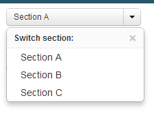
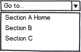
In our application, users can choose a "section" that controls what they're looking at. If they go to a different page, they should be able to click on the section name to be brought back to the "home page" of the section. They can use the dropdown to choose their current section (which is remembered across pages).
So far, we've used a split-button approach for this scenario:

From testing with a few of our users, it's not obvious that clicking the "Section A" navigates back to the section's "home page". They all understand that to change the section, click the drop down. But can't figure out how to get back "home" of the section.
You can think of it like the navigation inside of a GitHub repository. If you want to go back to the "homepage" of the repository, you click the repository name. One differenece, however, is that UI doesn't have the ability to quickly switch to a different repository of that user.

One approach we've been thinking of is changing it to a link. However, our product manager said "it looks too ugly":

With bigger font:

With a different dropdown icon (taken from YT for design ideas) that was deemed not obvious by our product manager:

The product manager thinks that we should just leave the original split button and then have a link in our left-side navigation with the text "Home" that always navigates to the section "home". I would like to prevent the duplication of menu items.
How can we make the split button so that it affords clicking the name to navigate "home"? Are there some other sites that use this pattern for navigation?

