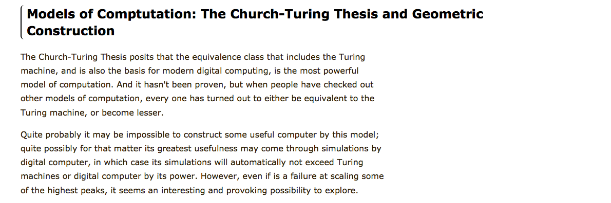
A few suggestions:
- Use different fonts/colours for breadcrumbs and body content. This look the same and it's not easy to differentiate where sections starts
- Separate sections, title and content so it's easier to notice scan through in case the user doesn't want to read all
- Don't add any background (zebra) to the images, it's just noise for the eyes
- You might also like can be a separate section, different background, etc.
A few general rules of body text are:
Text Length
Writing for the web is a whole different thing than writing for
print. Users want smaller pieces of text. They hardly ever read an entire page, instead, they scan for keywords.Therefore if you have to add much text, do it in such a way that it doesn't seem that is a long long text. Section it.
Sections
Break your page into sections, so the user can see quickly what the page is about and this will make them read the contents.
Leading
As with print design, take a look at your leading. A starting point would be 12px leading or more for a font size of 10px.
Width
Is suggest a length of between 12 and 16 words per line.
Fonts
Sure bets are Tahoma and Verdana (both designed especially for on-screen usage), both with more than 90% availability on OS X and Windows.
Based on: > Introduction to Good Usability - peterpixel


