5

I'm currently working on a search engine, filter options are provided to allow users to refine their searches.

Example:

TYPE

[box] Firm

[box] Lawyer

[box] Transaction

[box] Company

When the user ticks a box, the selected item is moved to the top of the list and a 'clear' link appears at the top of the list (to restore default settings).

Example:

TYPE

Clear

[box ticked] Lawyer

[box] Firm

[box] Transaction

[box] Company

I'm wondering if adding an 'all' box at the top of the list would be a better option. This box would be ticked by default, and the user could tick this box to restore default settings.

What do you think about it?


EDIT:

I don't think I gave you enough details, sorry about that.

The interface has 7 filter groups, these groups are collapsible and only the first group ('Type') is expanded by default when the user searches something. Filter groups include up to 75 filters.

(I can't post a screenshot because I'm a new member.)

When the user expands a filter group, 6 filters are displayed followed by a 'see more' button. Clicking on the 'see more' link displays a pop-up showing all the filters available within this group.

For short filter lists (≤ 6 filters), I agree that I shouldn't move selected filters to the top because the user doesn't expect this behaviour. However, I'm dealing with long filter lists, therefore I think moving selected filters to the top afterwards (not on click) could offer a better readability, because the user will easily know in which filter groups he has selected filters (I observed this behaviour on Amazon and eBay).

Here is the user journey:

1 - Expand a given filter group

==> 6 filters are displayed followed by a 'see more' button

2 - Click on the 'see more' link

==> A pop-up is displayed showing all the filters available in this group

3 - Tick one or several boxes

4 - Click on apply

==> The search is refined accordingly, the filter group is updated (selected filters appear at the top of the list in alphabetical order, and a 'clear' link is added)

3 Answers 3

5

OkCupid has an interesting way of dealing with this that you may want to take a look at.

enter image description here

Basically, you can add filter criteria by selecting an additional one from the Advanced dropdown list, and you can remove existing filters (other than the basic ones) by selecting the x on the right of the optional filter.

This has the advantage that only the filters that you want to use are visible, and it also lets you specify details of the filter in a very organic way.

2

As Henrik Ekblom said, you should avoid moving elements when they're clicked, unless you do a very obvious animation of the elements fading in/out the respective areas. In this case though, I'd definitely avoid it. It's unnecessary.

Your refinement options seem like they could be mutually exclusive. If so, you should use radio buttons instead of check boxes, and the first default option should be "Search everything" or "All".

If multiple options can be selected for the same search, I'm personally not a fan of 'Clear' links. While the term 'Clear' makes sense to web professionals in the context of checkboxes, to the average user it's not so obvious. It could appear to mean clearing the search box and starting the search again. You'd want it to be really obvious, "Clear your checkbox selections", and even that could be confusing. I'd avoid it if you can.

An "All"/"Everything" option is ideal in theory, though you must consider the implied functionality of checkboxes to web users. An "All" checkbox would have to change the checked value of the 4 filters. So if I had checked Lawyer and Firm, subsequently checking "All" would have to either select or de-select all 4 options. This is not expected functionality from web checkboxes. The "All" option would probably have to be a button or text link, and is probably un-necessarily complicated in this instance.

In your situation, with only 4 possible checkbox options, I would show all four selected by default, and allow users to deselect the ones they're not interested in. This is super explicit and doesn't require a "Clear" or "All" option at all.

enter image description here

0

I would rather suggest that you don't move the selected item to the top - this might cause the user to be confused since the selected item will "disappear" under the mouse once clicked.

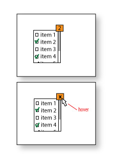
The mockup I added is using a system that work well for the places where I want to use multi select with a "clear all" option. As a bonus, the clear button can show the number of items selected.

Multi select with clear option

Depending on the target users, you can change the "x" to a label ("clear all", "clear" or similar) to further explain what it does...

Your Answer

By clicking “Post Your Answer”, you agree to our terms of service and acknowledge you have read our privacy policy.

Not the answer you're looking for? Browse other questions tagged or ask your own question.