4

We have a site with one page that has a big table, that we also want to add some graphs to. The table could quite easily fill up the whole page, both in terms of width and height, so the question is: where do we put the graphs in?

  • If we put them after the table, they're potentially hidden, as the table gets longer and longer.
  • One idea was to squeezed the table horizontally and then put the graphs in on the right. This makes sure everyone sees them, but has the drawback that now the table is very squeezed looking, and the graphs are small too.
  • Something "dynamic" - have small graph icons or hyperlinks that pull up more or less full-screen graphs in something like jQuery's dialogs.
  • Something else? Not much of a UI guy, so could well be we're missing something fairly obvious!
2
  • 2
    why not before the table? I did so in a pet project, and since the visual becomes the most "attractive" information for casual browsing it seems like a good fit. If you want to delve in the details you scroll. E.g. google analytics
    – riffraff
    Commented Jun 6, 2012 at 14:43
  • There are potentially a number of graphs, so the problem might be pushing the table itself too far off the page. Commented Jun 6, 2012 at 15:00

4 Answers 4

3

I think freezing your table and allowing it to scroll in a "frame" of sorts is probably the most viable solution. Then your table is always visible, and your charts can be placed easily above, or below depending on how you want your content organized.

The caveat to the suggestions I have is that this is assuming your table is basically a grid of data, but some of the concepts should apply even if it isn't.

Microsoft Dynamics CRM actually handles this concept pretty well I think. I believe their solution applies to your situation, even if you cannot apply scrolling to your table.

There are basically two types of designs used in the product:

  1. Chart focused design: Create a "Dashboard" where several charts are either below or above the table depending on which content is supposed to take priority, and which content will be used the most.
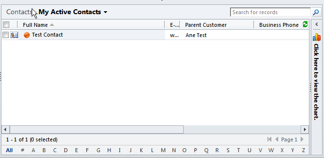
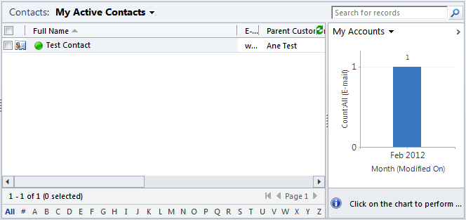
  2. Content table focused desgin: Allow the charts to be off to the right of the table, and allow their content area to be collapsible. The charts are selectable via a drop-down menu, so not all charts are shown at once. Depending on available screen real estate, it might be possible to show more than one.

An example of #2 with both the expanded and collapsed views.

enter image description here

enter image description here

2

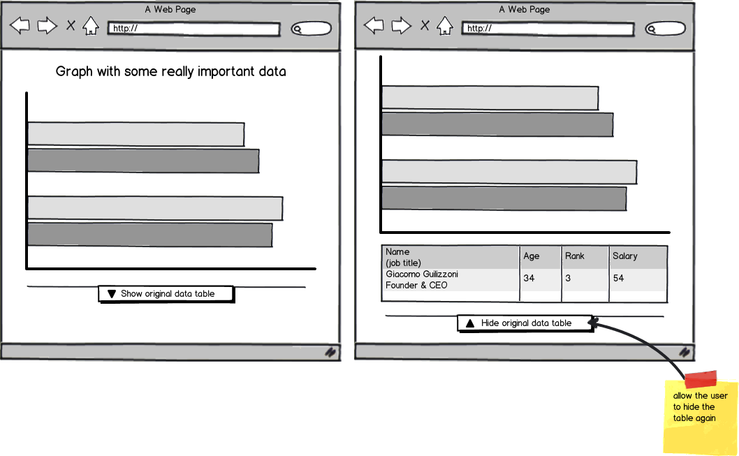
If you are trying to bring attention to the graph over the table, how about hiding the table by default and then adding the graph above the table. If users want to see the table at the point its a single click away. See mockup below:

mockup

download bmml source – Wireframes created with Balsamiq Mockups

1

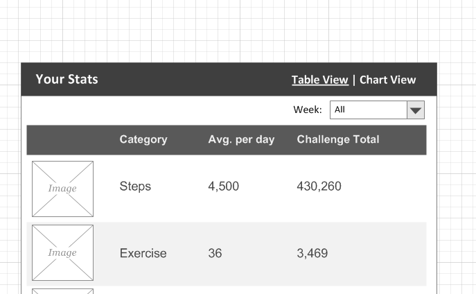
Why not set up a toggle, so the users can see a table view or a chart view in the same space?

Put a scroller or pagination on the table, to keep it to a reasonable length.

This will work if you're just displaying the same set of data two different ways. See sketch below.

enter image description here

1

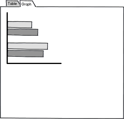
Have you considered using tabs?

mockup

download bmml source – Wireframes created with Balsamiq Mockups

Your Answer

By clicking “Post Your Answer”, you agree to our terms of service and acknowledge you have read our privacy policy.

Not the answer you're looking for? Browse other questions tagged or ask your own question.