11

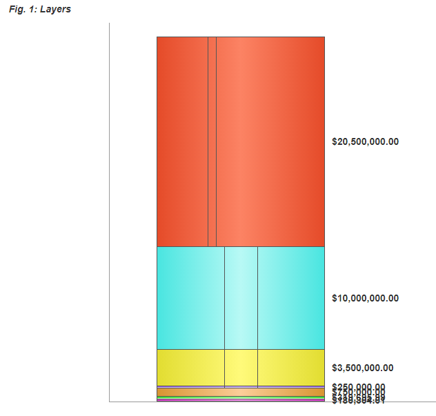
I have a web app that builds and displays a bar chart based on dollar amounts. A typical graph looks something like this:

typical graph

As you can see, the layers at the bottom of the graph have dollar amounts that are too small to show their labels without them overlapping.

What's the best way to compensate for this so that the bottom of my graphs are easier to read?

Things I've thought of:

  • Set up a minimum layer height so that the labels can't overlap. This looks the best but requires me to squish the remaining layers to make everything fit and so the graph is no longer accurate.

stretched

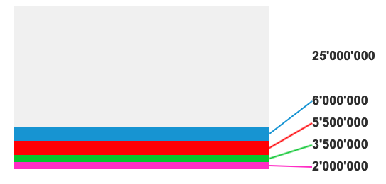
  • When a layer is too short, stagger the labels so they don't overlap. This is better than them overlapping but still doesn't look great IMO.

dashed

  • Remove the labels altogether and place them in a separate key/legend based on color. This is a clean solution but I already have the labels for the vertical slices separated into a key and I'm worried that the more I remove from the actual graph, the harder it is to interpret and therefore loses some of its value.
9
  • what do the colors signify in this chart? And is there a specific reason the are not in order of magnitude?
    – Mike M
    Commented Feb 27, 2019 at 15:20
  • @MikeM - The goal is to show a visual representation of the reinsurance process. So, in the example above, the first $180K is paid for by one party. The next $319K is paid for by someone else. The vertical slices represent when multiple parties split the bill. So the $3.5M after the first $1.5M (yellow layer) is split 3 ways with one party paying a smaller percentage. Commented Feb 27, 2019 at 15:27
  • how many splits can you have in a category? Is three the max? You could also have difficulty if multiple parties are splitting an already small category, am I correct?
    – Mike M
    Commented Feb 27, 2019 at 15:30
  • @MikeM - There's typically no more than 3. In theory, though, you're right. At one point the graph had labels directly on the splits that read something like "Reinsurer 1 - 40%", "Reinsurer 2 - 20%", "Reinsurer 3 - 40%". Commented Feb 27, 2019 at 15:48
  • 1
    Have you tried logarithms?
    – Sanchises
    Commented Feb 28, 2019 at 8:15

3 Answers 3

19

If it is absolutely necessary to see all the amounts in detail all the time you could go with a variation of your second solution but still keep the figures in one column. like this

enter image description here

Alternatively you could implement something like a magnifiyng glass to show the small amounts. I first thought about tool tips on hover but a amount could be so small, that the height of an amount is just one pixel an therefore not easy to hover over.

3
  • This is an attractive solution. The magnifying glass idea would work great for someone else but my graph gets converted to PDF so it can't be interactive. Commented Feb 27, 2019 at 16:00
  • If I can figure out how to code this from an HTML/CSS/JS perspective, this is probably my answer. Commented Feb 27, 2019 at 16:01
  • @TheIronCheek D3 probably has you covered there.
    – Seiyria
    Commented Feb 28, 2019 at 15:28
30

You have several visualization problems to solve in one graph. How are the users interacting with this?

Your question is focused mostly on labels, however, you also mentioned showing when an element is being split among several entities for payment, in addition to showing sequence of payments.

So you have a stacked bar - like graph doing some heavy lifting.

Users may need to understand and manipulate / explore:

  • who is paying (the label for the category)
  • the sequence of payments
  • their payment amount
  • the percentage a category is relative to the whole
  • which categories are split payments

I don't know your whole use case (and constraints), but you might consider altering the visualization type.

1. Consider a table for comparative values, and ability for sort and drilldown.

There are some tradeoffs (such as maybe more reading than a visual gestalt), but it brings data forward in a sortable fashion, and can show small % categories w/o eyestrain or interpretation.

Summary tables can:

  • Show totals (the summary at bottom, so users know the total, if that's important)
  • Show parts of the whole: the % column allows users to see relative values
  • Split payments by category (instead of vertical lines the user has to see in small volume categories, just label the category, and allow for hover details)
  • Sort for quick comparison
  • Scale: As more categories are added you can add additional rows
  • Display labels: your current labels still force the user to look for what color goes with which category

Is your visualization part of a larger dashboard?

If it is, you could put color legends in the table itself, to relate to other visualizations in close proximity:
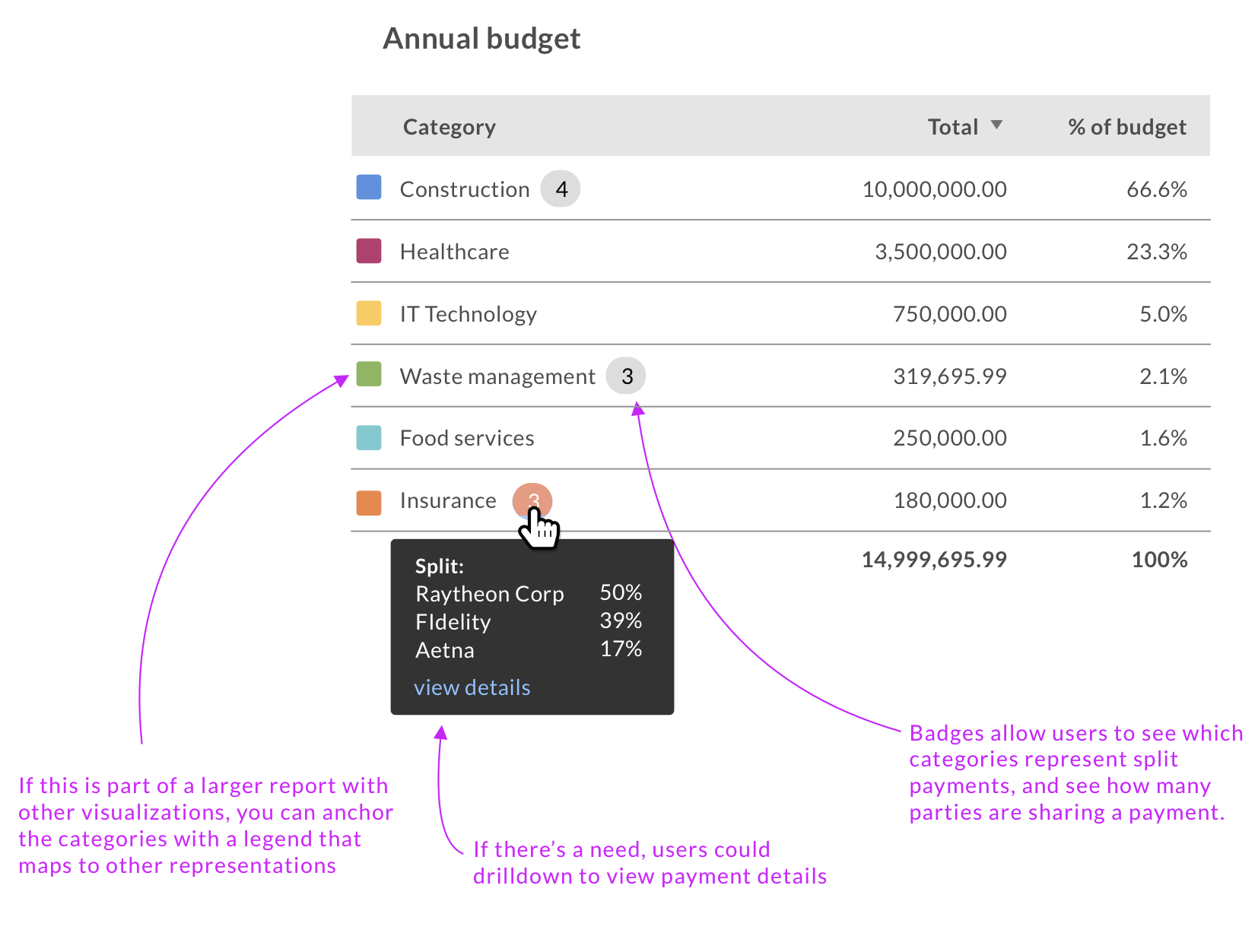
enter image description here

2. Or, try a horizontal bar chart.

In the stacked area example, users have to use height to see magnitude comparison at a glance.

With a horizontal chart, you can take advantage of humans ability to assess values by length. You can empower exploration by a sort control above the table.

from Show me the Numbers, by Stephen Few (pg 94):

Visual perception is highly tuned for seeing differences among the lengths of objects that share a common baseline but not well attuned for discerning differences among 2-D areas.
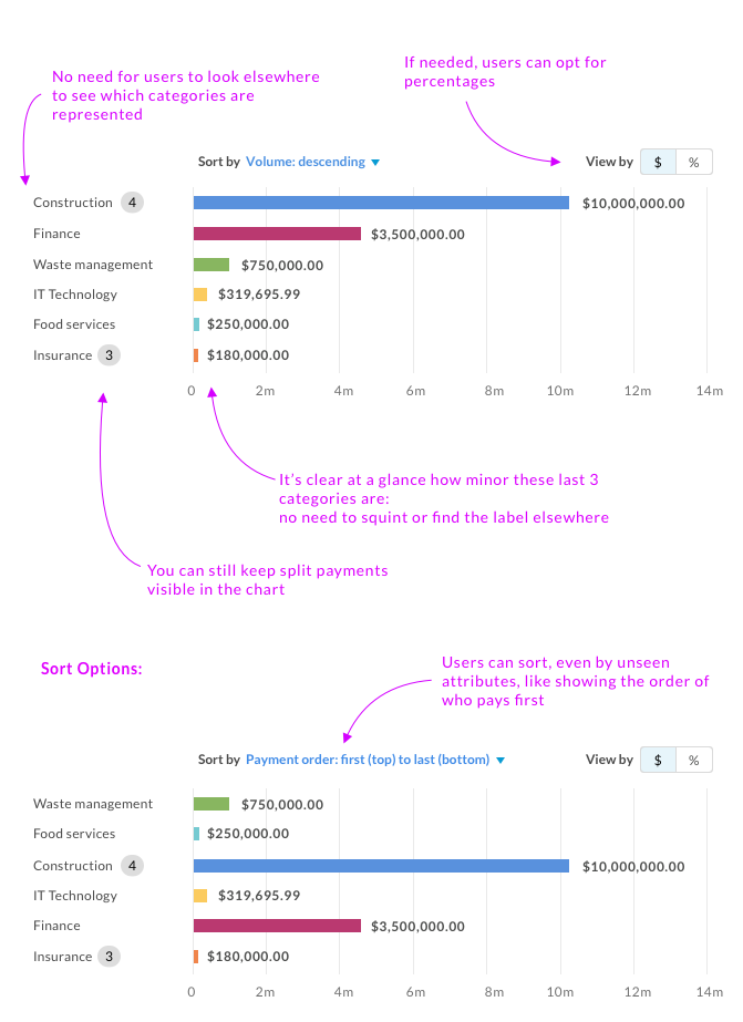
enter image description here

5
  • I'd say if a graph is necessary, a pie chart would be a much more apt chart here, but the separation between the data labels is a must. +1
    – Anoplexian
    Commented Feb 27, 2019 at 18:23
  • Your examples are great where magnitude is most important. In my situation, though, order is just as if not more important than magnitude. The point I'm trying to illustrate is who pays first and for how many dollars, followed by who pays second, etc. Commented Feb 27, 2019 at 19:06
  • In that case, you could possibly put a 'payment order' column on the table, and sort that way. Otherwise you're asking users to interpret the stacked column vertically by payment order, which could be different than dollar amounts, right?
    – Mike M
    Commented Feb 27, 2019 at 19:16
  • The payment order is sorted bottom to top in my graph so the bottom layer would be consumed first, followed by the next one up. The image I'm trying to evoke is more like a thermometer filling up. In other words, as the claim's dollar amount gets higher, additional layers are consumed and the payment distribution changes. Commented Feb 27, 2019 at 19:25
  • 1
    Unless your users are well versed in your visualizations, they might not read the chart the way you intend. Stacked bar charts do not usually indicate a timeline as well as segments of a whole. Commented Feb 28, 2019 at 16:59
0

You can try a combination of several types of charts and drill-down functionality.

Your Answer

By clicking “Post Your Answer”, you agree to our terms of service and acknowledge you have read our privacy policy.

Not the answer you're looking for? Browse other questions tagged or ask your own question.