0

We're designing a master vehicle inventory* settings template that can be overridden at the individual vehicle dealership* level.

The individual dealership Settings page opens in an Edit state so that the user can assign Override values quickly, save them, and close.

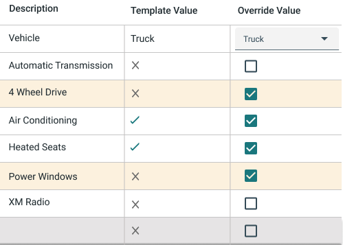
Template showing default and overridden values

The "4 Wheel Drive" row shows X as the Template value, which means "not included". The Override value has been checked by the user, which means "Set override to Included". The yellow highlighted background means "this value is different from the template" so that the user can quickly scan and see differences.

Users are telling us that they think the checked boxes are communicating "Yes, this value is overridden" rather than "Yes, include this item."

How can we make this less ambiguous and more intuitive?

Jobs to be done here include:

  • I want to understand the template values (we have to make them accessible from this page)
  • I want to set override values
  • I want to quickly see which values are overridden when I'm troubleshooting or updating

*Not really related to cars or dealerships. Masking sensitive info.

2 Answers 2

1
  1. A straight forward UI would be to have the same checkbox UI in the "Template value" column that you have in the "Override value", but in a disabled state to where they are clearly understood as unclickable/undefinable.

Additional design possibility: If it is unable to remove something that is standardly included in the particular vehicle, the record's checkbox can also be disabled in the "Override value" column.

  1. Keep the highlights to show when an "Override value" setting of a record doesn't match its "Template value" setting.

  2. Rename "Override value" so a checkmark doesn't mean "yes, here is an override value". Something like "Unique value" with something more clear

0

It seems reasonable to be more explicit if it's confusing for users. And it's hard to disagree with them on that. An imperative phrase as a column's title rarely makes sense.

If you received that kind of response, it appears to be the form that is not used frequently. Renaming the column to "Current Value" and prohibiting editing by default can make the UX more straightforward for the users. Only the special editing mode should enable the controls that can be manipulated. And when the editing mode is disabled, it would be clear that the shown static values are the current overridden values.

Your Answer

By clicking “Post Your Answer”, you agree to our terms of service and acknowledge you have read our privacy policy.

Not the answer you're looking for? Browse other questions tagged or ask your own question.