4

I'm involved in the design of a vehicle routing interface. It mainly consists of a Gantt-Chart, where jobs are arranged in a timeline. Each job is carried out at a different location. The total travel time in which the schedule can be carried out has to be optimized either manually or automatically. This is done by changing the order of the jobs and by changing the resource (=vehicle) a job belongs to.

The picture below shows the first draft of the interface. My problem focuses on the two ,,Optimize''-Buttons. They optimize the whole schedule with respect to two different optimization criteria (C1 and C2). Additionally it is possible to optimize single resources. This can be done with the buttons ,,Opt1'' and ,,Opt2" for the respective resources.
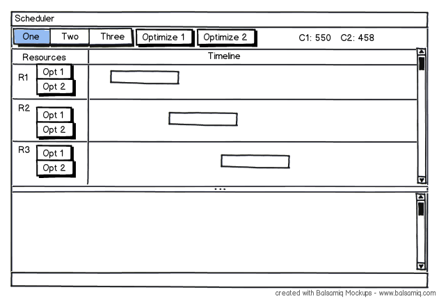
enter image description here

Now I have two problems:

  1. A third optimization criterion has to be included (later maybe even a fourth...)
  2. The results for C1, C2 and C3 are to be broken down for each resource

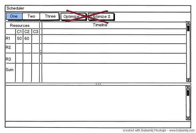
So we have decided to create a tabular resource view:
enter image description here

It shows the achieved values for the optimization criteria for each resource separately. Below the resources the sum shows the value for the overall schedule. This might be a good visualization, but my questions are:

which controls are suitable for the user to trigger the optimization? and where should the controls be placed?, as currently there are no ,,Optimize''-Buttons. One suggestion is to show a context-menu, if the user right-clicks in a cell, e.g. in cell R1/C1. The user must be able to decide, which resource is optimized with which criterion. Any help is appreciated.

2
  • FYI, you can now create Balsamiq mockups straight from SE posting windows by clicking on that smiley face (import option is also there). Those mockups can be downloaded to be used in answers.
    – dnbrv
    Commented Mar 1, 2012 at 14:27
  • Oh, that's great :-) Commented Mar 1, 2012 at 14:30

1 Answer 1

1

Suppose, I am the layman for the solution that you provide since I do not understand complete objective. I will address from the point of how the interface might be well suited.

The "Optimize" button should be located on the header section since it governs the entire schedule. Try adding a drop down to the "Optimize" button (similar to Google Mail (controls a set of controls under one hood) and moving it to the far right where it is separated from the usual schedule tracker. You can have Optimize 1,2,3...under the "Optimize" button & your count 50,60,70 in line with the "Optimize 1" [Optimize 1 (50)]. So it means that much less information is shown upfront and combined together.

Your interface 1 looks a lot more intuitive and easy, since it Section Titles are aligned left, and each section has a dedicated the Optimize button. If there are more items in Resource 1 as to Optimize (which I did not understand), you may use the same way as the other button as noted above and combine them under this button.

Your Answer

By clicking “Post Your Answer”, you agree to our terms of service and acknowledge you have read our privacy policy.

Not the answer you're looking for? Browse other questions tagged or ask your own question.