9

I am not a designer but I am dealing with a task to implement a functionality. I have to develop a working UI where a user can enter values into text-boxes inside a grid. While entering these values the user should have a reference value, which is different for each text-box in the grid. I therefore want to design a text-box where the user sees the reference value while entering the values. Can anyone suggest a good design to solve this problem?

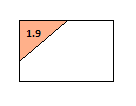
What I have thought of is having a custom text-box with an uneditable label on the top left of the text-box, while the other area of the text-box is editable (to enter the value).

enter image description here

So as seen in the image above, the top left is where I will show the value to be referred, while the white space is a text-box where the user can enter the value.

Below is another image with what I want to finally achieve:

enter image description here

If my proposed solution is a good one then how do I implement it? Are there other solutions anyone can suggest?

6
  • How many states do the grid boxes have?
    – Confused
    Commented Jan 16, 2017 at 9:18
  • 1
    just one state. the reference value is just to refer which is fixed and it will not change , it will come from backend. later on I am also looking for the user to enter a reason if there is a difference between the actual value entered and the referenced value. This specific functionality will be across all text boxes in the grid with validation. Any other solution better then one I have thought of is most welcomed..
    – Chetan
    Commented Jan 16, 2017 at 9:26
  • How many of these boxes would someone need to complete? Is the previou values always a small number with a decimal point? Commented Jan 16, 2017 at 9:28
  • one box per grid cell is required to complete. The previous values will always be less than 10 and in decimal upto 1 decimal place i.e 0.0 to 9.9
    – Chetan
    Commented Jan 16, 2017 at 9:31
  • 2
    why do the previous values matter?
    – Confused
    Commented Jan 16, 2017 at 12:00

4 Answers 4

6

I find the approach you present quite clear. I would simply organise the values without adding oblique lines and use some opacity to differentiate the elements.

In the image one of the fields is hovered, so it's buttons edit field and edit comment appear, which would open a simple dialog:

Normally the edit icon wouldn't be necessary as it is the only action. But in your case you have an extra action which is add a comment. These could be the possible interactions.

  1. Click in empty Field T (there are no edit/comment icons)
  2. Add value in Simple Dialog from Field T
  3. Enter
  4. Add comment in Simple Dialog from Field T
  5. Enter

Finished. Edit field:

  1. Click in Field T (not in edit or comment icon)
  2. Edit value in Simple Dialog from Field T
  3. Tab
  4. Edit comment in Simple Dialog from Field T
  5. Tab
  6. Edit value in Simple Dialog from Field U
  7. Tab
  8. Edit comment in Simple Dialog from Field U

etc.

Depending on the situation if the values will be changed without the need to change the comment, you could skip the comment edit (4+5) in the above workflow.

2
  • that's a good option, but for mass update , the user experience will slow down as textboxes are by default editable and can be navigated easily and continuously by the TAB key.
    – Chetan
    Commented Jan 16, 2017 at 13:45
  • @Chetan You can edit the value with the same method, tab opens the small dialog (like this image)
    – Alvaro
    Commented Jan 16, 2017 at 13:49
0

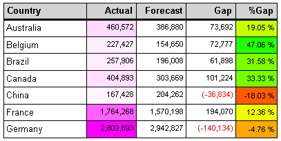
Use color coding

color coding of data table cells

Color coding differences between reference and actual values could help users quickly locate problematic fields. You can use colors or simply highlight a table cell with grey color.


Update:

when there is a mismatch between actual and reference value a reason should be entered

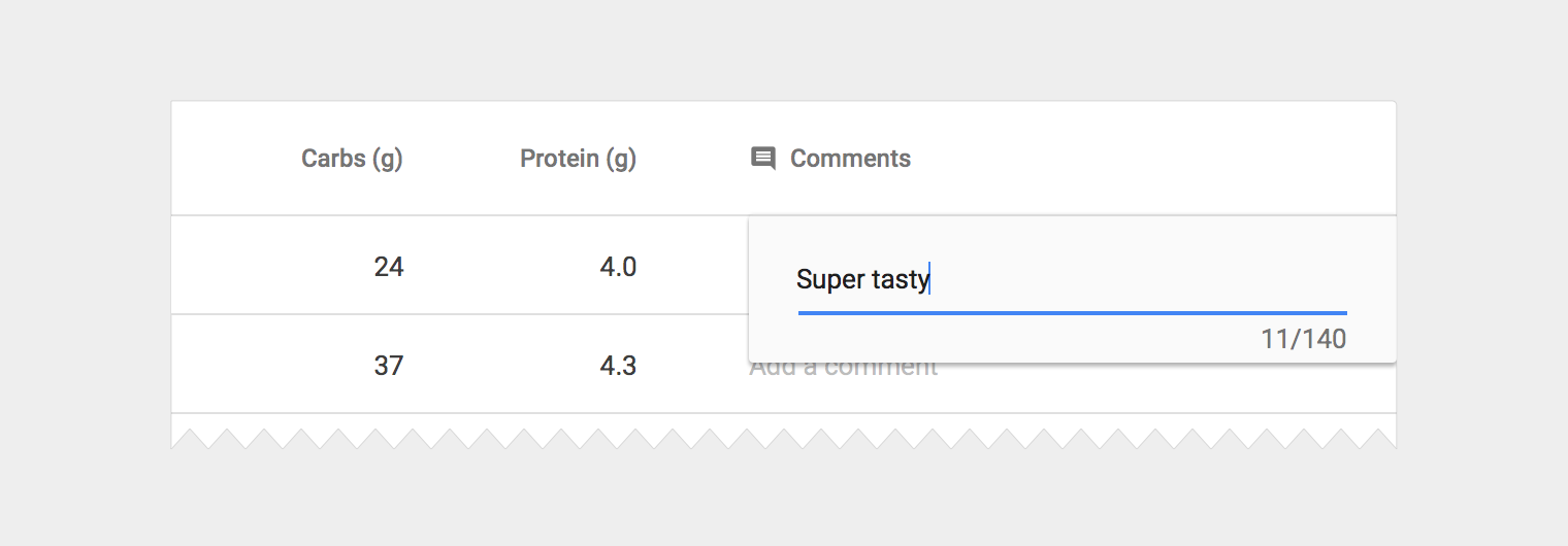
To put descriptive information in the intended field you could use a Popover. They are great for quick edits and entries. An input field is presented in-context to the related data so users don’t lose orientation in the data table.

popover input field in a data table

Then the entered description could be displayed as a tooltip. When you want to check why a particular cell has a mismatch user just hovers over it and reads the description. This way a lot of screen space is saved.

3
  • sounds good , but values have to be explicitly visualized and if there is a difference then some corner of textbox with expanding some panel to enter the reason? any suggestions?
    – Chetan
    Commented Jan 16, 2017 at 10:19
  • 1
    If I understood correctly when there is a mismatch between actual and reference value you should enter a reason? Commented Jan 16, 2017 at 11:19
  • 2
    Yes you are correct
    – Chetan
    Commented Jan 16, 2017 at 11:30
0

You can have a textbox and reference value as a placeholder text and when the user clicks on the textbox the old value disappears and he can enter the new value. For example : Search Box

0

Like all elements of a UI’s design, consistency with label positioning helps users and minimizes errors. This means it’s best if you can use the same approach in this form as in the other forms.

I suppose you will use an inline editing for this table (datatable probably) and you will have an input in every cell with the reference value as a label.

As development method, the label shouldn't have an absolute position necessarily. You can have a smaller height for the input than the cell and position the label before.

The advantages of having the label on the top of the input are:

  • the user may be able to see the label and the field within one glance;
  • allows for different label lengths and the width is bigger than if is in the corner;
  • easy to implement.

Your Answer

By clicking “Post Your Answer”, you agree to our terms of service and acknowledge you have read our privacy policy.

Not the answer you're looking for? Browse other questions tagged or ask your own question.