0

I am working on a desktop and mobile app that sometimes shows a list or grid of cards, that are clickable to get to the detail of each item.

I worry that some users may not understand that they can click on the card.

What would be a nice way to show it? We experimented with a "see more" link/button on each card but we are not satisfied with the output.

I have browsed the following questions, and found some useful insights.

Make it clear that a card is clickable : this one focuses on the specific issue regarding a clickable card holding other call to action.

Make Cards more clickable : the answers mainly focus on behavior on hover, which we cannot achieve on a mobile app (yet, we will experiment with hover behavior to improve experience on desktop)

How can I make it more obvious that a card view needs to be clicked? : adding a bit of elevation, is nice.

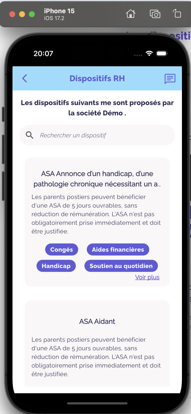
EDIT2 / SOLUTION : a bit of elevation, coupled with a "See more" link-like text, and a hover behavior did improve the overall "clickability" of the cards. See final version below.

final mobile version Final mobile version

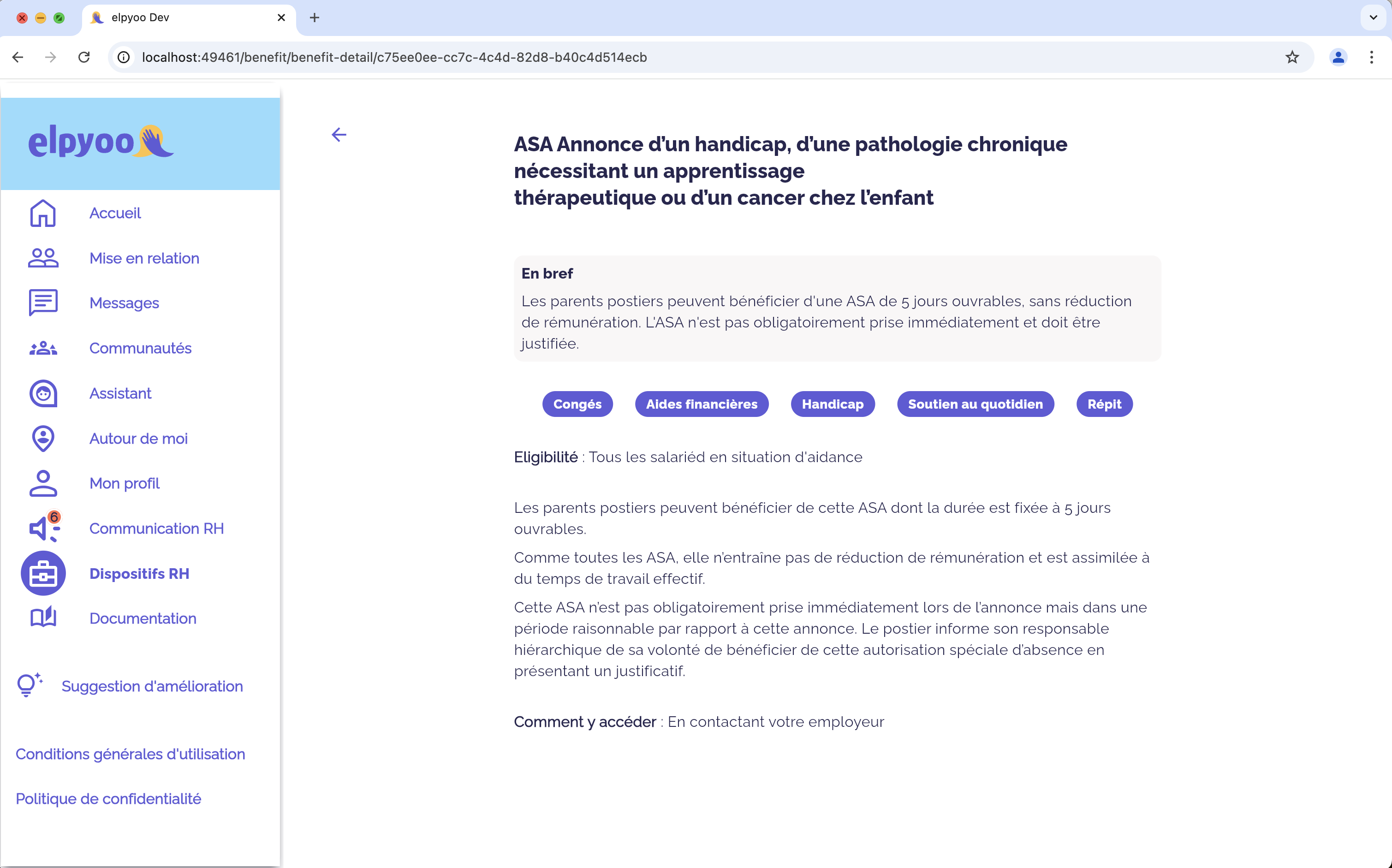
Initial versions: See the example screenshots below.

card list on mobile Card list on mobile

card list on desktop Card list on desktop

detail screen on desktop Detail screen on desktop

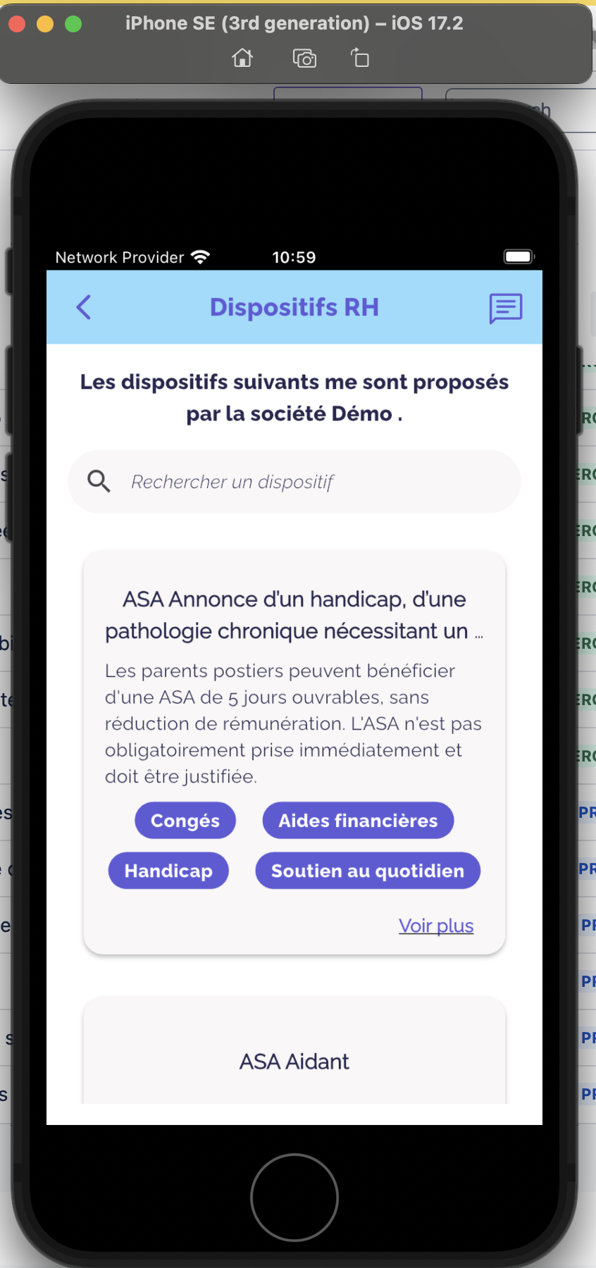
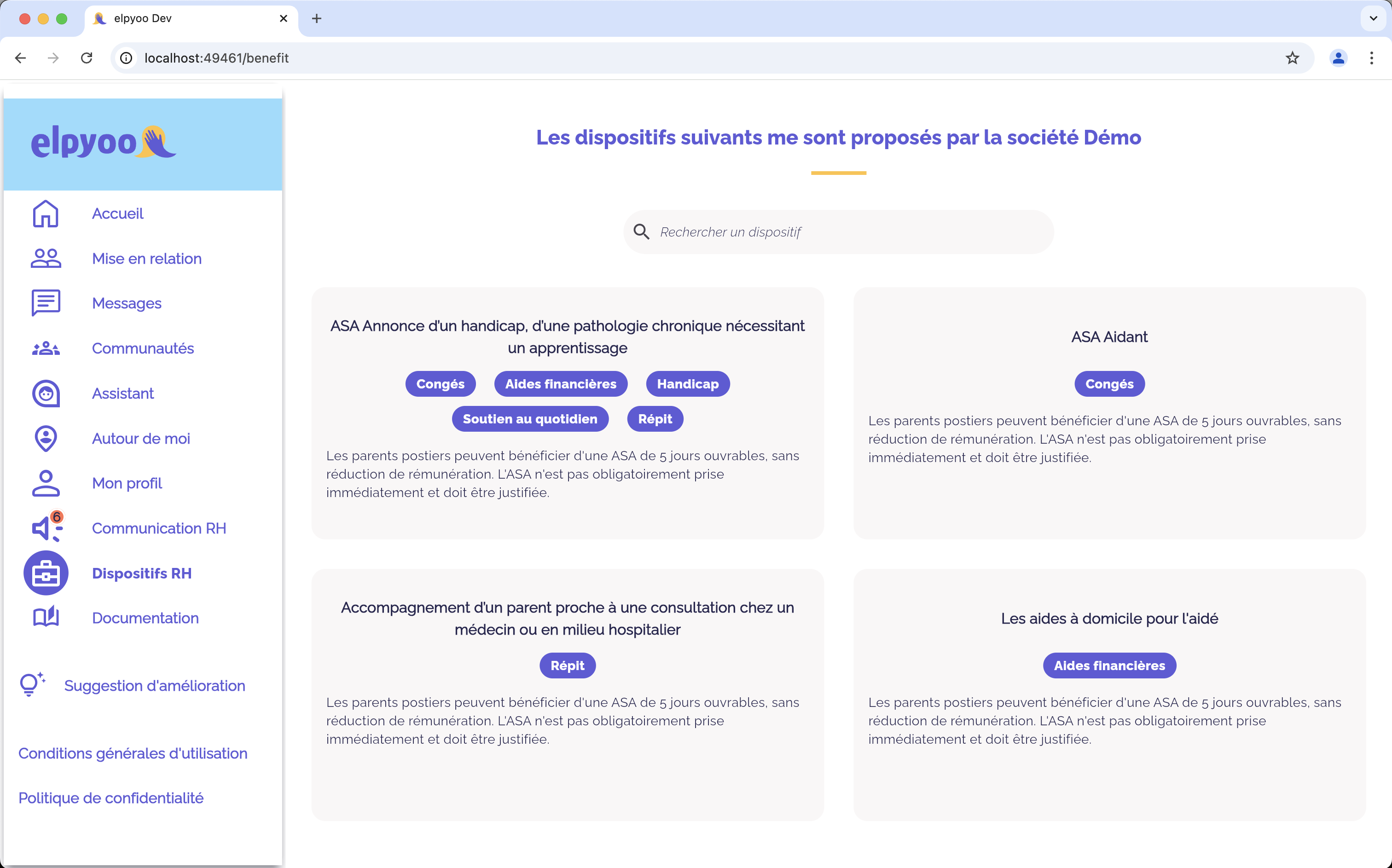
EDIT1: added the version with the "See more" link, which is ok on desktop but a bit off on mobile
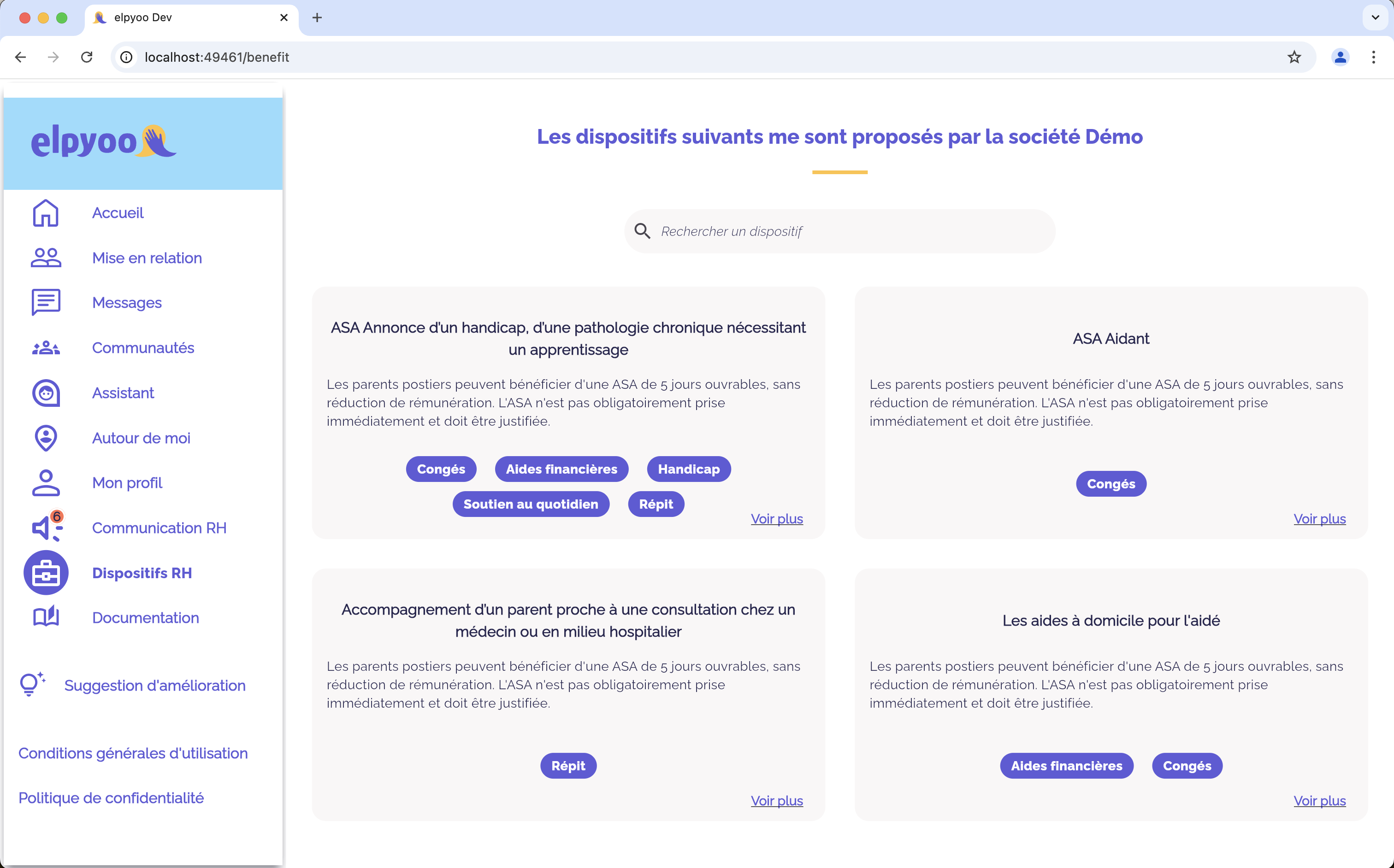
desktop version with see more Desktop version with "See more" link app version with see moreApp version with "See more" link

2
  • Can you elaborate on why "see more" isn’t the solution that you’re looking for and why that other question doesn’t provide an answer for you either?
    – jazZRo
    Commented Oct 3 at 13:27
  • 1
    There are no visual cues to indicate a clickable area. The pink background color only signifies grouping. There should be a 'See more' or caret on the card along with hover actions such as background color change perhaps. Additionally the card title should be a link. The related posts do have useful hints in them to solve this problem.
    – Ren
    Commented Oct 3 at 17:55

1 Answer 1

0

Have you considered an expansion panel? I find that to be a well-understood design pattern.

Based on your mocks, it seems that you have a good bit of text content. Material 3 documentation illustrates scrollable expansion panels for a desktop. In a mobile interface, expanding to full-screen may be a cleaner transition.

1
  • No, we have not considered yet this expansion panel solution. So far, we tend to maintain similar behavior between mobile and desktop apps, for development simplicity. But thanks for the insight! Commented Oct 3 at 18:59

Not the answer you're looking for? Browse other questions tagged or ask your own question.