4

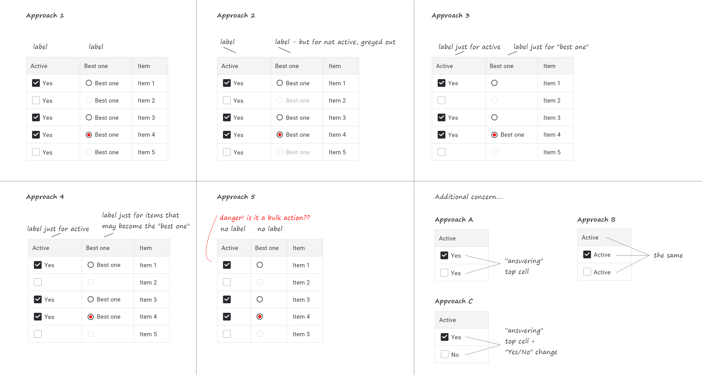
Table, which enables users to configure items within. User can select "active" items (checkboxes) and among them he/she needs to select just one "best one" item (radio button).

I created 5 possible versions, how this could be displayed:

    1. Both checkbox and radio button have label (no matter what)
    1. Checkbox has label, but label for inactive radio button is greyed out (to indicate that this item cant be selected as "the best one")
    1. Checkbox has label just when it's marked as active, radio button has label just when its selected as the "best one"
    1. Checkbox has label just when it's marked as active, radio button has label when it may be selected as the best one
    1. Both checkbox and radio button don't have label (IMO there is a big chance that it will be confused with bulk action checkbox - undesirable effect!)

Additional concern (if label is applied):

  • A. Should label "answer" the top-cell statement, and label should always say the same?

  • B. Should label repeat top-cell statement?

  • C. Should label "answer" the top-cell statement, and label should say different thing for checked ("Yes"), and different for unchecked item ("No").

enter image description hereWhich approach is correct?

2 Answers 2

2

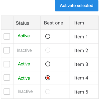
The repeated labels for the controls are not very useful and only add visual clutter. Using labels only for active controls is just confusing. In my example below the status column has repeated values but it is functional. If you would only display "active" and leave the status for inactive items blank, it would look cleaner, but might also give the impression of incomplete data or that something is broken. See this great answer about keeping the table clean.

If you have other tables with bulk actions, it is a reasonable concern that the checkboxes may give the impression of available bulk actions. In this case it is a good idea to give this table bulk actions too. It is consistent and users don't have to learn something new. Since the "Best one" option is not possible as bulk action it shouldn't be presented that way. I don't see harm in using the radio buttons.

enter image description here

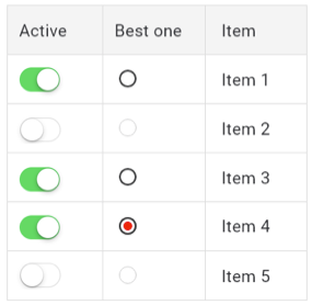
When activation of items is immediate (no save button needed) you can also consider using toggles instead of checkboxes.

enter image description here

1
  • This is absolutely awesome idea - especially second one. First one also could work, but in this case bulk action isn't actually 100% proper (let's say that enabling change at the same time wouldn't be so safe). But toogle and all comments regarding labels completely dispelled my doubts.
    – Iga
    Commented Mar 22, 2021 at 10:10
0

I would go for approach 5 and put the 'Active' and 'Best one' columns at the right, not at the left. This to prevent the confusion.

Your Answer

By clicking “Post Your Answer”, you agree to our terms of service and acknowledge you have read our privacy policy.

Not the answer you're looking for? Browse other questions tagged or ask your own question.