I am using Bootstrap's button groups to present checkboxes and radio buttons in the form of a button group. You can see an example of this functionality here: https://ng-bootstrap.github.io/#/components/buttons/examples
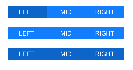
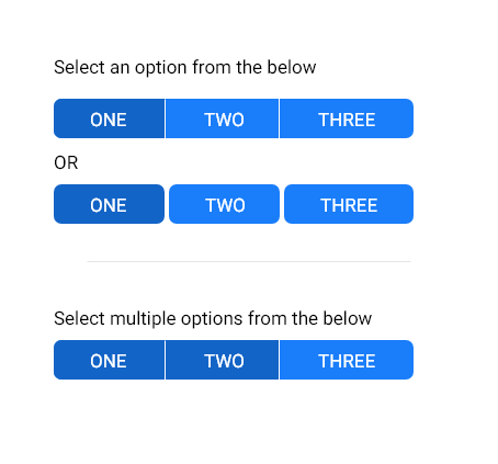
Here is a screenshot of what is on that site (top is a checkbox, bottom is a radio):
As you see, there is no difference between the two, the user will not know when they click on the button if it is going to allow multiple selections or not.
My question is, is this okay? Should I add some more styling to create a difference between them?
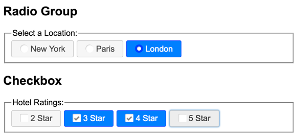
One idea I had was to add a circle and square to the radio and checkbox respectively before the button text so it is obvious what it is, but the program manager instantly hated the circle on the radio ones which leaves me to having the radio buttons be just the text, and checkboxes have a square with a checkmark next to the text.
Is this a good idea? Below is an image of what I have right now. I personally thought there should be a difference between them, and right now I'm at a loss as to how to do that best.


