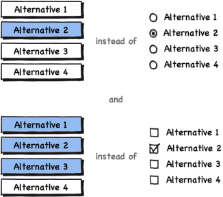
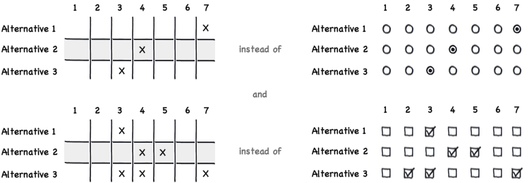
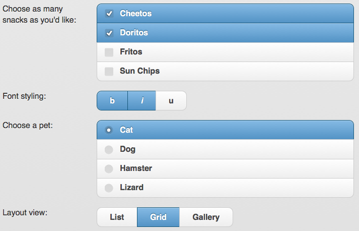
The challenge with your suggestion for checkbox and radio box replacements is that there is no visual distinguishing between the two types of behviours. The best UI design always sets user expectations BEFORE they have to interact with the control. I don't have enough rep yet to comment on erikrojo's response, but that certainly has the benefit of leveraging off of known idioms, while enjoying a larger hit zone.
A slider, as Glen suggests has the benefit of modeling itself on real-world tactile user interfaces that can have only a single state at a time - there's no ambiguity there, the way there is with radio buttons. The slider unfortunately also comes with its own implementation and usability challenges, and is much harder to lay out in the context of a form with a diverse control set.
A dial is a variant of a slider that integrates itself better into a layout (it's generally more compact), at a significant usability hit (the motion of the control is rotational - but user mouse input tends to be axonometric, and this can lead to confusion across different implementations)
A different approach might be to design an additional component to both the single-select and the multi-select controls that accurately informs the user of how many selections he has available to make. I'll try to explain the visual using real-world elements, and you could then abstract that into a digital representation in any way you like. Consider a bank of lightbulbs. If I have 5 possible answers, and I may select all, some or none, then I have 5 lightbulbs, all of them on. As I click my answer buttons (not the lightbulbs - they are not directly interactable) a lightbulb goes out and the button I clicked in some way becomes selected. As I continue to select additional answers, more lightbulbs extinguish.
Continuing with this concept, if I have a multiple-choice, single-answer question, then there is only one lightbulb in the bank. It's clear to me from the start that I get one answer.
Obviously using lightbulbs in your interface will look silly (or maybe not?) but you get the idea - we set the expectation right off the bat about how many selections / answers the user will be allowed to make for each question. One downside of this approach would be that the user may feel she has to "use up" all her choices before moving on. This could be easily mitigated by making it clear that after the user has made her first selection (even if multiple answers are possible), the next question becomes active or available. This could be done in a myriad of ways, from disabling / hiding the next question, to simply showing a checkmark or other indicator that the requirements for the current question have been met.


