48

Buttons used to be easily identifiable. Not anymore. Some buttons today are not immediately identifiable as buttons. And with some it's unclear whether they are enabled or not. But the old buttons look strange to users today so I rather not use them.

So how do I correctly signify a button to users?

(I'm not referring to blue underlined hyperlinks, nor to icons at the top of the app like ⚙️✂📋. Those seem fine.)

4 Answers 4

66

Your question revolves around signifiers for a button's design (i.e. hints that communicate what an element can do/how to interact with it).

I assume your primary concern with buttons is that many of them are becoming flat, borderless areas of text or icons, which often lack many of these important signifiers that indicate clickability.

There has been a very interesting progression in UI design since the early days of digital interfaces. Early digital user interfaces focused heavily on skeuomorphic design (i.e. designing UI elements to resemble their real-world counterparts), to completely flattening elements (using no shadow or indication of depth), to now using mostly flat elements, but with subtle shadows to communicate depth and focus (termed Flat 2.0).

So to actually answer your question...

Buttons need to appropriately signal to users that they are clickable. To do that, you can utilize a variety of design techniques (surely this is not a comprehensive list):

Note: I'm not claiming that all of these are excellent examples of buttons, but they each adequately exemplify the points listed.

  • Borders/shading which resemble a three-dimensional real-world button, as seen on this very site:

    UX.SE's "Post Your Answer" button

  • Drop shadow, seen (subtly) in Google's Material Design guidelines:

    Material Design button example

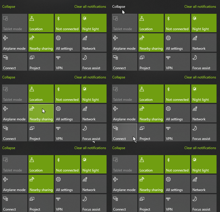
  • Hover animations. Use caution to only use these in conjunction with other affordances, as these cannot be utilized on mobile interfaces. Example from Windows 10's Action Center:

    Windows 10 button hover animation

  • Placement/convention can be relied upon when the interaction is a familiar pattern. In the WhatsApp desktop app, access to emojis or voice dictation are represented near the text input field. There's little-to-no affordance that these are actual clickable buttons, but the interaction can be inferred, as it follows many other chat clients before it.

    WhatsApp chat interface

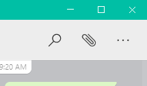
  • Spacing. Elsewhere in the same WhatsApp interface, there are additional options for your conversation. These are spaced far apart, which provides an adequate target area. Buttons have traditionally been padded with sufficient spacing so the user can point and click without much difficulty, so perhaps this indicates subconsciously that the space is allotted for a clickable interaction.

    Additional WhatsApp icon buttons

  • Consistency in the interface's design. Using the example of WhatsApp's interface once more, discovery of a single one of these buttons will enable the user to recognize all buttons in the interface.

  • (Okay, last WhatsApp example, I promise...) Not sure the UX term for this, but the WhatsApp design also contains an element of "well what else would this be for?" The buttons do not communicate information, but are reserved a fair amount of space, so let's click on it!

The bottom line is...

There are several tools to choose from, and as the designer, you simply have to ensure that your elements have enough of these clues to nudge the user in the right direction.

10
  • 9
    Thanks. Consistency is a nice point.
    – ispiro
    Commented Mar 12, 2020 at 19:07
  • 7
    maxathousand has covered most of everything, so there's no point in adding another answer, but I'd like to add to this answer. The most important visual key to a button is contrast. This refers both to the button itself contrasting against the background behind it, but also to the text within the button contrasting against the button itself.
    – Davbog
    Commented Mar 12, 2020 at 20:34
  • 3
    @Davbog Feel free to turn that into an actual answer.
    – Mast
    Commented Mar 13, 2020 at 8:43
  • 9
    I really prefer three-dimensional buttons, even with flat-design. It gives a clear visual indicator that something has "popped out" and wants to be pressed. "Action Links", especially if they don't react to hovering at all, are terrible UX in my opinion. They are borderline hostile to users, to whom navigating a computer interface is not intuitive. (E.g. I might know edit is a clickable button, but my grandma does not)
    – MechMK1
    Commented Mar 13, 2020 at 12:26
  • 1
    What @MechMK1 referred to by edit is the edit button right below questions and answers here on StackOverflow. The light gray text "edit" to the right of the same colored "share" that are "action links".
    – ispiro
    Commented Mar 13, 2020 at 12:53
6

I'm expanding my comment on maxaathousand's answer as requested and have added some additional insight:

The most important visual key to a button is contrast (see what I did there?). This refers to:

  • The button contrasting against the background behind it
  • The button contrasting against surrounding elements and the whole page
  • The text or symbol within the button contrasting against the button itself
  • The button contrasting against other buttons or button types

With that said these can be achieved with various graphical styles and trends. For example in skeuomorphism, highlights, shading, and shadows are used to create a 3D-like effect to visually raise the button above its background whereas in flat design, color contrast and larger padding is used.

Consistency is key for button usage in the sense that no other item should use the same style as the button because this would result in the button having less contrast against its neighboring elements. Consistency holds true for different button types too. For example, main buttons should be of a certain style, while secondary buttons should be of another.

While hovering over a button can help indicate that it is a functional button, this should not be solely relied on because it is not possible on touch interfaces. On cursor interfaces, this is used more to add effects solely for decorative purposes.

The second most important visual key to a button is the identifier. As buttons are used to trigger an action, they should indicate this. Be sure that the text or symbol within the button is clear enough. To publish this answer I will press the button with the action text "Post Your Answer", or I will "Submit" a filled out contact form, or I will "Sign Up" for a newsletter, etc.

If a button is merely for navigation, it should be clear where it goes -- "Next", "Home", etc.

1

I just had a half hour Skype talk with my old mom. She understood she must hit the button - she was not able to see the two buttons on the screen right in front of her! This definitely would never happened decades ago, when the buttons pictured like the true 3D buttons. It is also true for windows and other GUI elements. Older people just do not see them on the screen, even when right in front of them.

I think that well designed UI that takes all groups of users in mind should have the "classic look" mode to show the buttons as close to 3D realistic view as possible. Some people must use computers now that first time tried them well after retirement. Here:

enter image description here

is the proper example (from Wikipedia Commons):

This button has the proper shading both on the button and around it. It has clear, well readable text in a normal font size and normal color contrast. The button color differs from the background color with the clear contrast between the two. It gets without unusual colors.

This button looks for me really nice. Really. I wish to see more buttons like this again. I will press them with enjoyment calling your design great. Why do designers think I must spend no less than ten seconds looking for buttons just to like the result of they work? And not in reverse?

If you wish to impress the users, would not be the first goal just not to enrage them? To make thinks even more clear, this is that I definitely will never like:

enter image description here

(derived from Commons).

3
  • The problem with the high spectral reflectance buttons (reflective/shiny) is that lately, it's become synonomous with less seriousness. These bubble buttons are now frowned upon commonly. I'm not 100% sure why, because they can definitely punch out of the page as an indicator of where to click. But I do see the point: You don't want to make the page/window look like a toy, unless the UI as a whole is meant to actually be a toy. Commented Mar 15, 2020 at 14:17
  • Most important is to put the feeling of 3D surface. It does not need to be a mirror-like reflection, even if I personally would not see any problems with this.
    – h22
    Commented Mar 15, 2020 at 14:47
  • 2
    The first thing that comes mind when seeing the first button is "scammy advertisement", not sure why.
    – Voo
    Commented Mar 15, 2020 at 16:57
0

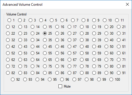
For buttons, well, I'm obligated to post this radio button mess:

enter image description here

(This is fairly fun: https://uxdesign.cc/the-worst-volume-control-ui-in-the-world-60713dc86950)

1
  • 2
    Since this is just a bunch of designers/developers having some fun, I think it is better to actually post a real world example to illustrate the point. Also, the buttons are numerous but identifiable as buttons, whereas the OP is suggesting that they don't really look like clickable things all the time...
    – Michael Lai
    Commented Mar 26, 2020 at 22:56

Your Answer

By clicking “Post Your Answer”, you agree to our terms of service and acknowledge you have read our privacy policy.

Not the answer you're looking for? Browse other questions tagged or ask your own question.