5

Similarly to the author of this question, I was thinking about replacing a disabled button by one giving a feedback why the action is not allowed. That's not subject of my question as in my case, I'm pretty sure the feedback must be given.

The question is how to do it. I use material-ui and there's no support for this. I considered the following

  • The standard disabled button. That's bad as it very clearly indicates that it should not be clicked, so most users won't try and won't get any feedback.
  • The standard non-disabled button. That's better but it'd nice to make clear that it won't really work.
  • A different color. Unfortunately, there's a bunch of images in different colors nearby, so it can improbably help. Moreover, in some places, there's just a single button, so making it pale like in the image below won't work due to lack of comparison.
  • An icon. Unfortunately, there's no place there.
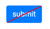
  • A strike-through text. Unfortunately, it looks more like a visual bug than anything else.

So I need something compact and clearly indicating a non-standard state yet inviting to click. Any idea?

proposed solution

TL;DR What I'm asking about is how to visually indicate that the wanted action can't be done, but the button can be clicked in order to get a hint. I find such an indication important as it gives the user a positive feedback when they do an action enabling the button. I'm thinking about something like in this image, just better.

My idea

4 Answers 4

2

I had to solve a similar problem recently. I had to turn all components in a screen read-only. Not disabled, but read-only, where user could interact with all values in the components, but not change it. The approach we took with buttons was:

  • For web: on hover, the mouse cursor changed to the not-allowed state, with a tooltip informing the user why it was not possible to click

Cursor not allowed

  • For mobile: When touching the button, it shows a tooltip like the one on web

For both cases we didn't change the button style, it would look like any button on active state.

1
  • Apologies for being unclear. Lacking a better idea, I may do what you did, but I'd really like to change the state to indicate that the action is impossible and a hint can be obtained instead.
    – maaartinus
    Commented Jan 28, 2020 at 11:28
2

Since you want the user to be aware of when the button can be used, you can do a few things:

  1. Add a text explaining that and why submitting is not possible yet. But you probably have no space for that.

  2. Let users discover themselves that the button can not yet be used. Thus stick with the normal button, it is the only way to be sure users are going to click it.

If you need users to notice when a submit is possible and the button becomes "enabled", I would add a small indicator on the button. like a tag or something that states that the action is blocked, not disabled. Just an idea:

enter image description here

2

I answered something very similar not long ago:
Should disabled buttons give feedback when clicked?

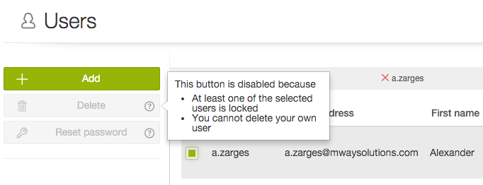
Basically this is a viable solution as well, add an extra element on top of the disabled button, making it clear that there's more to it than just a disabled state:

enter image description here

2
  • 1
    Ah, I remember our little discussion there ;-). I would still give that button a higher contrast (thinking a11y) and the question mark a color, but that would almost be like it isn't disabled. Sorry, we've been there already.
    – jazZRo
    Commented Jan 28, 2020 at 16:35
  • 1
    @jazZRo Haha, I've gone through our comments as well and I agree with you ;)
    – Big_Chair
    Commented Jan 28, 2020 at 17:14
0

Two thoughts come to my head if I understand your question correctly. Both of these are using other Material UI components.

  • If you need to allow the button to be clicked, have the button not disabled and on click, have a snackbar give the message to the user.
  • If you can disable the button but want to give feedback on why it is disabled, use a Popover component on hover explaining why it is disabled.
1
  • That's actually similar to what I'm doing now (I tried Snackbar, Popover and a non-intrusive small Dialog). Apologies for being unclear. What I need is a visual indication of the disabled-but-giving-feedback state.
    – maaartinus
    Commented Jan 28, 2020 at 11:23

Your Answer

By clicking “Post Your Answer”, you agree to our terms of service and acknowledge you have read our privacy policy.

Not the answer you're looking for? Browse other questions tagged or ask your own question.