Replaced "affordance" with "signifier", as clarified by Mike M.
Source Link
maxathousand
  • 19.6k
  • 6
  • 45
  • 65

The UX term with which yourYour question is concerned is called "affordance"revolves around signifiers for a button's design (i.

From the above linked article:e. hints that communicate what an element can do/how to interact with it).

Affordance is a property or feature of an object which presents a prompt on what can be done with this object. In short, affordances are cues which give a hint how users may interact with something, no matter physical or digital.

I assume your primary concern with buttons is that many of them are becoming flat, borderless areas of text or icons, which often lack many of these important signifiers that indicate clickability.

There has been a very interesting progression in UI design since the early days of digital interfaces. Early digital user interfaces focused heavily on skeuomorphic design (i.e. designing UI elements to resemble their real-world counterparts), to completely flattening elements (using no shadow or indication of depth), to now using mostly flat elements, but with subtle shadows to communicate depth and focus (termed Flat 2.0).

So to actually answer your question...

Buttons need to appropriately signal to users that they are clickable. To do that, you can utilize a variety of design techniques (surely this is not a comprehensive list):

Note: I'm not claiming that all of these are excellent examples of buttons, but they each adequately exemplify the points listed.

  • Borders/shading which resemble a three-dimensional real-world button, as seen on this very site:

    UX.SE's "Post Your Answer" button

  • Drop shadow, seen (subtly) in Google's Material Design guidelines:

    Material Design button example

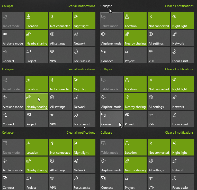
  • Hover animations. Use caution to only use these in conjunction with other affordances, as these cannot be utilized on mobile interfaces. Example from Windows 10's Action Center:

    Windows 10 button hover animation

  • Placement/convention can be relied upon when the interaction is a familiar pattern. In the WhatsApp desktop app, access to emojis or voice dictation are represented near the text input field. There's little-to-no affordance that these are actual clickable buttons, but the interaction can be inferred, as it follows many other chat clients before it.

    WhatsApp chat interface

  • Spacing. Elsewhere in the same WhatsApp interface, there are additional options for your conversation. These are spaced far apart, which provides an adequate target area. Buttons have traditionally been padded with sufficient spacing so the user can point and click without much difficulty, so perhaps this indicates subconsciously that the space is allotted for a clickable interaction.

    Additional WhatsApp icon buttons

  • Consistency in the interface's design. Using the example of WhatsApp's interface once more, discovery of a single one of these buttons will enable the user to recognize all buttons in the interface.

  • (Okay, last WhatsApp example, I promise...) Not sure the UX term for this, but the WhatsApp design also contains an element of "well what else would this be for?" The buttons do not communicate information, but are reserved a fair amount of space, so let's click on it!

The bottom line is...

There are several tools to choose from, and as the designer, you simply have to ensure that your elements have enough of these clues to nudge the user in the right direction.

The UX term with which your question is concerned is called "affordance".

From the above linked article:

Affordance is a property or feature of an object which presents a prompt on what can be done with this object. In short, affordances are cues which give a hint how users may interact with something, no matter physical or digital.

I assume your primary concern with buttons is that many of them are becoming flat, borderless areas of text or icons.

There has been a very interesting progression in UI design since the early days of digital interfaces. Early digital user interfaces focused heavily on skeuomorphic design (i.e. designing UI elements to resemble their real-world counterparts), to completely flattening elements (using no shadow or indication of depth), to now using mostly flat elements, but with subtle shadows to communicate depth and focus (termed Flat 2.0).

So to actually answer your question...

Buttons need to appropriately signal to users that they are clickable. To do that, you can utilize a variety of design techniques (surely this is not a comprehensive list):

Note: I'm not claiming that all of these are excellent examples of buttons, but they each adequately exemplify the points listed.

  • Borders/shading which resemble a three-dimensional real-world button, as seen on this very site:

    UX.SE's "Post Your Answer" button

  • Drop shadow, seen (subtly) in Google's Material Design guidelines:

    Material Design button example

  • Hover animations. Use caution to only use these in conjunction with other affordances, as these cannot be utilized on mobile interfaces. Example from Windows 10's Action Center:

    Windows 10 button hover animation

  • Placement/convention can be relied upon when the interaction is a familiar pattern. In the WhatsApp desktop app, access to emojis or voice dictation are represented near the text input field. There's little-to-no affordance that these are actual clickable buttons, but the interaction can be inferred, as it follows many other chat clients before it.

    WhatsApp chat interface

  • Spacing. Elsewhere in the same WhatsApp interface, there are additional options for your conversation. These are spaced far apart, which provides an adequate target area. Buttons have traditionally been padded with sufficient spacing so the user can point and click without much difficulty, so perhaps this indicates subconsciously that the space is allotted for a clickable interaction.

    Additional WhatsApp icon buttons

  • Consistency in the interface's design. Using the example of WhatsApp's interface once more, discovery of a single one of these buttons will enable the user to recognize all buttons in the interface.

  • (Okay, last WhatsApp example, I promise...) Not sure the UX term for this, but the WhatsApp design also contains an element of "well what else would this be for?" The buttons do not communicate information, but are reserved a fair amount of space, so let's click on it!

The bottom line is...

There are several tools to choose from, and as the designer, you simply have to ensure that your elements have enough of these clues to nudge the user in the right direction.

Your question revolves around signifiers for a button's design (i.e. hints that communicate what an element can do/how to interact with it).

I assume your primary concern with buttons is that many of them are becoming flat, borderless areas of text or icons, which often lack many of these important signifiers that indicate clickability.

There has been a very interesting progression in UI design since the early days of digital interfaces. Early digital user interfaces focused heavily on skeuomorphic design (i.e. designing UI elements to resemble their real-world counterparts), to completely flattening elements (using no shadow or indication of depth), to now using mostly flat elements, but with subtle shadows to communicate depth and focus (termed Flat 2.0).

So to actually answer your question...

Buttons need to appropriately signal to users that they are clickable. To do that, you can utilize a variety of design techniques (surely this is not a comprehensive list):

Note: I'm not claiming that all of these are excellent examples of buttons, but they each adequately exemplify the points listed.

  • Borders/shading which resemble a three-dimensional real-world button, as seen on this very site:

    UX.SE's "Post Your Answer" button

  • Drop shadow, seen (subtly) in Google's Material Design guidelines:

    Material Design button example

  • Hover animations. Use caution to only use these in conjunction with other affordances, as these cannot be utilized on mobile interfaces. Example from Windows 10's Action Center:

    Windows 10 button hover animation

  • Placement/convention can be relied upon when the interaction is a familiar pattern. In the WhatsApp desktop app, access to emojis or voice dictation are represented near the text input field. There's little-to-no affordance that these are actual clickable buttons, but the interaction can be inferred, as it follows many other chat clients before it.

    WhatsApp chat interface

  • Spacing. Elsewhere in the same WhatsApp interface, there are additional options for your conversation. These are spaced far apart, which provides an adequate target area. Buttons have traditionally been padded with sufficient spacing so the user can point and click without much difficulty, so perhaps this indicates subconsciously that the space is allotted for a clickable interaction.

    Additional WhatsApp icon buttons

  • Consistency in the interface's design. Using the example of WhatsApp's interface once more, discovery of a single one of these buttons will enable the user to recognize all buttons in the interface.

  • (Okay, last WhatsApp example, I promise...) Not sure the UX term for this, but the WhatsApp design also contains an element of "well what else would this be for?" The buttons do not communicate information, but are reserved a fair amount of space, so let's click on it!

The bottom line is...

There are several tools to choose from, and as the designer, you simply have to ensure that your elements have enough of these clues to nudge the user in the right direction.
Source Link
maxathousand
  • 19.6k
  • 6
  • 45
  • 65

The UX term with which your question is concerned is called "affordance".

From the above linked article:

Affordance is a property or feature of an object which presents a prompt on what can be done with this object. In short, affordances are cues which give a hint how users may interact with something, no matter physical or digital.

I assume your primary concern with buttons is that many of them are becoming flat, borderless areas of text or icons.

There has been a very interesting progression in UI design since the early days of digital interfaces. Early digital user interfaces focused heavily on skeuomorphic design (i.e. designing UI elements to resemble their real-world counterparts), to completely flattening elements (using no shadow or indication of depth), to now using mostly flat elements, but with subtle shadows to communicate depth and focus (termed Flat 2.0).

So to actually answer your question...

Buttons need to appropriately signal to users that they are clickable. To do that, you can utilize a variety of design techniques (surely this is not a comprehensive list):

Note: I'm not claiming that all of these are excellent examples of buttons, but they each adequately exemplify the points listed.

  • Borders/shading which resemble a three-dimensional real-world button, as seen on this very site:

    UX.SE's "Post Your Answer" button

  • Drop shadow, seen (subtly) in Google's Material Design guidelines:

    Material Design button example

  • Hover animations. Use caution to only use these in conjunction with other affordances, as these cannot be utilized on mobile interfaces. Example from Windows 10's Action Center:

    Windows 10 button hover animation

  • Placement/convention can be relied upon when the interaction is a familiar pattern. In the WhatsApp desktop app, access to emojis or voice dictation are represented near the text input field. There's little-to-no affordance that these are actual clickable buttons, but the interaction can be inferred, as it follows many other chat clients before it.

    WhatsApp chat interface

  • Spacing. Elsewhere in the same WhatsApp interface, there are additional options for your conversation. These are spaced far apart, which provides an adequate target area. Buttons have traditionally been padded with sufficient spacing so the user can point and click without much difficulty, so perhaps this indicates subconsciously that the space is allotted for a clickable interaction.

    Additional WhatsApp icon buttons

  • Consistency in the interface's design. Using the example of WhatsApp's interface once more, discovery of a single one of these buttons will enable the user to recognize all buttons in the interface.

  • (Okay, last WhatsApp example, I promise...) Not sure the UX term for this, but the WhatsApp design also contains an element of "well what else would this be for?" The buttons do not communicate information, but are reserved a fair amount of space, so let's click on it!

The bottom line is...

There are several tools to choose from, and as the designer, you simply have to ensure that your elements have enough of these clues to nudge the user in the right direction.