0

I've been reading about the "text vs icon" debate for some while already. Most of the articles and questions here are dated back to 2010-2016, so I wonder if they still apply for material Design for web.

My team uses the material design guidelines to develop a web (desktop) app.

When are text buttons preferred over an icon-only button?

Two cases come to my mind:

The first is a Search field we use all across the app. It looks like this: Search field

I find the "Search" text and the magnifying glass icon redundant (EDIT: please note that it's a search-as-you-type kind of search field, and the magnifying glass icon is not a button, but just an icon with no action associated to it). Also, The "Clear" text distracts from the field's main function (it's more prominent than the "Search" Label) and I'd change it to a simple "clear" material icon. But then I'd have to get rid of the magnifying glass icon, right?

The second case is an "Events" page. It's a list of events, and I have a button to create a new event (that's the only action a user can do on this list apart from clicking an event and editing it). Right now I have a button with a "+" icon and labelled "Create new event" on top of the page. I would change it to a FAB or even just an icon button with the "+" icon.

What do good practices for Material for Web say? Text labels or icons or both? I couldn't find anything specific about that (maybe it's considered common knowledge already?)

Thank you so much!

2
  • 1
    What does Material Design (material.io) guidelines say about these things? Add quotes and links to your question. Otherwise this question just feels that you are just asking us to go through the guidelines for you. Commented Jan 15, 2020 at 6:21
  • I couldn't find anything regarding the preference of text labels over icons in the Material Design Guidelines, that's the reason for my question.
    – Daniel
    Commented Jan 15, 2020 at 14:51

2 Answers 2

3

As context, I am a core contributor to the community driven Material Design Icons project.

We recommend that icons are primarily used alongside text and not by themselves unless the purpose of the icon is clear within the context of the UI. If icons are used on their own they should generally be given a tooltip (and suitable aria attributes) to allow users to discover the icon's meaning.

When it comes to the search input, you may want to use the search icon at the start of the field as an icon signifier to denote that the input is a search input. This is a common pattern that you can see used in the search bar at the top of this page. I personally wouldn't bother with the "Search" label as the input should be on its own near the data you are searching and would instead use some placeholder helper text to describe what is being searched.

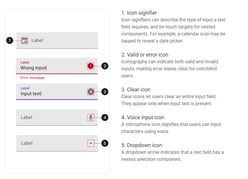
You should definitely use an icon for the clear action rather than text. The material guidelines for input components actually define this as an optional icon and it is a commonly used pattern in most environments nowadays.

Material Guidelines for icons in text fields

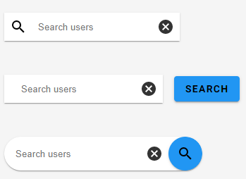
If you wish to add a button to initiate searches rather than automatically fetching results as the user types, make this it's own button that is separate from, but positioned next to, the text field. This makes it clear to a user that it is in fact a button and not just an icon. You should make this a text button unless it is absolutely clear that the field is a search field (based on its prominence and positioning relative to content) in which case you could omit the icon from the text field and just use an icon button.

Here are some options depending on how prominent the search needs to be and whether or not you will auto-retrieve results:

Some example search fields

2
  • That's a very good answer, thank you for that. "We recommend that icons are primarily used alongside text and not by themselves" could you point me to some Material-related documentation stating that?
    – Daniel
    Commented Jan 15, 2020 at 17:21
  • 1
    I am not aware of anything official on the matter but from years of experience working with these icons it is what we have found works best. Icons are great for quick recognition of a feature as long as the user understands what the icon is representing. We find our users always tend to be overly detailed with icons and often request icons which are way to specific and where something with a simpler design or more abstract representation would have worked better alongside some text which provides that additional detail. Don't try to make an icon convey too much information. Commented Jan 16, 2020 at 9:25
0

I'm also a new contributor. Here are some ideas about your first case.

Firstly, is the "Search" button necessary? Maybe in a desktop app, users used to use "Enter" to confirm their search. But you need to put a "Search" icon in the text field to indicate the function.

Secondly, I also think that the "Clear" text is improper. You can use a "Cross" icon.

So in my opinion, it looks like this:

enter image description here

I hope useful to you!

2
  • When it comes to the classic search, i mean when the form is submitted and the results are displayed on a new page, I have to strongly disagree with you. Most importantly, still many people want to click the button. Some even don't recognize it as a search, despite the icon and placeholder. It is also an accessibility issue. And last but not least an indicator that it is a classic search, which only shows results after sending.
    – chrisbergr
    Commented Jan 15, 2020 at 8:16
  • 1
    Some clarification is due, here, it seems (as it's the case with every question ever asked). I'm editing the original question.
    – Daniel
    Commented Jan 15, 2020 at 17:03

Your Answer

By clicking “Post Your Answer”, you agree to our terms of service and acknowledge you have read our privacy policy.

Not the answer you're looking for? Browse other questions tagged or ask your own question.