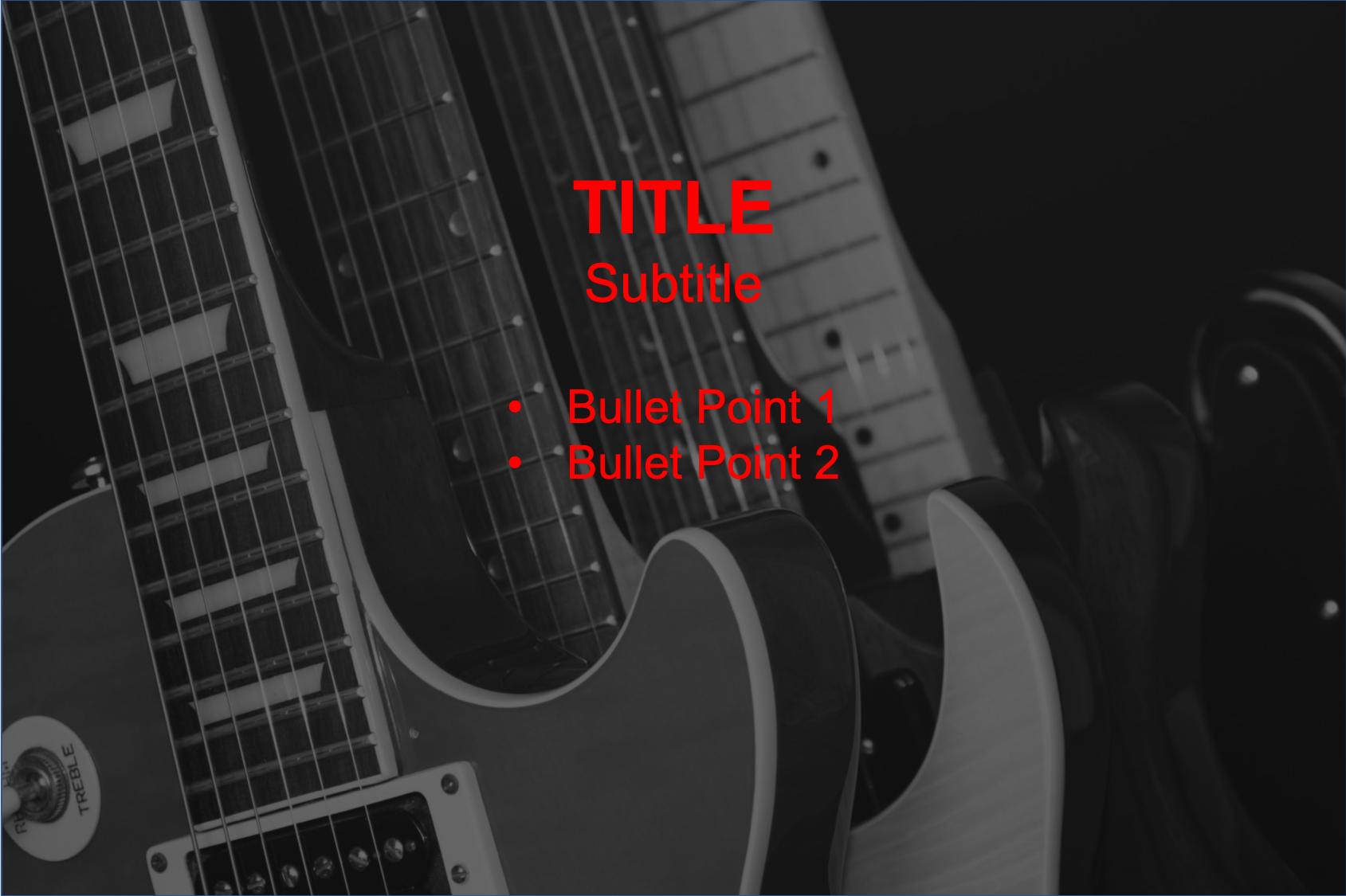
The bullet points are not standing out with red.
-
Hi, welcome to UXSE. A option would be to try and use black text on the white/lighter parts or white text on the darker parts. Another option is white text with a black border (like most subtitles in movies)– Martijn VissersCommented May 14, 2019 at 9:39
-
1Why do you want to use the background image? You can easily use plain colors along with some illustration and show your headings, bullets in parallel to the illustration.– SherazCommented May 14, 2019 at 11:14
-
1It looks like a PowerPoint slide?– 習約塔Commented May 14, 2019 at 11:18
4 Answers
Based on the priority of the image & content we must edit the screen,
Considering the text has much more priority - put a subtle dark solid or gradient over lay on the image, which makes the text pop out.
In this sort of a case, there is likely nothing you need to change about the text colour - red is a very vibrant colour that differs from the monochrome image, but the image's detail seemingly draws the attention away from the text. To solve that I would recommend:
- A black overlay over the image - this will put the focus on the text whilst maintaining the impact of the background image:
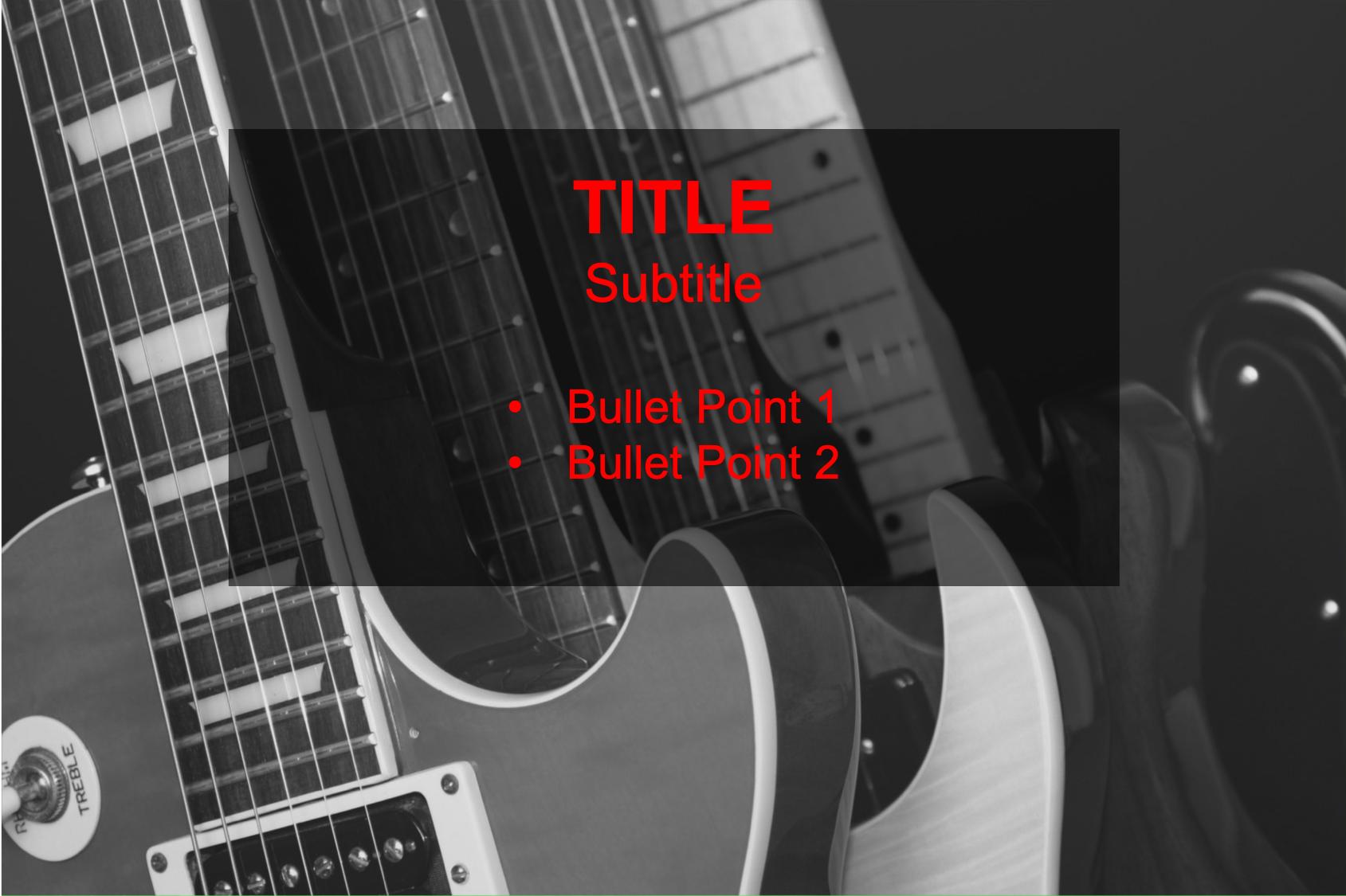
- A Lightbox-like overlay - this is similar to a black overlay but instead defines the text within a box. A darker opacity would be more suitable for this style:
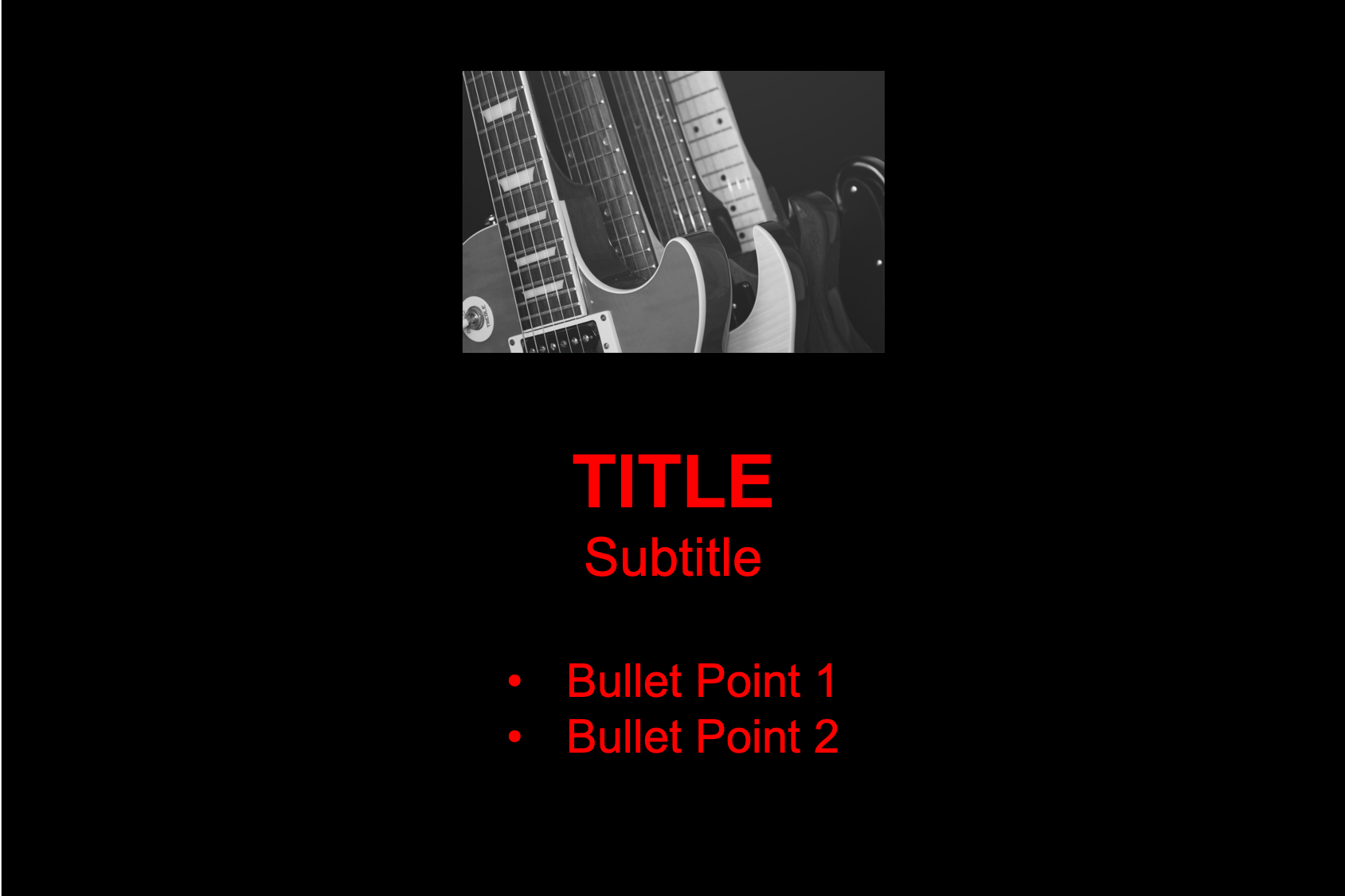
- Change the placement of the image - Rather than placing the image behind the text, place it alongside, above or below your text. This makes the image appear more like an asset to your text, rather than dominating the focus:
In my personal experience, placing images behind large amounts of text actually discourages people from reading it as the detail of the image makes it less legible.
Welcome! There are several options in this case:
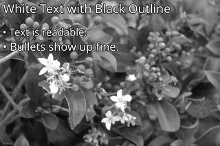
- Add a black outline to the text and make the text itself white.
- Add a low opacity (semi see through) square behind the text as an overlay of the image.
Assuming ofcourse you want to add the text above the image. Is the image relevant or really necessary? Maybe it could be more appealing to add icons and place the information below those icons, instead of bullet points, like so:
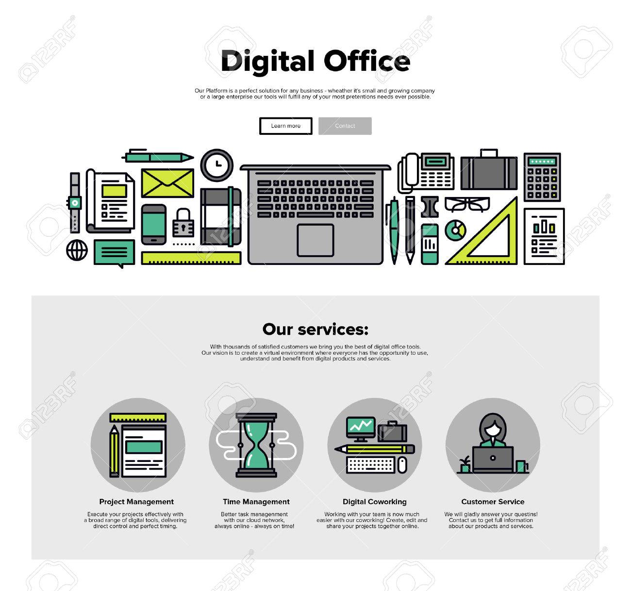
Just a suggestion.


