I'm trying to figure out the best UX for the following situation, in which we are developing a mobile application that will work with the database from an existing web application.
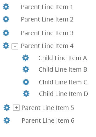
In the web application, we use tables / grids to display job sheets that can have multiple line items. The line items are typically some sort of inventory, and the line item row can contain up to 10 cells of information (name, quantity, location, price, etc.). A cog-wheel next to each item gives options like "Open Item," "Delete Item," "Copy Item," etc. As an example:
Note how some line items have child line items (like if the parent is a package, and the child line items are the items inside that package). Very easy to represent that in a table.
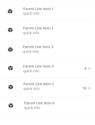
The problem is that we're trying to implement the same idea in a mobile app, but we aren't using tables in the app. We're using lists. Right now it works like this. Using the same example job (from the image above), it would look like this in the app:
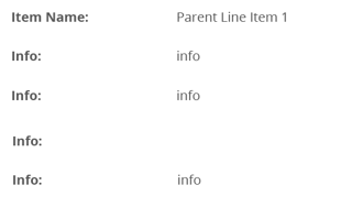
If you tap on a line item, the screen shifts over to show all the info about that line item (the same info that would normally be showing in the table / grid):
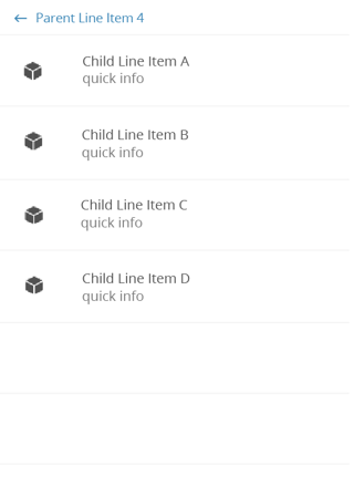
To view the child line items, you would tap the quantity with the > icon on the right-hand side of the line item. It will shift the list over to show the child line items, with a breadcrumb at the top of the list to show you are "inside" of the parent line item:
Then you can tap one of the child line items and it will shift to show the information about that line item, or you can tap the back arrow to go back to the parent line item list.
So for line items without child line items, it's easy. Just tap the line item (anywhere) to view info about that line. But for line items WITH child items, you'll need to still be able to tap the line somewhere to view info about just that line, but then a second tap area to shift the list over to view child line items.
Here are the problems I'm facing:
1) Initial feedback from beta testers is that the quantity and > icon are confusing to them. They don't get the idea that tapping that means it will let them view the child line items.
2) Most mobile apps will use the > icon to indicate that tapping a line item will shift the screen to show more info or open that item. Right now, we only use the > icon to show that you can shift the list to show child line items. So I worry that the way we are doing it isn't consistent with design standards and how most apps work.
3) Right now this just represents simple viewing on the mobile app. But in the future we want to implement editing and other advanced features. Again, most apps I see will use some sort of "..." in the right-hand side of the line item to indicate "more options" like editing the line, deleting the line, etc. So I'm worried that the space we currently have the quantity and > icon will be better used for something like a "..." menu in the future.
Has anybody dealt with something similar when designing a mobile app? How did you handle this?

